
I’ve been keeping a daily journal for 1272 consecutive days.
About halfway through that period, I started adding a simple “day rating” (1–10) to quantify my overall experience. That gives me 581 days of rated data.
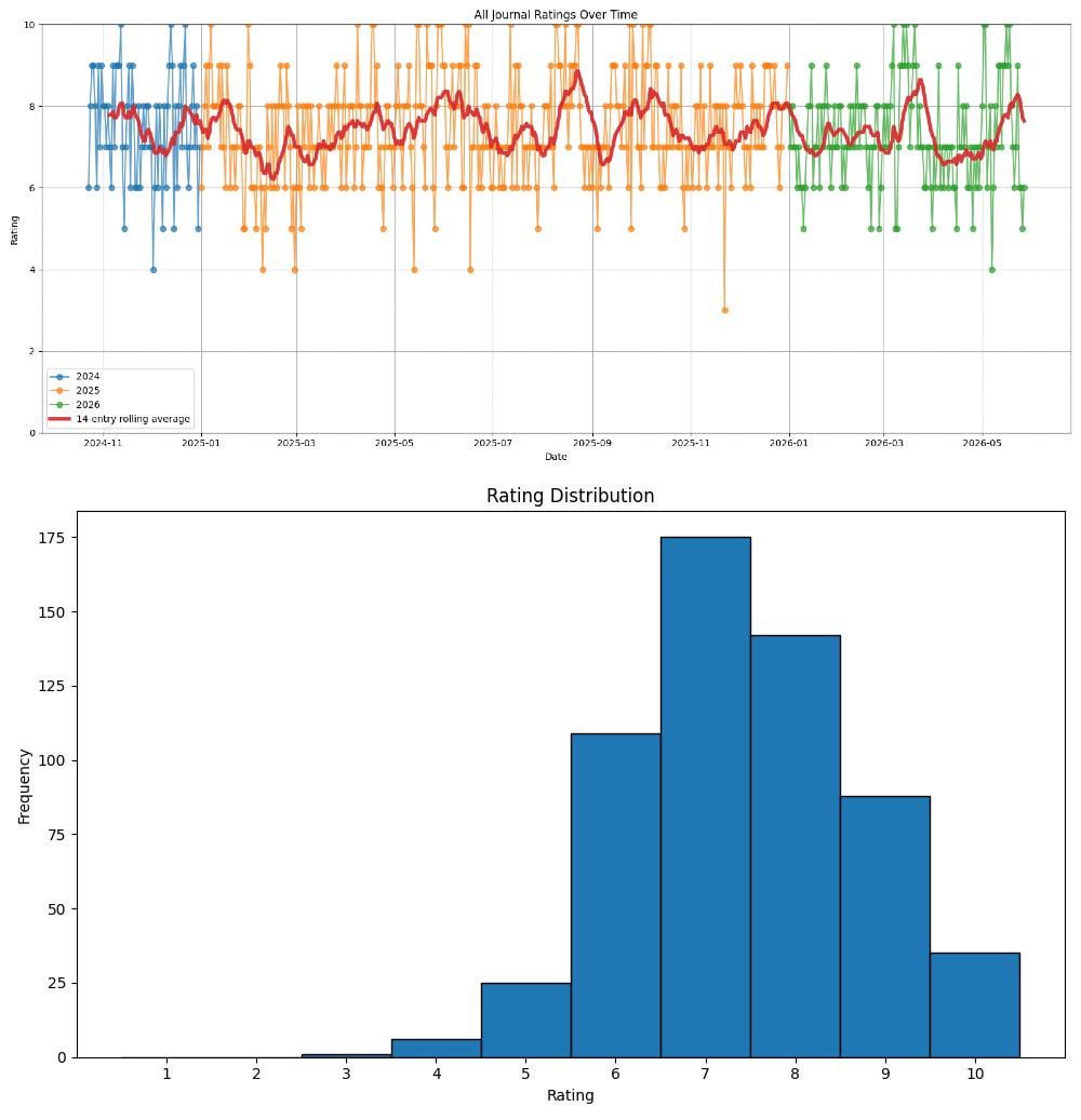
Some stats from the rated portion:
* Entries with ratings: 581
* Average rating: 7.42
* Median rating: 7
* Standard deviation: 1.30
* Highest: 10
* Lowest: 3
What I visualized:
- Distribution of all ratings
- Time series of ratings over time (with rolling averages)
A few patterns that stood out:
* Most days cluster around 7–8, with relatively few extreme lows
* Bad days are rarer than they feel in memory
* The rolling average smooths out noise and makes longer-term phases more visible
* Trends become much clearer when you step back from individual days
All analysis was done in Python (pandas + matplotlib) using an exported Excel journal from a google sheet.
by deepraval2905
2 Comments
• Where or how you got the data : Tracked by myself
• The tool used to generate the visual: Python script (https://pastebin.com/YAne9Wku)
probably going to get taken down b/c personal data day is Monday