
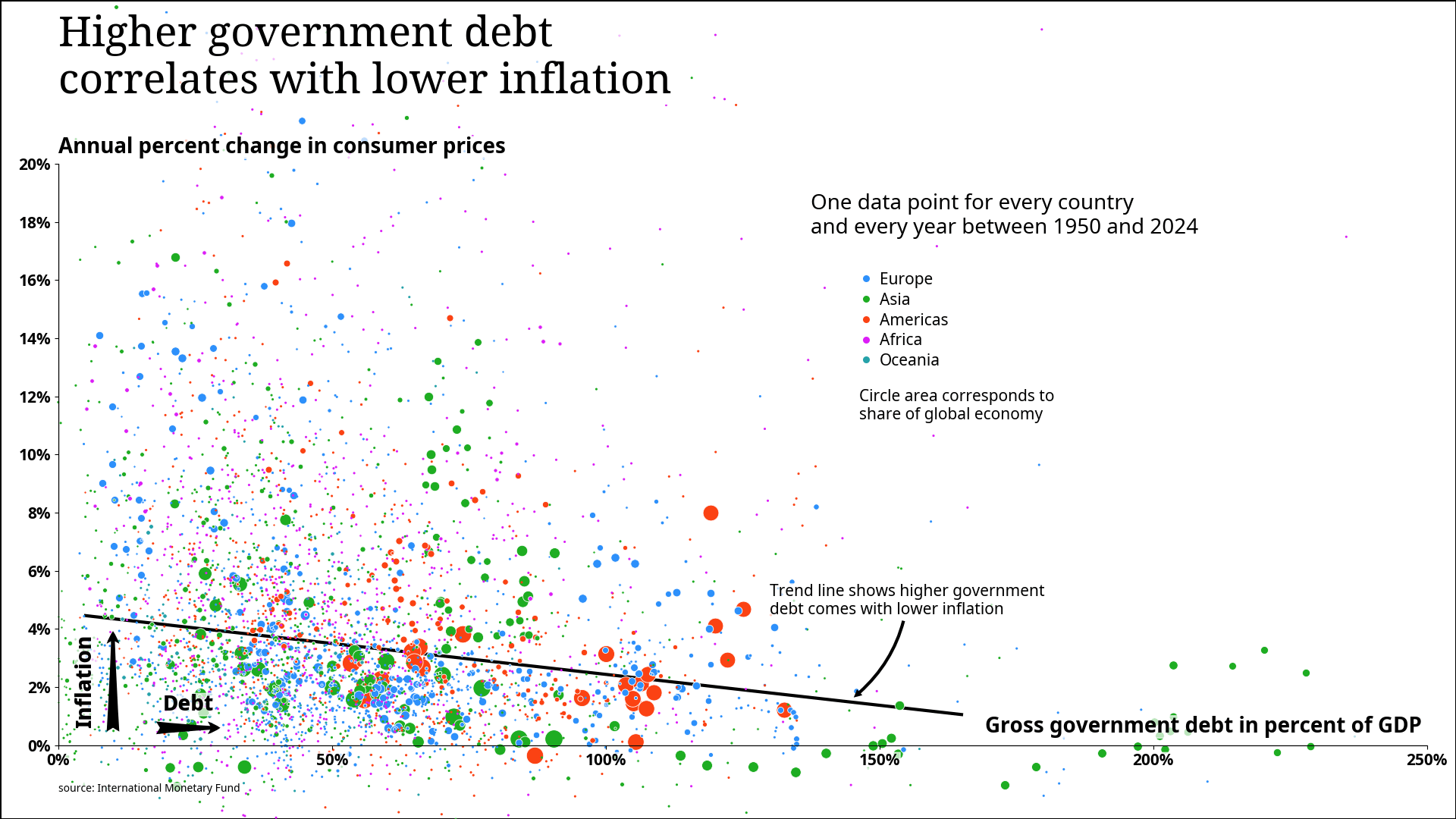
Simple data analysis using Python and the IMF (International Monetary Fund) database.
I used 3 different datasets:
- CPI._T for inflation (y-axis)
- WEO.GGXWDG_NGDP for debt (x-axis)
- WEO.PPPSH for relative economy size (circle radius)
The relative sizes of the country economies are also used as weights for the trend line fit.
by aaeberharter
2 Comments
Interesting! I don’t see a clear trend on my first look.
Are the green dots on the right (very high gov. debt, low inflation) all from the same country? If yes, what happens to your trend line if you exclude that country? These dots seem to have a big lever on the regression.
This plot plays an important role in debates about public spending because often it is suggested that the correlation is significantly positive when in reality it is negative.