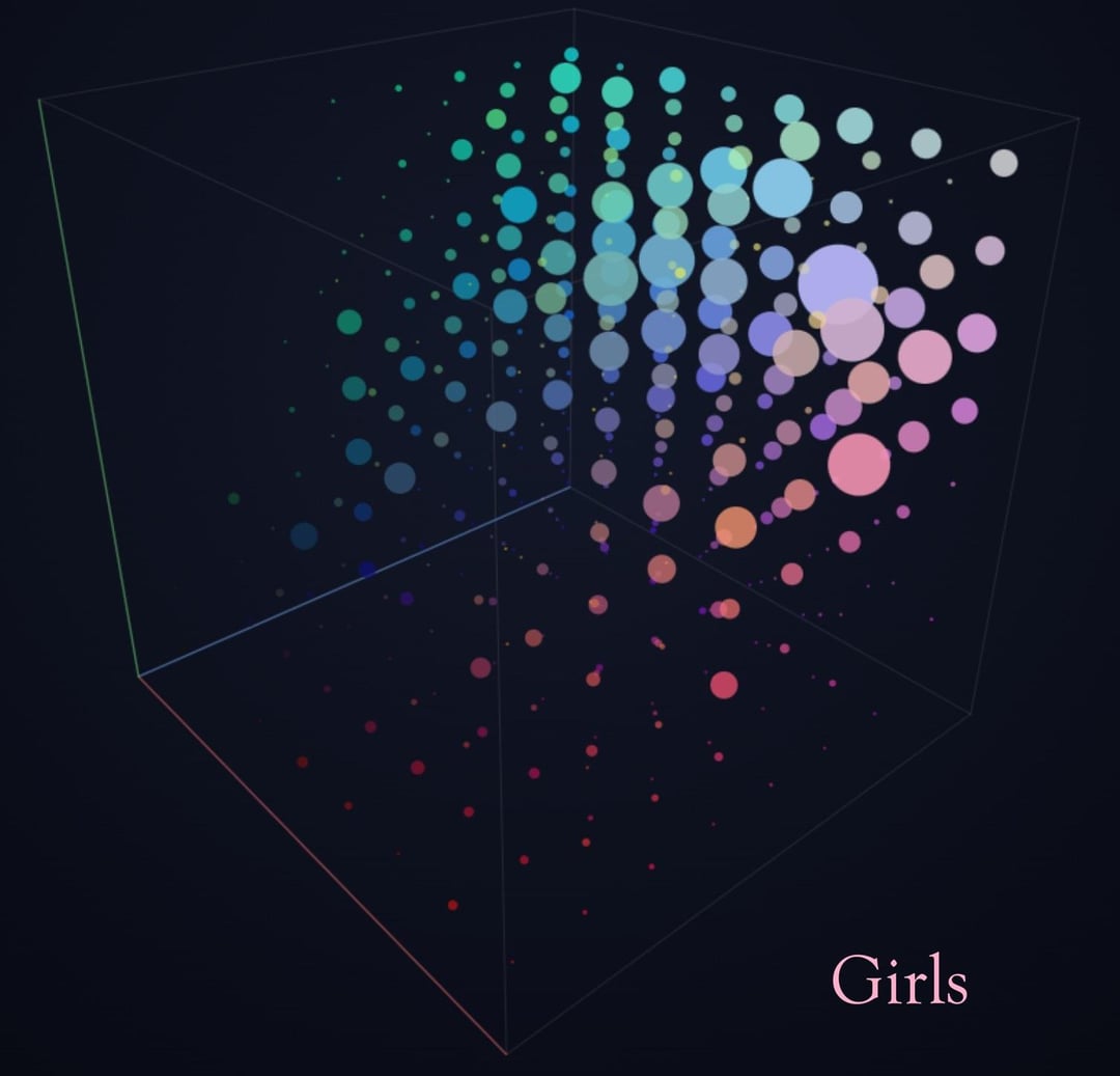
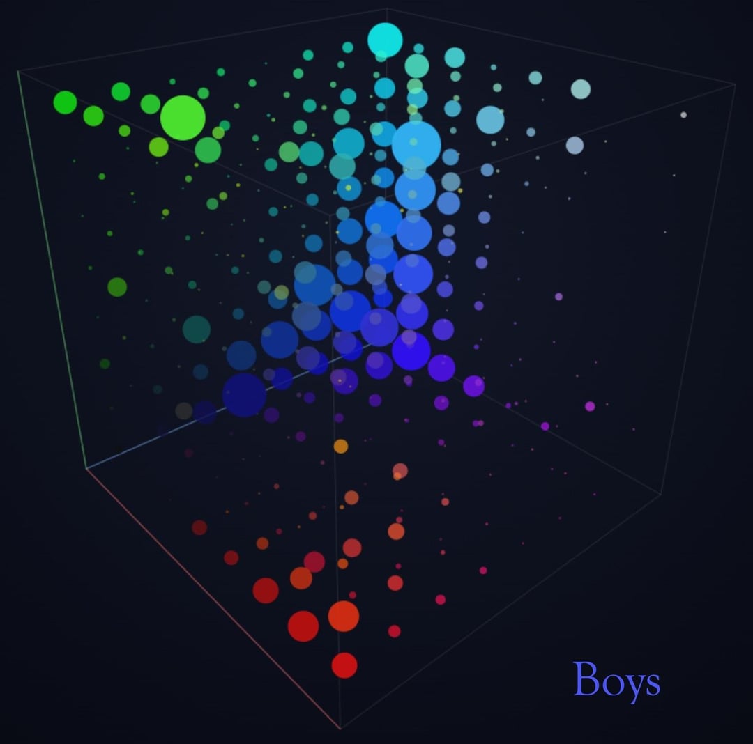
[OC] Visualizing the favorite colors of girls and boys, their shared preferences and the differences between them
by andyviner

[OC] Visualizing the favorite colors of girls and boys, their shared preferences and the differences between them
by andyviner
6 Comments
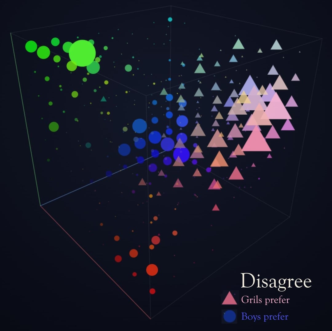
Whats up with the triangles in the last image?
Cool graph, never thought pastel was a gender thing but i love that the boys are just straight up RGB
**Data Source:** Data and interactive project available at [https://andreaslindeman.com/projects/colour-polygraph](https://andreaslindeman.com/projects/colour-polygraph)
**Tools Used:** Python (data processing and cleaning), PHP (custom survey platform), and HTML/JS/CSS (visualization).
**Methodology & Demographics:** To ensure accurate results, I filtered out troll responses and spam from over 20,000+ raw submissions.
More meta data i found intresting:
https://preview.redd.it/430ilx1bi92h1.png?width=886&format=png&auto=webp&s=3afd7980e85d2df7ff2948d975a2516696c24e6d
For more information on the filtering process, data collection, or to play around with the 3D graph yourself, you can [check out the full project website](https://andreaslindeman.com/projects/colour-polygraph).
*(Note: Re-uploading today to fix a missing [OC] tag in the title on my previous attempt!)*
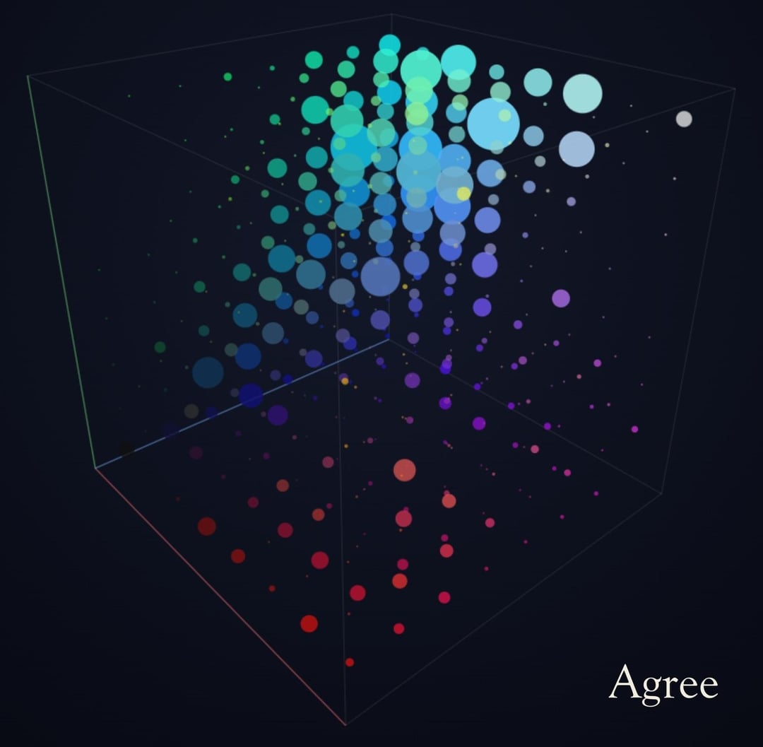
Am I looking too much into this or is it that girls don’t like green and boys and girls basically only agree on the colors of the sky/dawn/dusk?
It seems to show different preferences for saturation as well as hue but that’s been disregarded in the agree/disagree charts.
I also don’t understand what axis relates to saturation, or what depth on the cube shape represents. Why use a 3D shape instead of a colour wheel?
For me the biggest surprise is that girls don’t like green.
Oh man, I’m a girl?
This is not what I had on my bingo card.