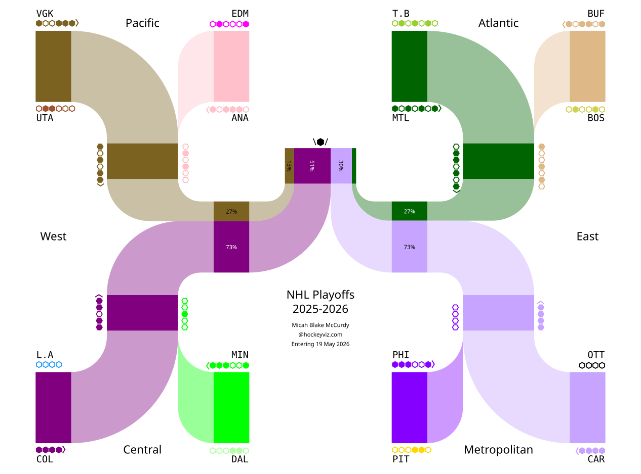
Data source: raw data from the NHL, munged through my various measurement and prediction models.
Viz tool: the python library svgwrite (and inkscape to make it into a raster)
by mbmccurdy

Data source: raw data from the NHL, munged through my various measurement and prediction models.
Viz tool: the python library svgwrite (and inkscape to make it into a raster)
by mbmccurdy
4 Comments
Data source: raw data from the NHL, munged through my various measurement and prediction models.
Viz tool: the python library svgwrite (and inkscape to make it into a raster)
Counterpoint: https://youtu.be/hnX2yLeTnY8?si=KarDbWXfKFwIz_00. Go Habs Go.
This is neat. My only gripe is that I wish the coloured lines were one of the teams’ primary colours so it was easier to read. Seeing MTL in green is messing with me.
This is too exhausting to decipher. A more traditional bracket with percentages listed would be easier to understand.