Source: United States Postal Service (USPS) Historical Pricing Data & US Bureau of Labor Statistics (BLS) Consumer Price Index (CPI-U) data.
Tools: Python (Pandas for timeline alignment/interpolation and Matplotlib for visualization).
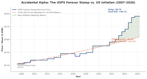
Context: In April 2007, the USPS released its first “Forever Stamp” at $0.41. While meant to reduce the administrative burden of small rate changes, aggressive pricing hikes over the last 5 years have caused it to substantially outpace standard US inflation, netting a ~90.2% raw nominal return compared to ~51.2% general inflation.
lord_ne on
I’m not sure if this is an issue on my end, but I’m seeing the image as super low-resolution. This is on the official Reddit app on Android
Aspirational1 on
Do a cost of stamp multiplied by the number of letters sent graph.
That’ll probably show a decrease in overall value.
No one is sending letters, but the USPS is committed to delivering to everyone, almost daily.
Parcels on the other hand, will likely show a different profile, with increasing toral value.
letitgo99 on
You can buy forever stamps for more than half off on fb marketplace, so that definitely bucks this curve. I am not a lawyer or police officer, use this information at your own risk.
FrickinLazerBeams on
Are the remaining pixels waiting to ship once you save up for some stamps?
tyen0 on
Can you repost with better resolution, please? Some of the letters are barely legible due to pixelation.
brownblacklove on
Should have bought shares in a forever stamp ETF
JeromesNiece on
Why is the inflation adjusted line so smooth? CPI looks like [this](https://fred.stlouisfed.org/graph/?g=1WrRe) during this period; much faster increase during 2021-2022 than what’s shown here
jxj24 on
Good thing I never mail anything anymore. Except when there is no choice, and even then unwillingly.

9 Comments
Source: United States Postal Service (USPS) Historical Pricing Data & US Bureau of Labor Statistics (BLS) Consumer Price Index (CPI-U) data.
Tools: Python (Pandas for timeline alignment/interpolation and Matplotlib for visualization).
Context: In April 2007, the USPS released its first “Forever Stamp” at $0.41. While meant to reduce the administrative burden of small rate changes, aggressive pricing hikes over the last 5 years have caused it to substantially outpace standard US inflation, netting a ~90.2% raw nominal return compared to ~51.2% general inflation.
I’m not sure if this is an issue on my end, but I’m seeing the image as super low-resolution. This is on the official Reddit app on Android
Do a cost of stamp multiplied by the number of letters sent graph.
That’ll probably show a decrease in overall value.
No one is sending letters, but the USPS is committed to delivering to everyone, almost daily.
Parcels on the other hand, will likely show a different profile, with increasing toral value.
You can buy forever stamps for more than half off on fb marketplace, so that definitely bucks this curve. I am not a lawyer or police officer, use this information at your own risk.
Are the remaining pixels waiting to ship once you save up for some stamps?
Can you repost with better resolution, please? Some of the letters are barely legible due to pixelation.
Should have bought shares in a forever stamp ETF
Why is the inflation adjusted line so smooth? CPI looks like [this](https://fred.stlouisfed.org/graph/?g=1WrRe) during this period; much faster increase during 2021-2022 than what’s shown here
Good thing I never mail anything anymore. Except when there is no choice, and even then unwillingly.