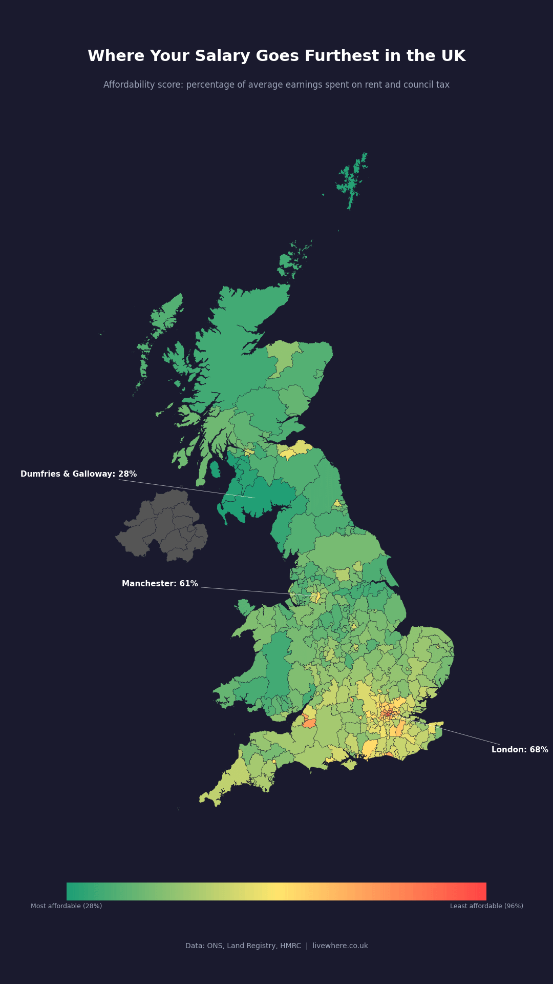
UK housing affordability by local authority – percentage of average earnings spent on rent and council tax [OC]
by BanksforBitcoin

UK housing affordability by local authority – percentage of average earnings spent on rent and council tax [OC]
by BanksforBitcoin
4 Comments
Map shows the affordability score for each UK local authority, calculated as (average monthly rent + monthly council tax) / average monthly gross earnings, expressed as a percentage. Lower percentage = more affordable (green), higher = less affordable (red). Grey areas are Northern Ireland where the data sources don’t currently cover.
Most affordable: Dumfries and Galloway (28%) Least affordable: Kensington and Chelsea (96%)
Uses median values for both rent and earnings.
Source: ONS Price Index of Private Rents (rent), ONS Annual Survey of Hours and Earnings (earnings), MHCLG / Scottish Government / Welsh Government (council tax)
Tool: Python / matplotlib
Interactive version where you can hover over any area: [livewhere.co.uk/tools/affordability-map](http://livewhere.co.uk/tools/affordability-map)
This is fairly misleading, as it misses a huge component of effective affordability.
Housing cost help under universal credit is paid to about half of rental households.
https://www.ukhousingreview.org.uk/ukhr25/tables-figures/pdf/25-111.pdf 4.1M total housing cost as of 2025.
This is about half of the rental sector.
https://www.bigissue.com/news/housing/universal-credit-rent-benefits-dwp-stats/ It is further complicated by the fact that in some areas, due to old valuations and other factors the rent cap is below what is reasonably rentable.
This is of course a direct subsidy of the landlord class from general taxation.
How does it deal with commuting? If you work in London but live in the suburbs, you need the salary from London vs the house price in the suburb.
Guh, this is so skewed by other competing boundaries in my area. (National Park)
I live in a tourist area where living here is extortionate to buy or rent, compatible to parts of London, but the mean income is under national avg. During COVID we saw some of this highest house price increases in the country, pushing rents up with it.
The national park boundary sees housing half in price/rent costs by just leaving it. And is exaggerated the further from the national park you go. With the council funnelling funds from the national park into the surrounding areas to boost their growth.
I’m not questioning the data, but suggesting that it’s a very incomplete way of dividing areas for cost of living, in some specific places.