
I built an interactive civic/data visualization experiment called Land Doesn’t Vote.
The project starts from a common problem with U.S. election maps:
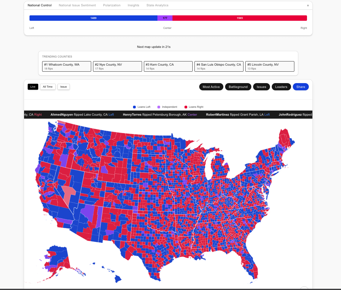
Traditional county maps show geography, not population.
Large rural counties can dominate the visual space of a red/blue map, even if relatively few people live there. Dense urban counties can contain far more people but appear tiny.
But I also wanted to test something more interactive:
What happens when users can symbolically change the map?
On the site, users can sponsor a symbolic “flip” of a county. This does not represent real votes, real election results, polling, donations to campaigns, or political influence. It is a civic/data art experiment where user participation becomes part of the visualization.
So the changing map is showing two things at once:
-
The familiar geography-vs-population problem in county election maps
-
A live layer of symbolic user participation — which counties people choose to flip, and how that changes the visual story of the map
Interactive version: https://landdoesntvote.com
The reason I included monetization is because I wanted the interaction to have some friction. If flipping counties were free and unlimited, the map would probably turn into noise immediately. Making it a small paid action turns each flip into a deliberate signal, while also testing whether people find this kind of civic/data experiment interesting enough to participate in.
The goal is not to simulate an election. It’s more like a public, interactive map experiment about perception, participation, and how political geography can be visually manipulated.
I’d love feedback:
Does the visualization make it clear that this is symbolic participation, not real election data?
Does the paid flip mechanic make the experiment more interesting, or does it distract from the geography/population lesson?
What would make the map easier to understand at first glance?
by snugglenator
1 Comment
Methodology / clarification:
This is not a map of real-time election results, polling, campaign donations, or people buying real votes.
The base layer uses U.S. county-level presidential election geography to show how land area affects political map perception.
The changing layer comes from symbolic user interactions. When someone sponsors a county flip, the county changes visually on the map. That creates a participation dataset: which counties users chose to interact with, and how those interactions alter the visual story.
Data sources:
– County presidential election results: MIT Election Data and Science Lab, County Presidential Election Returns 2000–2020
– County population data: U.S. Census Bureau / ACS county population estimates
– County boundaries: U.S. Census Bureau TIGER/Line county boundaries
– Symbolic flip data: generated by user interactions on the site
The goal is to make a participatory civic/data artwork, not to simulate or influence an election.