
OC: Built this in Power BI using 1 million NYC
collision records from Datdotgov (2017–2022)
Key findings that surprised me:
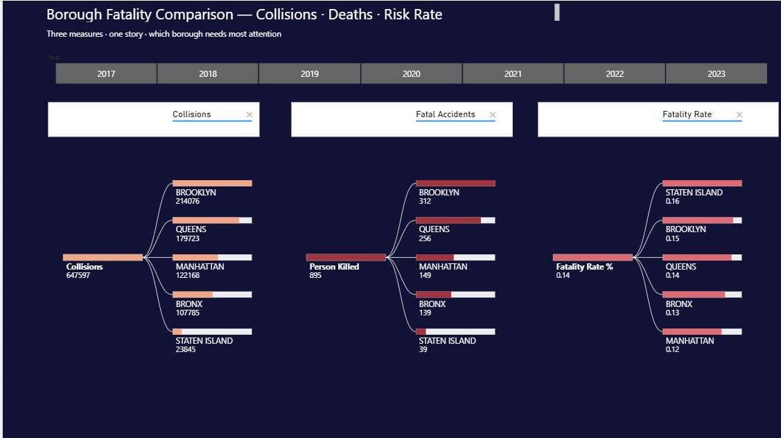
– Staten Island has the HIGHEST fatality rate
at 0.49% — nearly double Manhattan's 0.33%
despite having the fewest total crashes
– Belt Parkway is the most dangerous street —
14,649 collisions and 36 deaths
– Midday 10am–3pm has MORE crashes than rush
hour — completely counterintuitive
– Backhoe loaders and tow trucks: 100% fatality
rate on every collision
– Driver inattention is #1 cause across all
5 boroughs without exception
Tools used: Power BI Desktop, Power Query, DAX
Data source: DataDOTgov (publicly available)
Happy to answer any questions about the
methodology or how the measures were built.
by Fun-Investigator7818
6 Comments
I think average speed would be highest in staten island and could explain this
I think the law of small numbers might explain the states island effect. It was likely going to be at the top or bottom just because of that, the size of the data is just much smaller with such a small (relatively) fatality number of 39.
(I also take issue with describing 0.49% and nearly double 0.33% but I digress).
Very cool analysis, especially the note about backhoe loaders and tow trucks.
>Midday 10am–3pm has MORE crashes than rush hour — completely counterintuitive
Eh, can’t crash as easily when stuck in gridlock.
It’s kind of what I expected.
WTF is your AI workflow that produces these awful multiline pastes
Actually, midday thing completely surprized me. You’d think rush hour would dominate but gridlock actually protects people — not enough speed to cause serious damage. Staten Island was expected for me once I saw the highway layout but midday was the real plot twist in this data 😄