
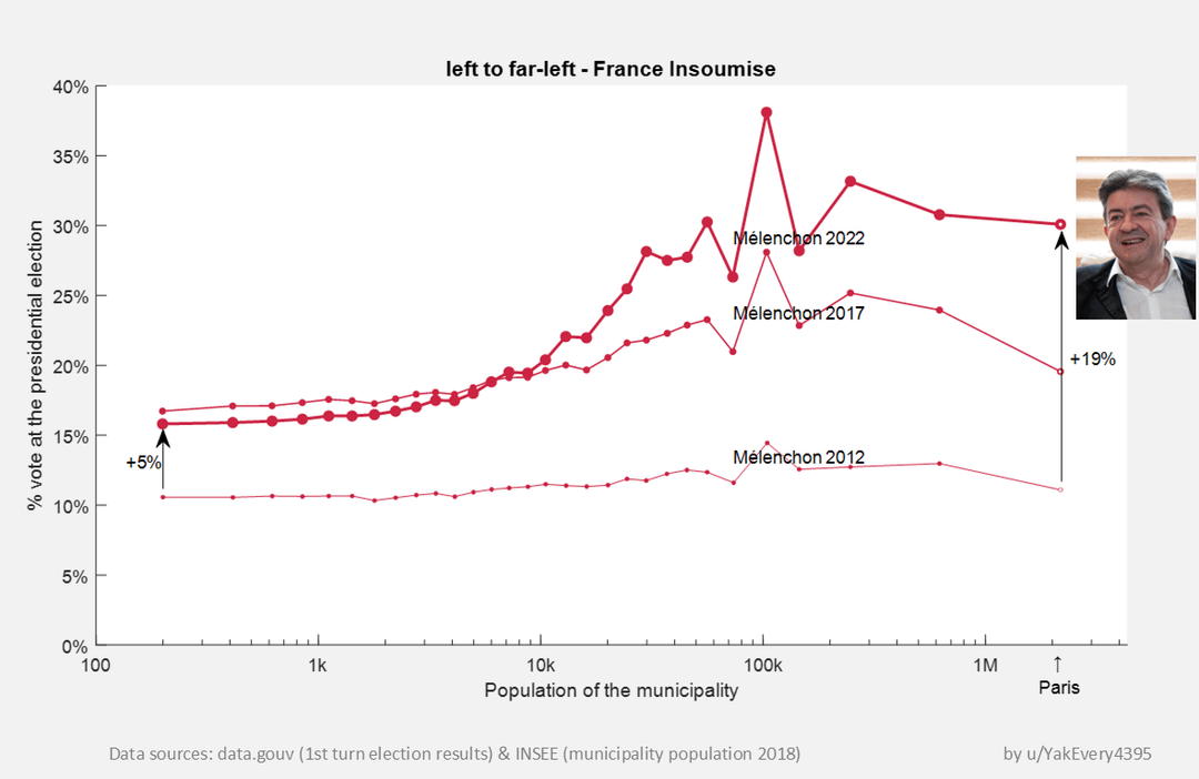
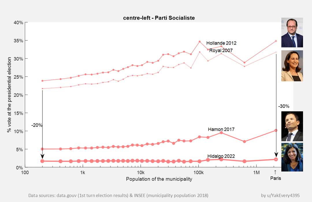
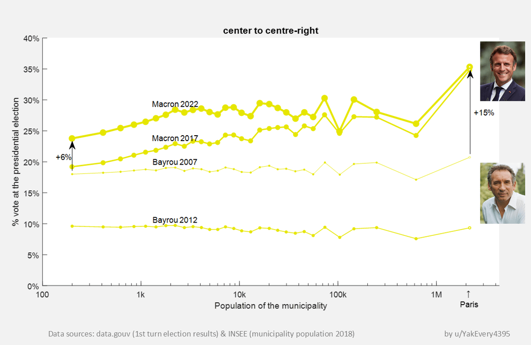
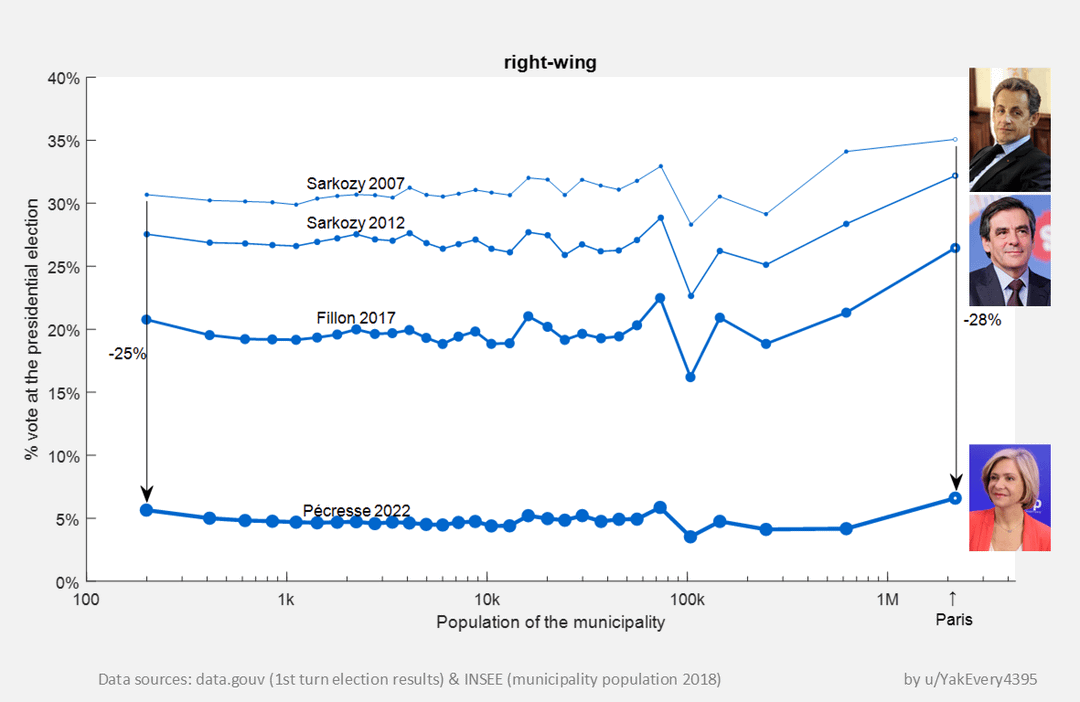
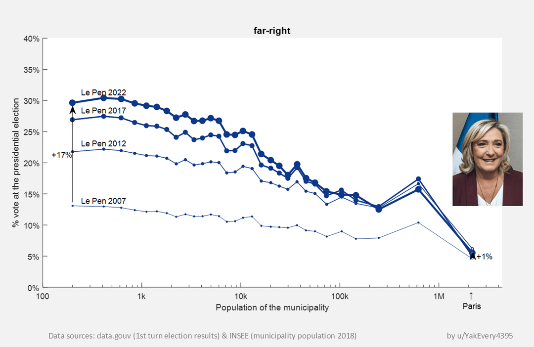
This graph illustrates at least two key points:
- The obvious one: the fall of traditional left and right parties leading to the rise of the center (Macron) and both "far" parties, left and right.
- The one that's a little more subtle: since 2017 people's vote is becoming more and more dependant on their municipal size. Mainly, the left to far-left (Mélenchon) does big scores in big cities and far-right (Le Pen) does big scores in the country-side.
by YakEvery4395
4 Comments
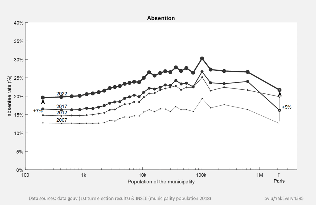
Methodology for the plot: Municipalities are sorted by population and then divided into thirty groups, each comprising municipalities with a similar number of inhabitants. Each of these groups represents a similar total population (~2.2 million).
The 3 points corresponding to the most populous cities (furthest to the right on the curves, INSEE data, 2018):
2.2 million: Paris
between 320k and 870k: Nice, Marseille, Toulouse, Lyon
between 170k and 320k: Bordeaux, Montpellier, Rennes, Saint-Étienne, Nantes, Reims, Lille, Strasbourg, Toulon
Plot tool: Matlab
I’ve never seen this done before. I like it. Interesting.
Any idea what’s causing the disruption at 100k inhabitants?
LFI is a left wing, not far left…
For the rest, Nice chart