
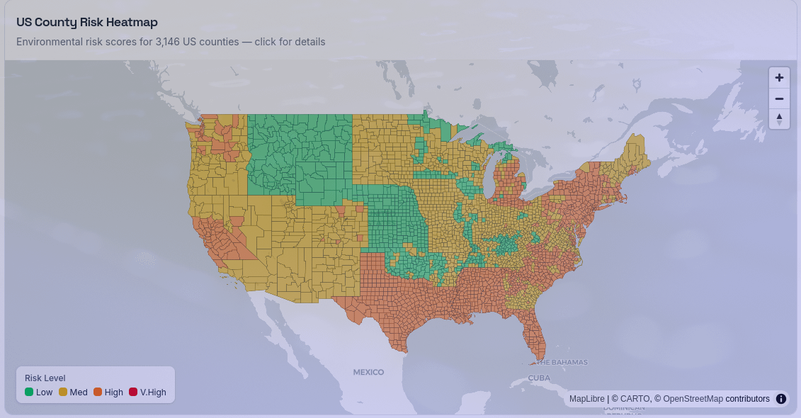
I built an interactive county-level risk heatmap for the US.
What it shows:
Each county gets a 0-100 score combining flood, hurricane, wildfire, earthquake, PFAS contamination, and water quality data from federal sources.
Data sources:
– FEMA National Risk Index — county-level ratings for flood, earthquake, wildfire, hurricane, tornado, coastal flooding
– EPA UCMR5 — PFAS contamination data per ZIP code
– EPA SDWIS — water quality violations per ZIP code
Tools: Next.js, MapLibre GL JS, Python (data aggregation)
Methodology: FEMA NRI categorical ratings mapped to 0-100, weighted Flood 25%, Hurricane 20%, Wildfire 15%, Earthquake 10%, Tornado 5%, PFAS 15%, Water Quality 10%. PFAS/WQ aggregated ZIP→county by averaging.
Live demo: https://protectmyzip.com/maps
Click any county for its score breakdown. Full methodology on the site.
by jessepinkman76
12 Comments
Waffle Houses on the red zones are probably militarily trained and have backup staffs for their backup staffs.
Highly improbable that all of texas would be orange while almost all of Oklahoma is green
The fact that it’s so square and following state lines in a lot of places, makes me not trust it
Some boundaries are weird and just follow the state lines.
A highly vibe coded project
This map isn’t accessible
interesting seeing michigan being dissimilar to its immediate neighbors
At least one state has identical scores for every location I checked, despite the fact they are hundreds of miles apart and have totally different hazard profiles. Absolute trash.
The fact all the Mountain West is green means this is bad, never mind the fact Idaho is going to run out of water this year, no part of the Rockies is safe from wildfire.
Why are there abrupt transitions following parts of state borders (CO-KS, CO-WY, etc.?)
Why is risk elevated downwind of the Great Lakes?
You’re right the map was indeed broken. I just fixed it.
Turns out I had only loaded the water quality data (PFAS + contaminants) and somehow didn’t include the actual hazard layers (flood, wildfire, earthquake, hurricane, tornado) from the FEMA National Risk Index dataset I already had. So yeah, the map was basically just showing water contamination patterns, not real hazard risk. That explains the weird state-line artifacts.
It’s live now with the full dataset. If you guys care to provide more feedback it’ll be really helpful to further improve thé tool.
Source: FEMA National Risk Index (flood, hurricane, wildfire, earthquake, tornado, lightning, hail, strong wind, cold wave, coastal flooding), USGS real-time earthquake feed (M2.5+ past 30 days), EPA AirNow AQI, EPA UCMR5 PFAS contamination data, EPA SDWIS water quality violations. All data from US federal agencies.
Tools: Python (aggregation script), Next.js, Cloudflare Workers, MapLibre GL JS, TopoJSON. US county boundaries from US Census Bureau. Python script merges FEMA NRI CSV (3,233 counties) with USGS GeoJSON earthquake feed and EPA AirNow API responses, outputs per-county scores. Adaptive weighting: only hazards with non-zero scores contribute to overall, so inland counties aren’t penalized for coastal risks.
Notes: Scores are county-level, not property-level. Color palette is colorblind-safe (blue/amber/red). Seismic activity reflects recent earthquakes, not predictive probability. PFAS data has significant coverage gaps and many counties have no testing data. Compare tool at [protectmyzip.com/compare](http://protectmyzip.com/compare) lets you see two cities side by side.
All hazard scores are derived from the government sources listed above. AI tools (Claude) were used as coding assistants during development.