
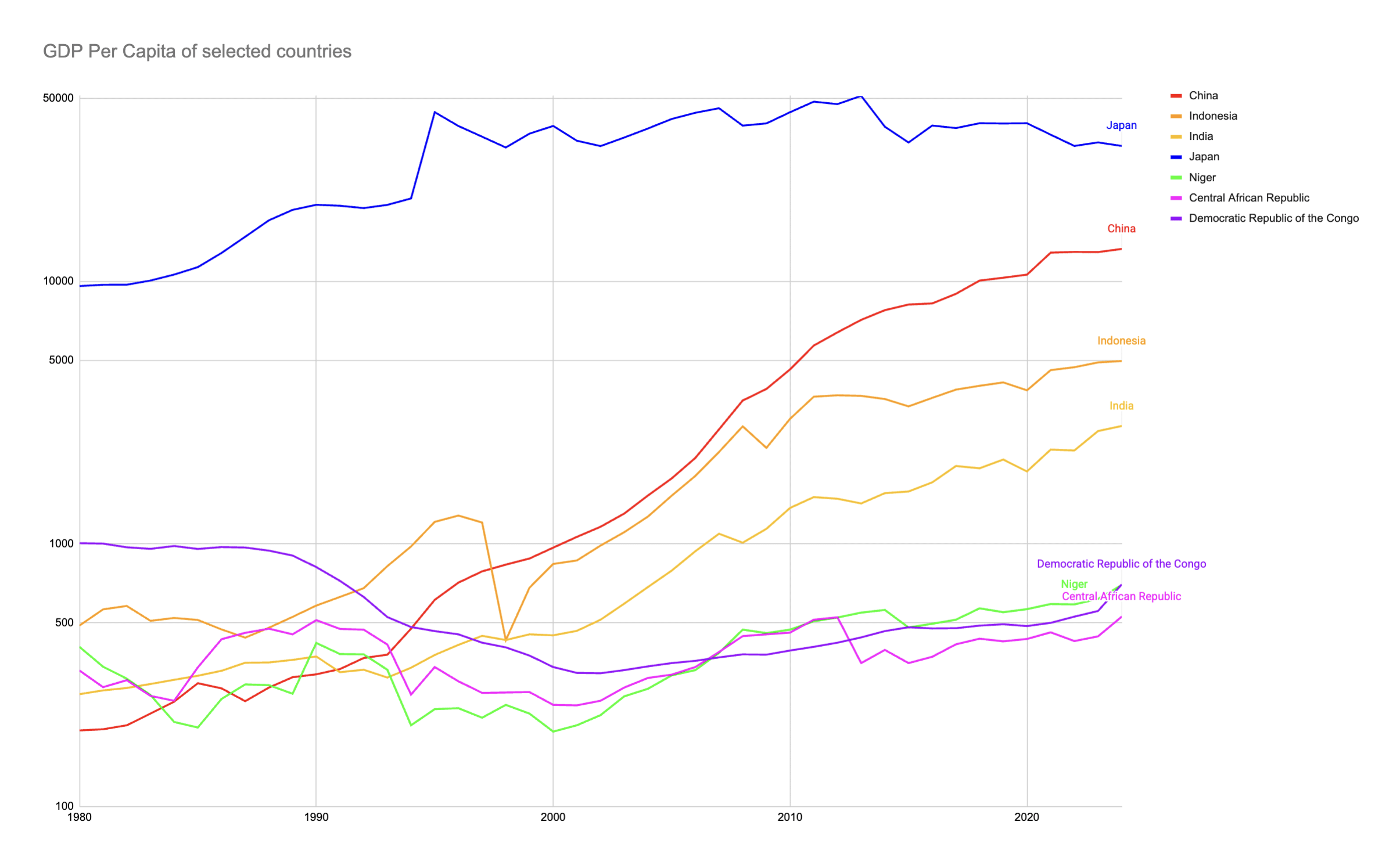
Log graph is used as otherwise much of the countries here would be represented as just a flat line at the bottom of the graph. Annual growth would have the same slope regardless of where it was. PPP is not used because it is pretty inaccurate especially with data like this. Yes I know it feels cherry picked that I picked the 3 worst looking African countries but its just intersting seeing the explosive growth of China then India over the past few decades. I know it might not be apparent here due to log graph but Japan's GDP per capita was roughly 50x higher than China's in 1980. One thing I didn't realize was that Indonesia's economy also grew pretty fast since its collapse (basically) in the Asian Financial Crisis.
1980: China: $195 Indonesia: $470 India: $267 Niger: $278 Central African Republic: $303 Niger: $237 Japan: $9614
2024: China: $13400 Indonesia: $5100 India: $2890 Niger: ~$600 CAR: ~$600 Niger: ~$700 Japan: $34321
Bottom left starts at $100.
Source: IMF
by PomegranateFederal97
1 Comment
wild how China basically went from medieval peasant economy to middle-income country in like 30 years 🚀 meanwhile those African countries are still stuck at same level since the 80s 💀