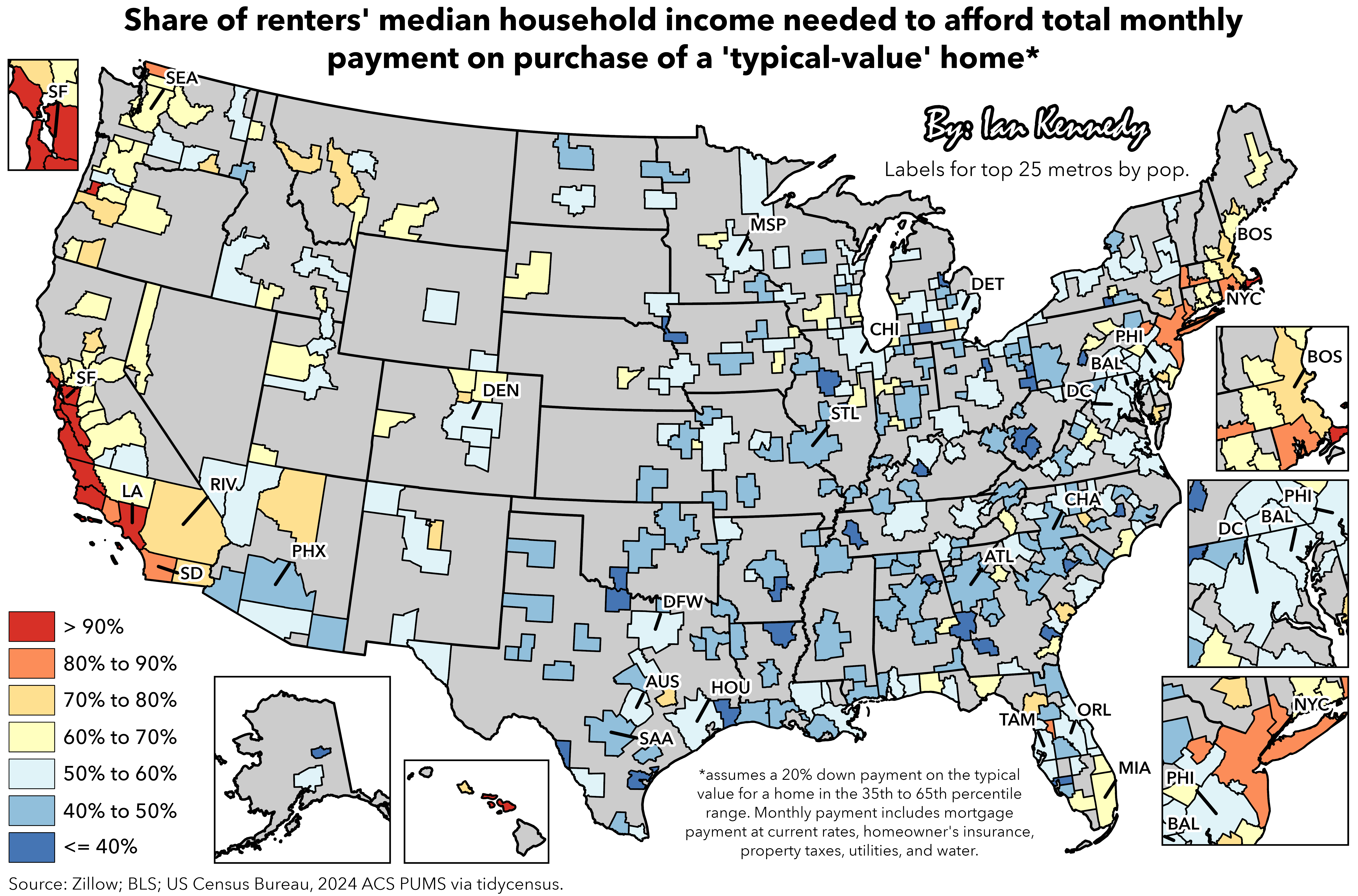
Why use both short abbreviations and IATA airport codes? Standardize!
CoughRock on
just watched a youtube video on changing zoning law to allow higher density housing in california. Jeebus, the amount of nimby popping up in the comment is ridiculous. They would rather save the “neighborhood feel and prevent too much people traffic” than allow people to have affordable housing. Not just rich people. Even poor and middle class people hinting they don’t want new housing lower their property value, and they are here first so new buyers should suffered.
Such suffocating nimby and lack of self reflection.
Dillweed999 on
I saw one of these once that combined rent/mortgage costs with heating/cooling costs. TLDR Cali and the Northeast were much more competitive with the sunbelt states.
lil_layne on
Was not expecting DC to be blue
AnalAttackProbe on
I live in Denver. The tipping point for me was when my rent became more expensive than a mortgage payment. I couldn’t justify paying more to live in someone else’s apartment vs my own home.
I was fortunate. My wife and I are both frugal and could afford a down payment. I know not everyone is in that situation.
VoluntaryExtinction on
40% is still really bad, but the map shows it as fine
Why is any land gray, are they not part of metro areas?
Diligent-Chance8044 on
This is right on the money for my area. Rents are close to 40-50% of the median take home here but home prices are 60-70%. You really need a spouse to afford a home here. Contrast to the area I moved from I could afford a home and was above median for that county. Same salary btw just change in location.
DC makes sense when the salaries being the highest in the country, however they do have a super high poverty rate 6% over the national average. California makes sense. Texas also makes sense being the only place in the country with rents having recorded decreases but oil industry/new tech keeping salaries high.
luxtabula on
Currently in the orange. Send help please. Thanks.
skobuffaloes on
Props for using median and not average.
No_Lube on
Why are stat borders shown but only for some areas? Where is New Jersey lol
grubnenah on
And this is assuming the buyers were able to afford a 20% down payment! The map would look much worse if there was a comparison for new home buyers who need to use an FHA loan / pay mortgage insurance.
SgtSkulduggery on
Some of these cities are much worse when you consider the city alone and not the whole metro area. Southern New Hampshire and Plymouth county are doing a lot of work to keep Boston in the 70-80% range.
LargeHard0nCollider on
The one red square in Oregon is Benton county, which is basically just Corvallis (population 60k) the town where Oregon State University (enrollment 40k) is located. The rest is farmland. I think the numbers just skewed because the majority of people there are college students. It’s a nice place to live so houses are expensive, but not more so than other nice places in Oregon

13 Comments
Why use both short abbreviations and IATA airport codes? Standardize!
just watched a youtube video on changing zoning law to allow higher density housing in california. Jeebus, the amount of nimby popping up in the comment is ridiculous. They would rather save the “neighborhood feel and prevent too much people traffic” than allow people to have affordable housing. Not just rich people. Even poor and middle class people hinting they don’t want new housing lower their property value, and they are here first so new buyers should suffered.
Such suffocating nimby and lack of self reflection.
I saw one of these once that combined rent/mortgage costs with heating/cooling costs. TLDR Cali and the Northeast were much more competitive with the sunbelt states.
Was not expecting DC to be blue
I live in Denver. The tipping point for me was when my rent became more expensive than a mortgage payment. I couldn’t justify paying more to live in someone else’s apartment vs my own home.
I was fortunate. My wife and I are both frugal and could afford a down payment. I know not everyone is in that situation.
40% is still really bad, but the map shows it as fine
Why is any land gray, are they not part of metro areas?
This is right on the money for my area. Rents are close to 40-50% of the median take home here but home prices are 60-70%. You really need a spouse to afford a home here. Contrast to the area I moved from I could afford a home and was above median for that county. Same salary btw just change in location.
DC makes sense when the salaries being the highest in the country, however they do have a super high poverty rate 6% over the national average. California makes sense. Texas also makes sense being the only place in the country with rents having recorded decreases but oil industry/new tech keeping salaries high.
Currently in the orange. Send help please. Thanks.
Props for using median and not average.
Why are stat borders shown but only for some areas? Where is New Jersey lol
And this is assuming the buyers were able to afford a 20% down payment! The map would look much worse if there was a comparison for new home buyers who need to use an FHA loan / pay mortgage insurance.
Some of these cities are much worse when you consider the city alone and not the whole metro area. Southern New Hampshire and Plymouth county are doing a lot of work to keep Boston in the 70-80% range.
The one red square in Oregon is Benton county, which is basically just Corvallis (population 60k) the town where Oregon State University (enrollment 40k) is located. The rest is farmland. I think the numbers just skewed because the majority of people there are college students. It’s a nice place to live so houses are expensive, but not more so than other nice places in Oregon