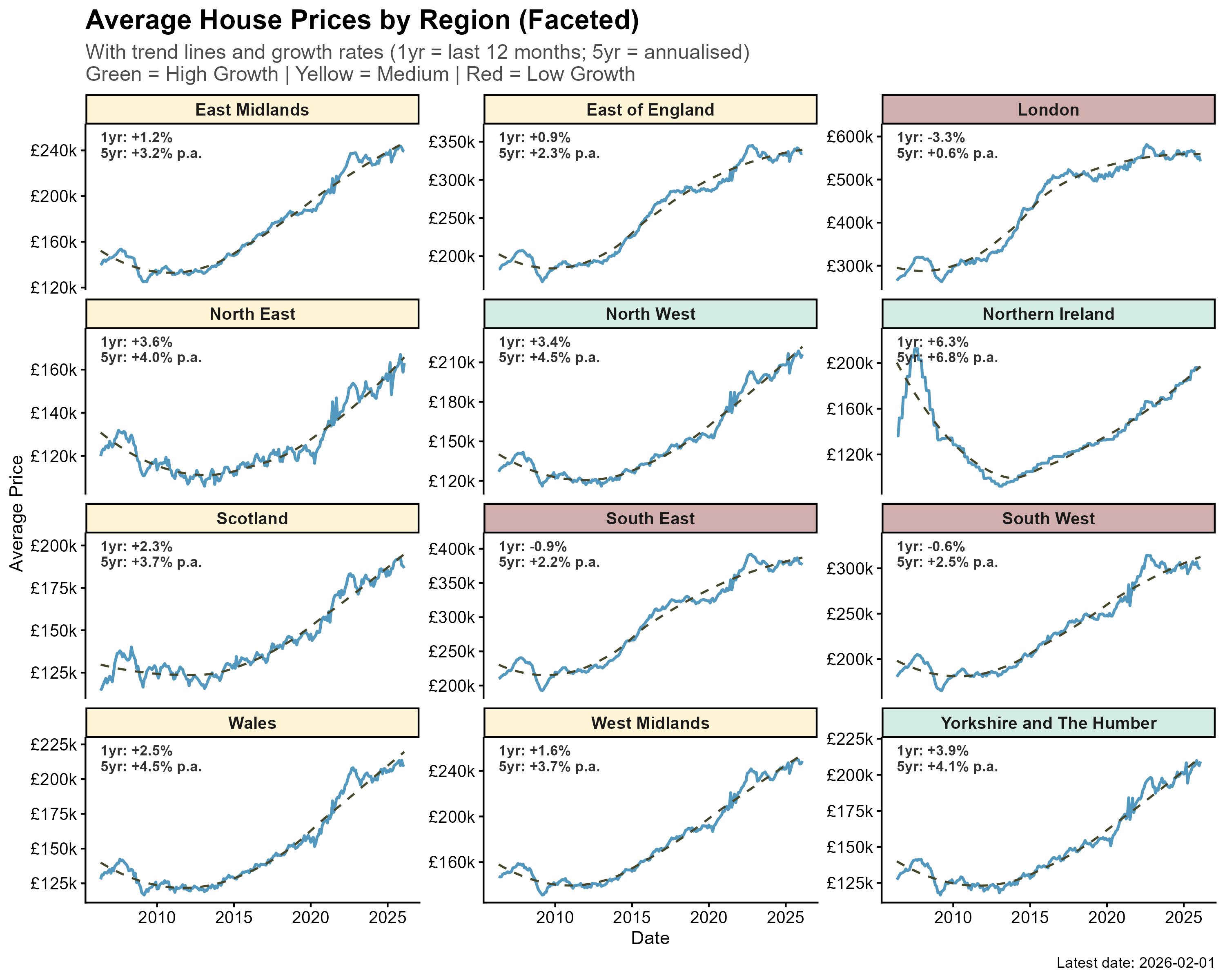
Data source: ONS UK House Price Index. Tools used: R (ggplot2). Each panel shows average house price over time with a trend line. Colour coding indicates growth tier — green = high growth, yellow = medium, red = low/negative. 1yr figure = last 12 months growth, 5yr = annualised rate over 5 years. Full methodology and data at [https://databait.co.uk](https://databait.co.uk)
ThePistachioBogeyman on
Good old London with double the price scale,
and basically triple some areas
SpinIx2 on
Pretty sure using different origin values on your y axes is unhelpful.
the_ak on
I would suggest aligning the y axis to be same on all

4 Comments
Data source: ONS UK House Price Index. Tools used: R (ggplot2). Each panel shows average house price over time with a trend line. Colour coding indicates growth tier — green = high growth, yellow = medium, red = low/negative. 1yr figure = last 12 months growth, 5yr = annualised rate over 5 years. Full methodology and data at [https://databait.co.uk](https://databait.co.uk)
Good old London with double the price scale,
and basically triple some areas
Pretty sure using different origin values on your y axes is unhelpful.
I would suggest aligning the y axis to be same on all