
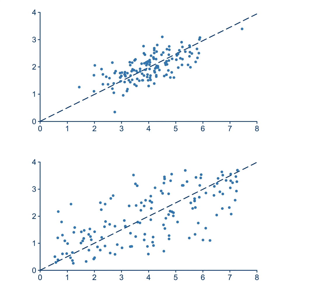
Both datasets: r = 0.70. Same correlation coefficient. But one looks noticeably more clustered around the regression line.
The difference is purely in the standard deviations – not the strength of the relationship. Because Pearson's r converts everything into standard units before measuring, it's blind to how physically spread out the data is. Smaller SDs → visually compact plot → same r.
It's a surprisingly easy trap. Your eyes read the raw coordinate space. r operates in standardized space. Those two views can look totally different.
I put this exact question to ChatGPT (with Thinking Mode) as a test – it fell for it too. Made a short video breaking down the full explanation here: https://youtu.be/GA7DQcc-ouo
by Jazzlike_History89
1 Comment
Reminds me of Francis Anscombe’s work. I made a figure consisting of four different datasets that when fitted resulted in the same intercept, slope and correlation coefficient, when a line was fit through them.