
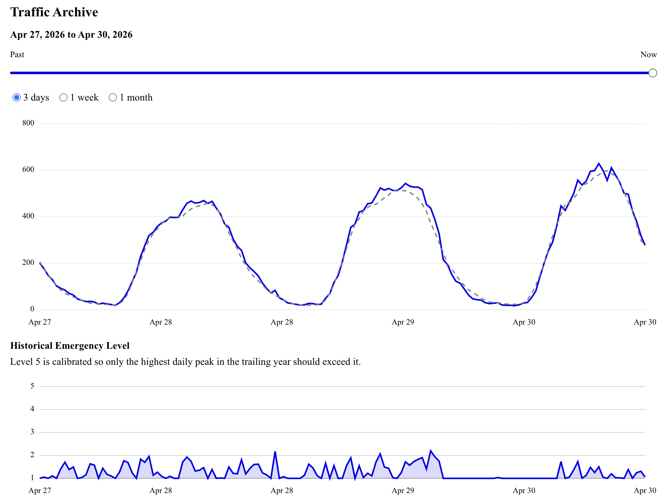
i made a system that watches a fixed cohort of business jets and asks: is the number airborne unusual for this time?
it uses ADS-B exchange heatmaps + a filtered FAA registry (matched by hex), and compares the current count to a rolling baseline for similar times of day/week.
most of the time it just reveals a very stable daily rhythm, with occasional spikes.
there was a spike on april 6, around when trump posted “a whole civilization will die tonight, never to be brought back again.”
i’m interested in what it means to treat something like this as a signal, and how quickly a dashboard can make it feel legible.
by kcimc
5 Comments
live: [https://ews.kylemcdonald.net](https://ews.kylemcdonald.net)
**data sources:** ads-b exchange heatmaps, faa registry
**tools:** python, sqlite, custom dashboard
it pulls a new heatmap every ~30 min, matches aircraft, and computes deviation from an expected baseline.
“sigma” rescales that deviation by recent error so quiet periods register more strongly.
there are spikes throughout — april 6 is just one that lines up cleanly with an external moment (besides obvious ones like holidays).
youll be first to know of a zombie apocalypse being covered up
Your x-axis has equally spaced labels saying April 27, 28, 28, 29, 30, 30. Consider either different resolution on your axis label, or different placement if you want to keep it at one day resolution.
I’m not saying something is going on, but the internet to Taiwan did just get cut off today.
I would think this would not work as sigint because all the people fully in the know would use PIA to mask their hex in the event of a real crisis event.