Share Facebook Twitter LinkedIn Pinterest Bluesky Threads [OC] H1 2025 was the US Dollar’s 4th worst first half since 1973 by Low_Ability4450
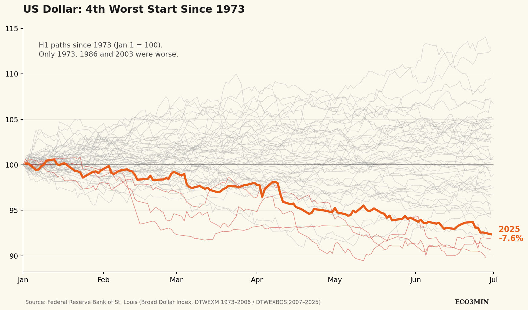
Low_Ability4450 on April 30, 2026 1:01 pm H1 2025 ranks 4th worst on record (-7.6%). Only three first halves were worse: – 1973 (-10.2%) — Bretton Woods breakdown – 1986 (-9.4%) — post-Plaza Accord unwind – 2003 (-8.1%) — Iraq War period The dollar stabilized in H2 2025, but remains ~8% below its January 2025 peak (as of April 2026). Data: FRED Broad Dollar Index (DTWEXM 1973–2006, DTWEXBGS 2007–2025) Full dataset (CSV/XLSX) + methodology: [https://eco3min.fr/en/us-dollar-worst-first-halves-1973-2025/](https://eco3min.fr/en/us-dollar-worst-first-halves-1973-2025/) Tools: Python (pandas + matplotlib). Happy to answer methodology questions.
LittlePinkApple_ on April 30, 2026 1:02 pm Wow, thats wild! Seeing the dollars performance laid out like this is pretty eye-opening. Makes you wonder whats coming next tbh.
aljobar on April 30, 2026 1:08 pm As an Australian buying USD for an upcoming vacation, please keep the trend going.
wiznaibus on April 30, 2026 1:26 pm As someone paid in USD living in Europe, I feel every bit of this chart deep in my bills.
thinwhitedune on April 30, 2026 1:26 pm That’s a great job that America is doing right now, the rest of the world is very excited by that. /s
duskfinger67 on April 30, 2026 1:36 pm A US economy plot without a red/blue colour scheme?! Blasphemy!

8 Comments
H1 2025 ranks 4th worst on record (-7.6%).
Only three first halves were worse:
– 1973 (-10.2%) — Bretton Woods breakdown
– 1986 (-9.4%) — post-Plaza Accord unwind
– 2003 (-8.1%) — Iraq War period
The dollar stabilized in H2 2025, but remains ~8% below its January 2025 peak (as of April 2026).
Data: FRED Broad Dollar Index (DTWEXM 1973–2006, DTWEXBGS 2007–2025)
Full dataset (CSV/XLSX) + methodology: [https://eco3min.fr/en/us-dollar-worst-first-halves-1973-2025/](https://eco3min.fr/en/us-dollar-worst-first-halves-1973-2025/)
Tools: Python (pandas + matplotlib). Happy to answer methodology questions.
Wow, thats wild! Seeing the dollars performance laid out like this is pretty eye-opening. Makes you wonder whats coming next tbh.
As an Australian buying USD for an upcoming vacation, please keep the trend going.
This is that “winning” part.
What are the 4 at the top?
As someone paid in USD living in Europe, I feel every bit of this chart deep in my bills.
That’s a great job that America is doing right now, the rest of the world is very excited by that. /s
A US economy plot without a red/blue colour scheme?! Blasphemy!