
Hello everyone,
i had some spare time on my hands and my mind was kinda foggy due to sleep deprivation so i decided to use google colab and python to simulate one hour of Bouncing DVD Logo trajectories and trace them into a dedicated chart.
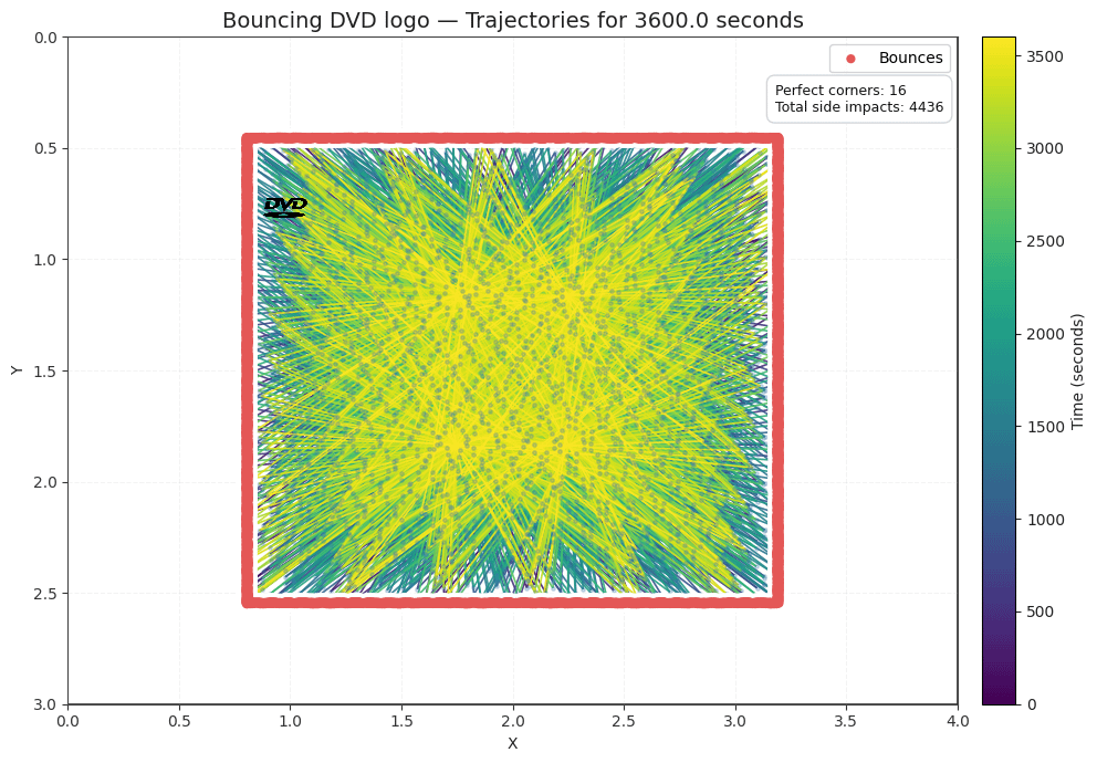
The simulation has the following base parameters:
width, height = the size and shape of the geometry which will serve as a boundary for the bouncing logo. In this case it was set to 4,3 to simulate a CRT 4:3 screen.
dt = the update resolution in terms of seconds per step, which essentially simulates the Hz frequency of the screen. It is set to 0.0167 here to approximate a 60Hz screen
t_total = total simulation duration, set to 3600 here to account for an hour of bouncing dvd logo
speed = logo speed magnitude (unit_measure/seconds). It determines how much the logo moves between steps (speed*dt)
logo_w, logo_h = the final width/height logo size using the same measurement units as the container.
A final numpy random seed.
The logo plotted in the chart marks the final logo position in the simulation.
There is no logo rotation ad here i am assuming a 37 degrees angle for the bouncing logo. The "perfect corners count" checks if one of the four corner of the picture hits one of the four corner of the defined bouncing area.
The colormap highlights the most recent trajectories in yellow and the oldest ones in purple.
I probably didn't add anything valuable to data science today. but I'm fairly new to Python and programming in general and this was mostly a joke project in had in my mind so i hope you people appreciate the stupid effort.
by Trollercoaster101
2 Comments
https://youtu.be/QOtuX0jL85Y
What is missing from data is ~~how many times DVD logo hit the corners.~~ Logo hitting corner frequency or frequencies if there are multiple
Edit: apparently I can’t read