
[OC] I visualized my Apple Music listening history as a financial market using Candlestick charts and Sankey diagrams.
by Exotic-Finish-5400
[OC] I visualized my Apple Music listening history as a financial market using Candlestick charts and Sankey diagrams.
by Exotic-Finish-5400
1 Comment
**Source:** Personal data export requested via the Apple Privacy Portal (Play Activity.csv and Library Tracks.json).
**Tools:** Python (Pandas) for data cleaning/ETL, SQLite for the database, FastAPI for the backend, and React (Recharts & Nivo) for the frontend visualizations.
**Context:**
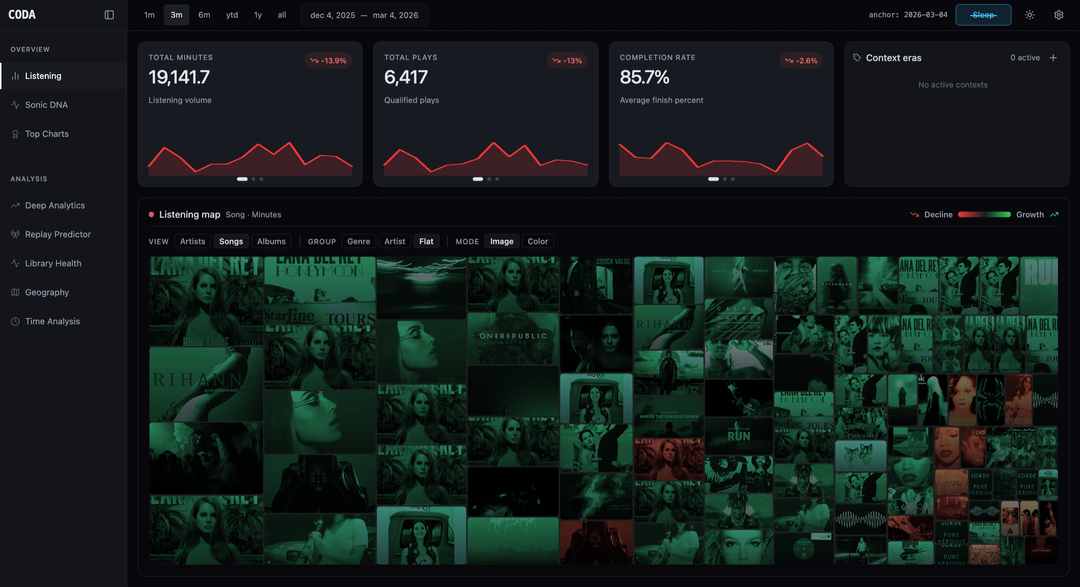
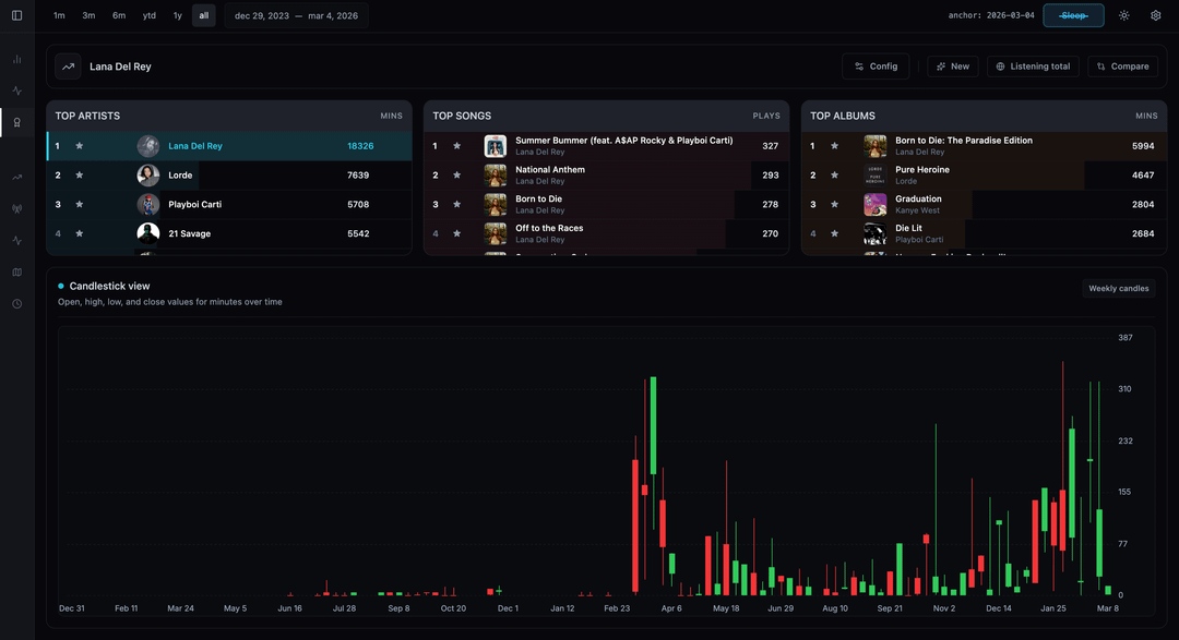
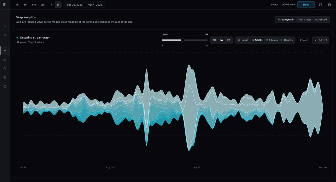
I wanted to see what would happen if I treated my music listening habits like stock market data. Instead of basic bar charts, I bucketed my listening minutes into Daily/Weekly/Monthly Open-High-Low-Close (OHLC) Candlestick charts to track the “volatility” and momentum of specific artists.
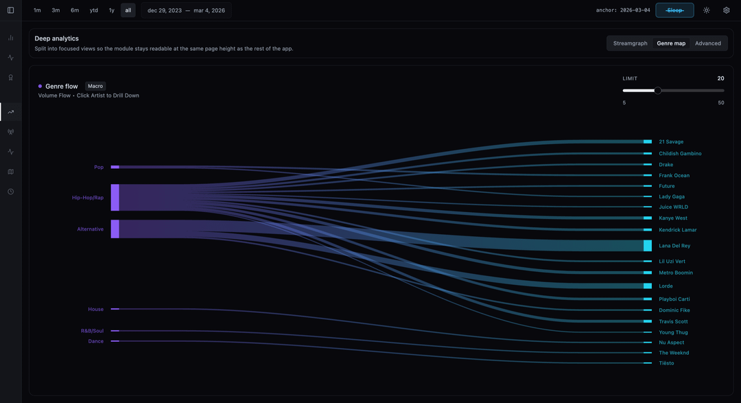
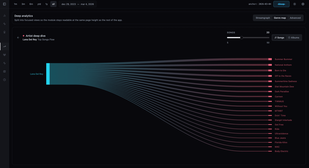
I also used Sankey flow diagrams to map how my listening volume flows from broad Genres down to specific Artists and Albums.
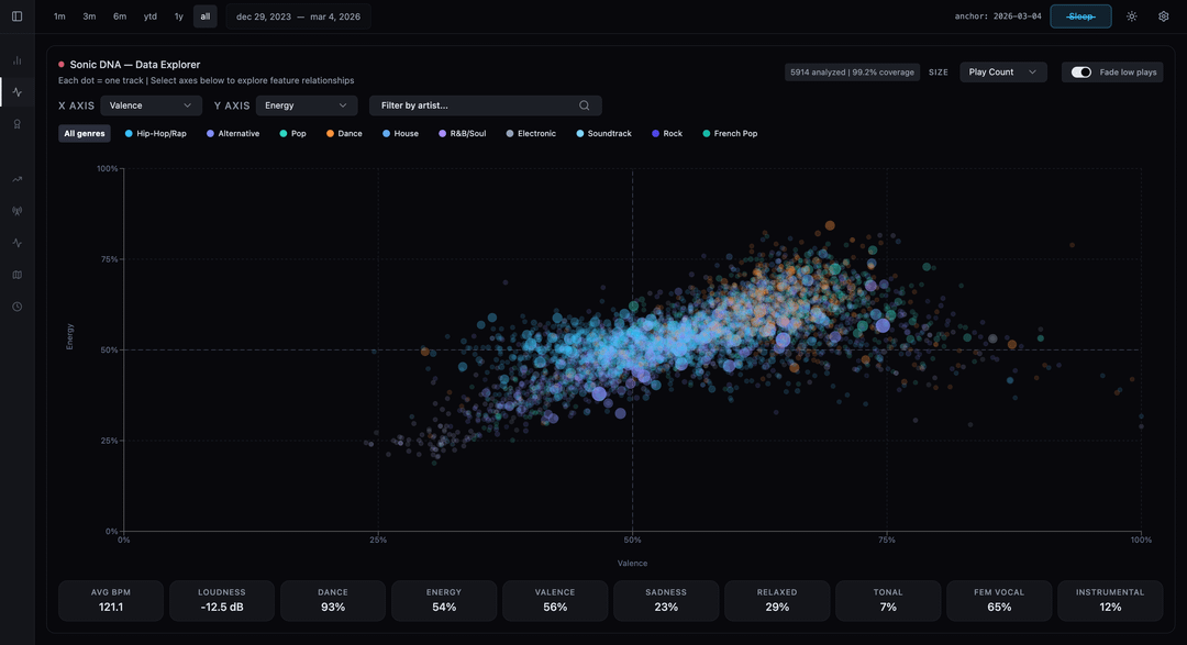
To make the data accurate, I had to write a heuristic algorithm to detect and filter out “sleep listening” (e.g., when a playlist runs for 8 hours overnight) so it didn’t skew the visualizations. I also ran my top tracks through local TensorFlow audio models to extract continuous features (Energy, Valence, Danceability) to plot my “Sonic DNA” on a scatter chart.
Right now this is a local Python/React dashboard running on my machine, but I’m packaging it into a desktop app so others can run their own CSVs through it locally. I’ll drop a link to the waitlist in a child comment below if anyone wants to try the beta!