
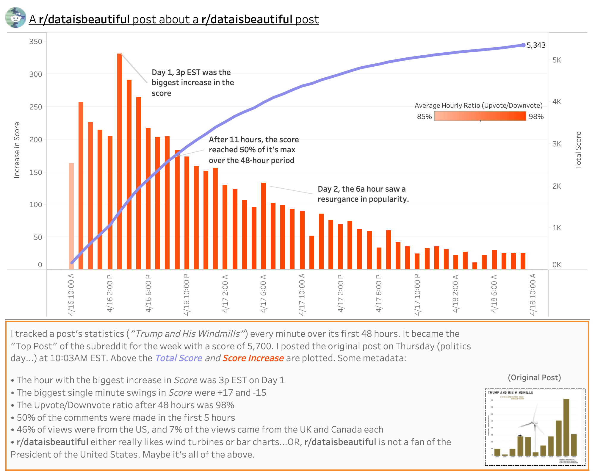
I shared a chart and some data last week about the President and his fascination with windmills. It became kind of a hit becoming the top post of the week with a score of about 5,700. On reddit, the score is supposedly an Upvote minus Downvote score of the post. The ratio, according to reddit, was 98% upvote.
But I also used Python to log the post count and upvote ratio every minute for the first 48 hours of the post going live. I think I gathered some fun data that I assume applies to a lot of the content posted here at r/dataisbeautiful.
I plotted the total score (in purple) and the increase in score with the histogram (colored by the upvote ratio average the post had during that hour–I know it's like 3 shades of orange and 2 of them are the same to my colorblind eye).
There will be no meta analysis follow up of the meta analysis follow up, but I thought this was kind of fun.
by shinyro
1 Comment
Viz is from Tableau. The data source is reddit directly (I used python and requests on the old.reddit site). Excel to clean up and tidy some data further.