
Hello I am an economist and this is a personal project of mine, all data manipulations were done by me in excel, and data visualization was done using Think-cell & PowerPoint. Original data was from the FRED & BIS. I cannot post links because I am getting autoblocked from posting so I will post the series names at the bottom of my post.
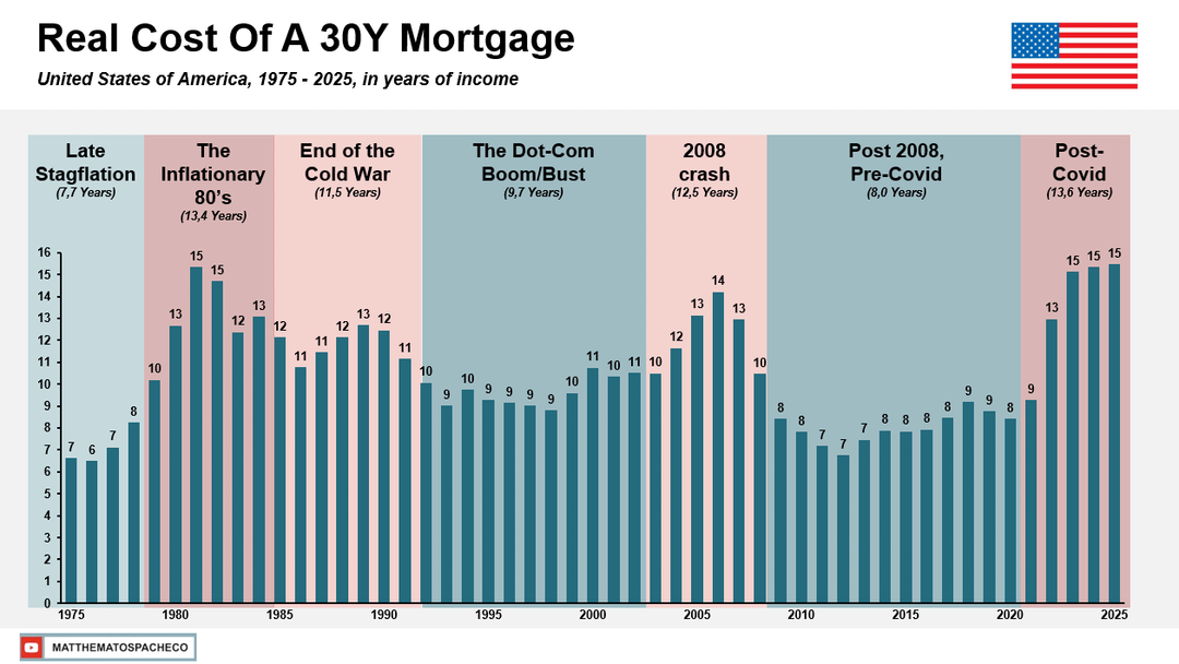
Basically this is the cost of a 30 year mortgage of the "typical housing stock" (BIS Dataset) if every payment was deflated based on the year of the payment. The time periods are personal choices that I found fit the data well, meant to situate the viewer, other events like S&L crisis, could of been used or even a year or to adjusted like 2021.
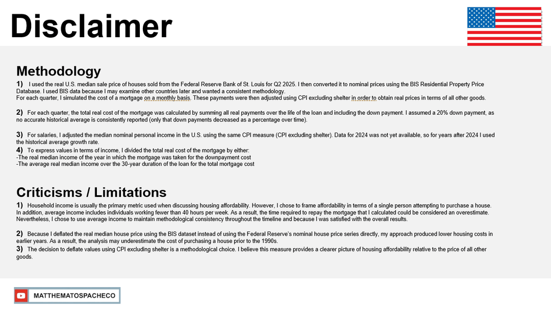
I added a Disclaimer page with the Methodology and Limitations, because no research is perfect. It is not peer reviewed so I will leave a link in the comments to my data set.
Also I made a video on this more in detail on my YT channel, and even a short where i showed how the research is done, I will post the link in the comments.
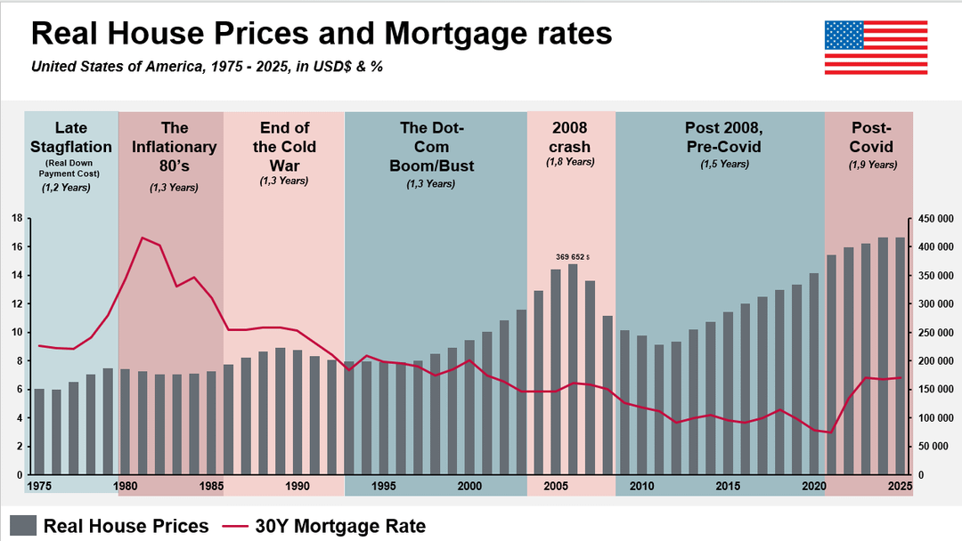
Graph 3 :
- (FRED) 30-Year Fixed Rate Mortgage Average in the United States (MORTGAGE30US)
- (FRED) 30-Year Fixed Rate Mortgage Average in the United States (MORTGAGE30US)
Other MANIPULATIONS FOR GRPAH 1 & 2
- (FRED) Median Personal Income in the United States (MEPAINUSA646N)
- (FRED)Consumer Price Index for All Urban Consumers: All Items in U.S. City Average (CPIAUCSL)
- (FRED) Consumer Price Index for All Urban Consumers: All Items Less Shelter in U.S. City Average (CUUR0000SA0L2)
- (BIS) United States – Selected residential property prices, Nominal, Index, 2010 = 100 Series key (Q.US.N.628 BIS,WS_SPP,1.0)
by MatthewMatosPacheco
4 Comments
Link to the excel doc, to see the work ( its messy sorry )
[https://docs.google.com/spreadsheets/d/1c5HcpDdAXcKDuflw0MmKS9pqZt87EXod/edit?usp=sharing&ouid=114163594790639793782&rtpof=true&sd=true](https://docs.google.com/spreadsheets/d/1c5HcpDdAXcKDuflw0MmKS9pqZt87EXod/edit?usp=sharing&ouid=114163594790639793782&rtpof=true&sd=true)
If you want a short form vid to see how it was done
[https://youtube.com/shorts/q9wZCjrLTPw?si=y23g9m-wbCm6CkCw](https://youtube.com/shorts/q9wZCjrLTPw?si=y23g9m-wbCm6CkCw)
Long Form video: on the financialization of housing ( more sensationalized, not just data)
[https://www.youtube.com/@MatthewMatosPacheco](https://www.youtube.com/@MatthewMatosPacheco)
this is a great representation of why sentiment and economic indicators are out of sorts, nicely done!
This is an interesting graph. I am curious how the analysis changes if prices calculates as $ per square foot? Over this same period the size of the “average” house has increased in size, it would be interesting to see how much size contributes to the prices.
How did you deflate future payments where you don’t know personal income or CPI?