
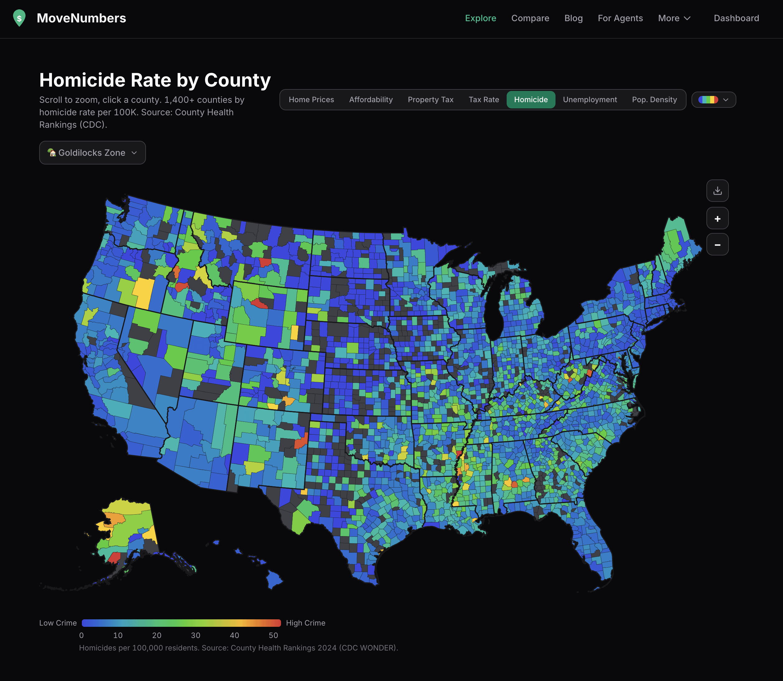
data from CDC WONDER + County Health Rankings, mapped by county. homicides per 100,000 residents (2018-2022 average, anyone know where to get more recent data?).
interactive version at movenumbers.com/explore you can toggle between 7 different map layers (home prices, affordability, property tax, tax rate, homicide, unemployment, pop density)
by supleezy
6 Comments
if anyone has any suggestions on things they’d like to see added/improved, i’m all ears!
Look at all those rural areas shining like beacons
Grey is no data? That’s a lot of missing counties.
Distribution of county size seems to be the biggest factor here. Graphic is pointless.
Surprised by: Maine, Idaho, Utah (seem high). Illinois and Florida (seem low)
Kinda surprised: Alaska, New Mexico (seem a bit high)
Not surprised: the South
Can you overlay voting patterns?