
👉 https://climate.portaljs.com/co2-monitoring
We built an interactive dashboard to make the long-term CO₂ signal impossible to ignore.
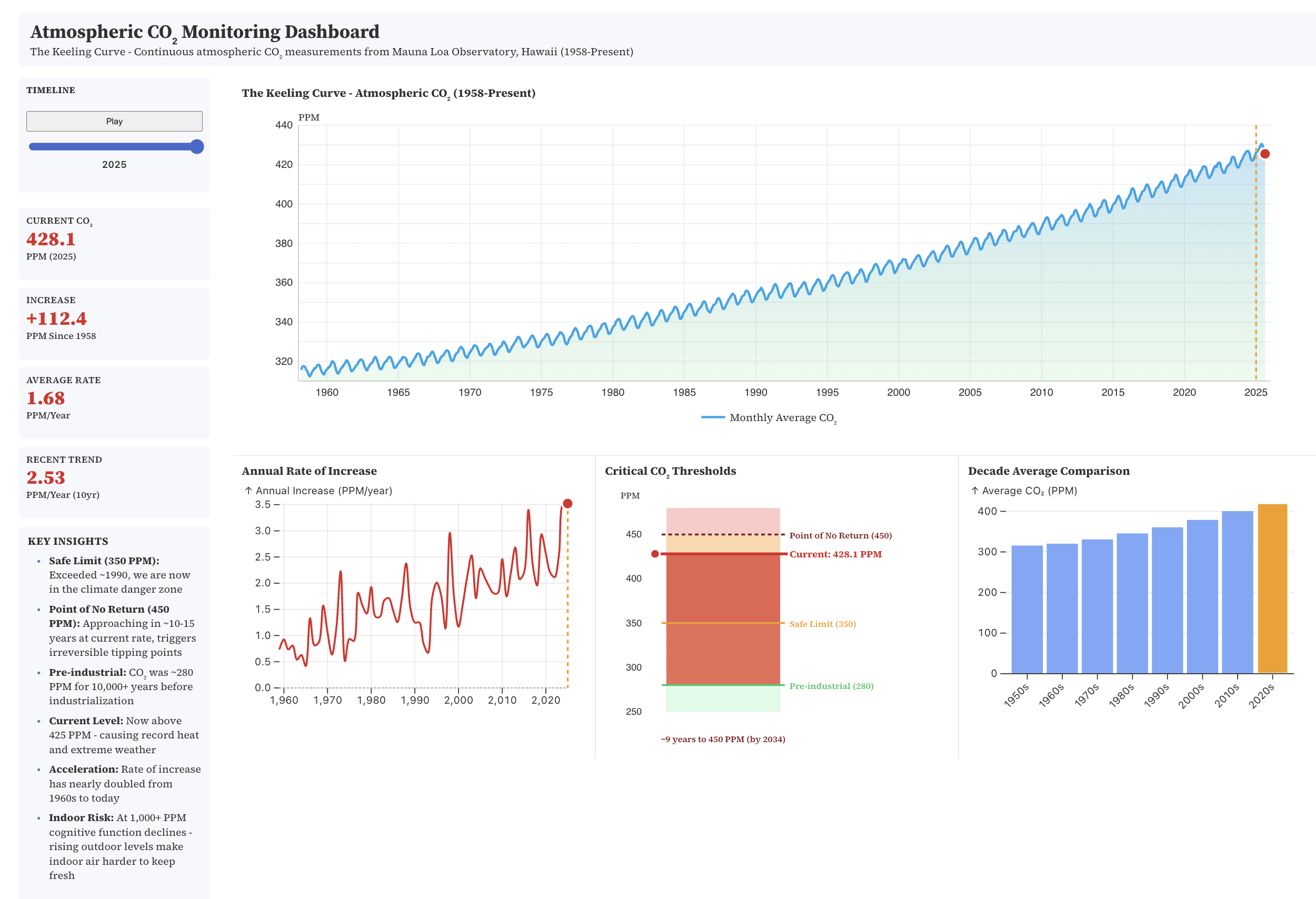
This visualizes continuous atmospheric CO₂ measurements from Mauna Loa (the Keeling Curve) from 1958 to today. A few takeaways that jump out immediately:
- CO₂ is now ~428 ppm — up ~112 ppm since measurements began
- The rate of increase is accelerating, not flattening
- 350 ppm (often cited as a “safe” upper bound) was crossed decades ago
- At current trends, 450 ppm is within roughly a decade
by anuveya
7 Comments
So, in a décade ppm will have increased by 100 in my life time ?
great, I’m gonna have to recalibrate my home CO2 sensors. Also, this is fucking terrifying
what causes this saw like pattern ?
There’s a ton of sensors out there that autocalibrates to 400 “lowest value measured the last days” or so, “surely it can’t be higher”. 🙁
Why is 450PM the “point of no return” is that on about the Clathrate gun hypothesis?
CO₂ growth looks “smooth” only because we’re trained to look at levels, not rates. The moment you plot ppm/year, it stops looking like a trend and starts looking like acceleration
CO2 has been amazing for plants, hey grow faster and the world is greener than ever.