
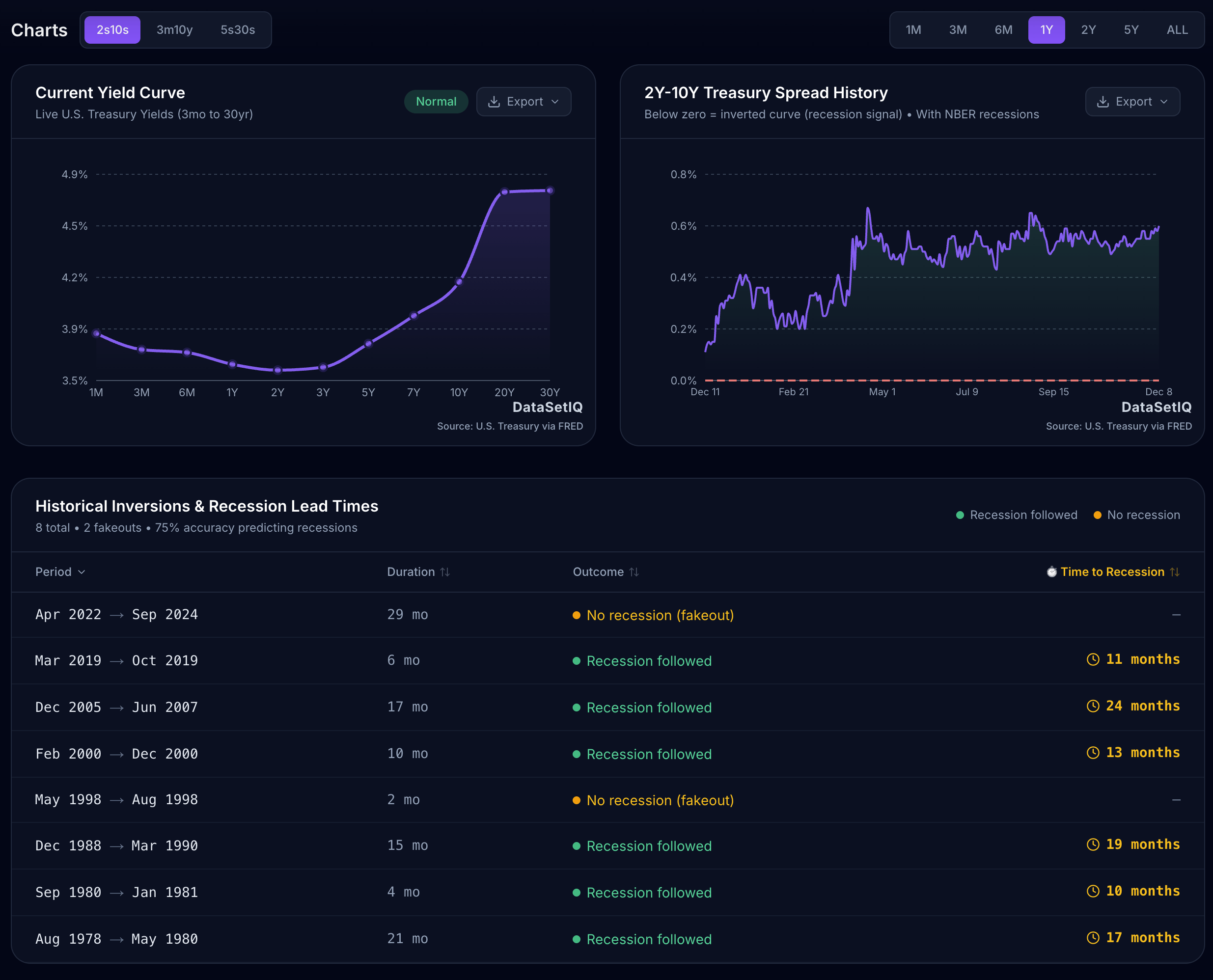
Data Source: Federal Reserve Economic Data (FRED), specifically series DGS2 and DGS10.
Tools Used: React, Recharts, and the DataSetIQ API for real-time calculations.
Methodology: I calculated the spread (10Y – 2Y) to identify inversions (negative values) and overlaid U.S. recession periods defined by NBER.
Live Interactive Version: I built a dashboard that updates this chart daily and lets you zoom into specific periods like 2008 or 2000. You can check it out here (no login/ads):https://www.datasetiq.com/tools/yield-curve-watch
by dsptl
1 Comment
I honestly think economists will look back at this period as an extended recession. Its just that a typical recession is not like this one, but if you combine a more holistic understanding of indicators and exclude the outliers (the .1%), its pretty ovvious that most of the country has been in a recession since 2021 if not earlier. Its just the insane inflation and stock market skew things so much not to mention real estate, tech bubbles, energy weirdness, etc. Its more spread out so harder to track, if that makes sense.