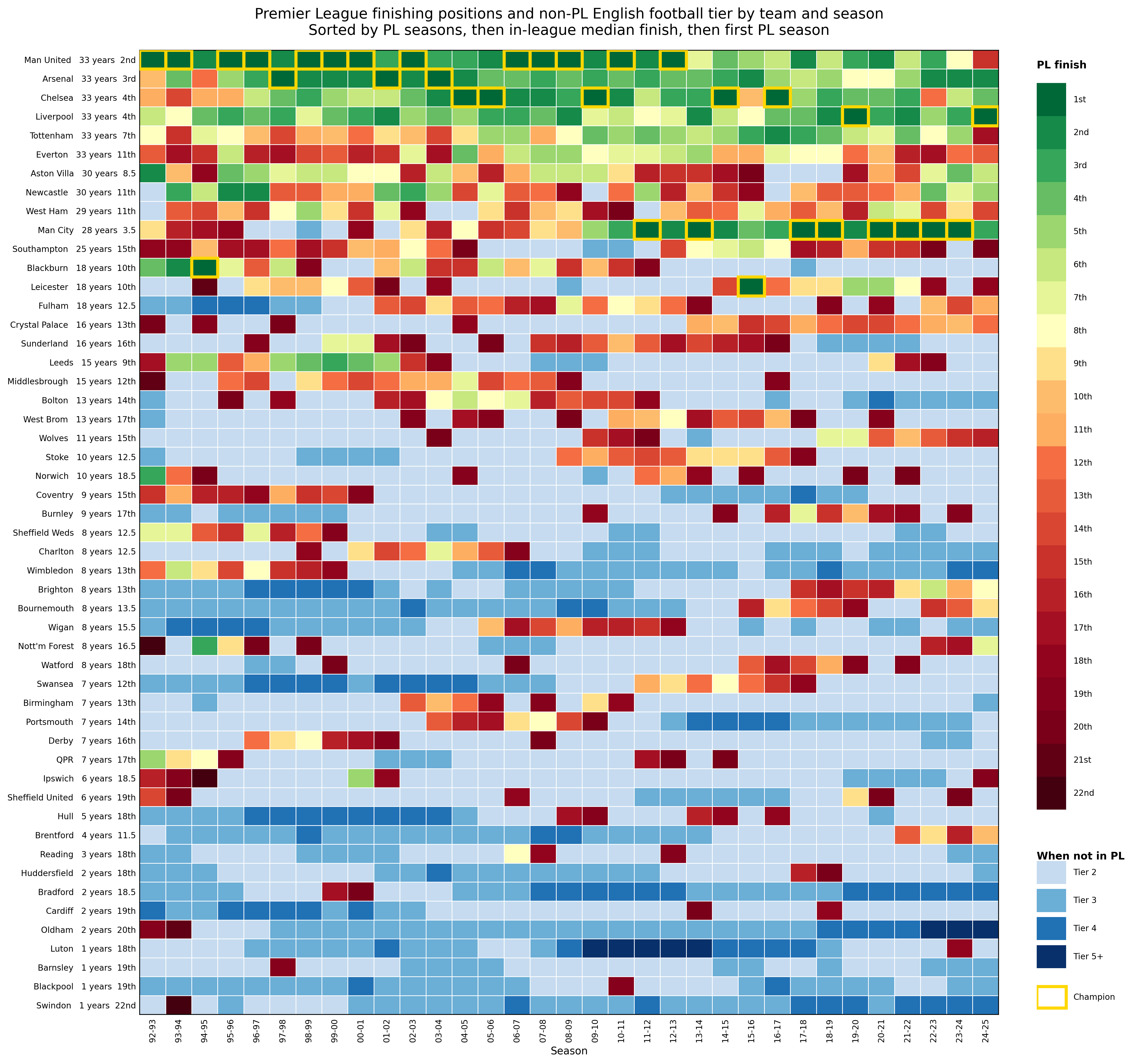
Will have to update next weekend after the final game of the season, so sorry for Arsenal's new title not yet being on the plot! Curious if people have suggestions for improvement.
by GoldenTorc1969

Will have to update next weekend after the final game of the season, so sorry for Arsenal's new title not yet being on the plot! Curious if people have suggestions for improvement.
by GoldenTorc1969
7 Comments
Data source: wikipedia, other internet sources, data fetched by chatGPT
Code: python generated by chatGPT
Funny how people were worried about the Prem being called a “farmers league” in the past 10 years but conveniently ignore when United dominated way longer
Cool
Is the position next to the number of years the median position of years spent in the Premier league?
I love this kind of stuff – Wikipedia’s league position history graphs are a minor obsessions of mine
I’d love to see another version of just four colours each representing a tier (so the greens and reds merged into one)
This is beautiful data in a literal sense, it looks beautiful. But the colour coding is counter intuitive. You’d expect green to be closer to blue compared to red, but it goes green->red->blue. I would’ve chosen blue->green->yellow as scale for Premier League rankings and red as “outside of the league”.
Wish the NBA worked like this. So much better for the game and the fans/supporters.
Quite possibly the best year of my life.
https://preview.redd.it/ai2pp6vtbb2h1.png?width=257&format=png&auto=webp&s=9cce4e4546c2632a50dd2f91abf215c6da3eee6e