[OC] What one hour of US median work bought in 1985 vs 2025, across six everyday items
by Low_Ability4450

[OC] What one hour of US median work bought in 1985 vs 2025, across six everyday items
by Low_Ability4450
18 Comments
Methodology :
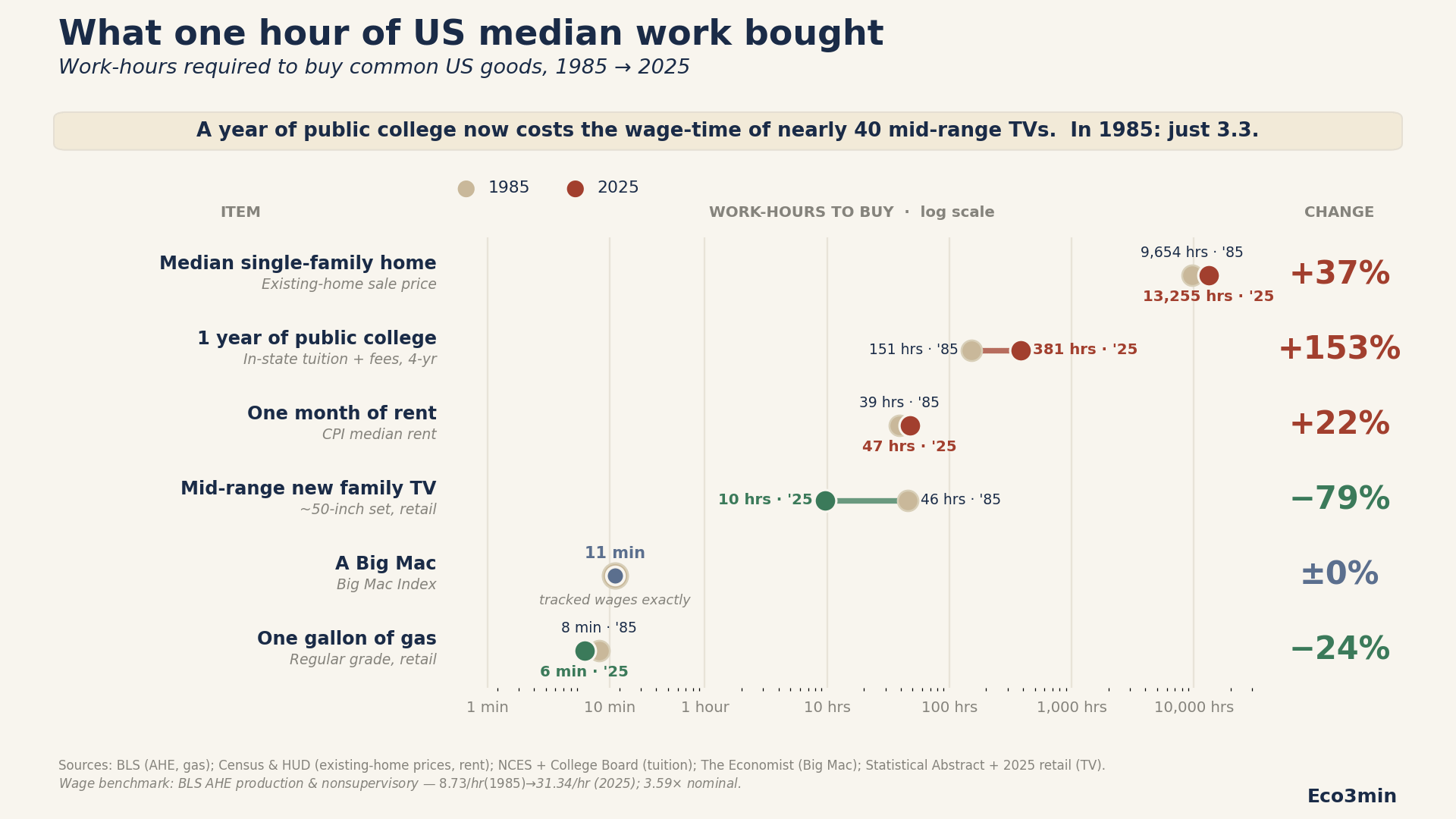
A year of public college tuition now costs the wage-time of nearly 40 mid-range TVs. In 1985, it was just 3.3 TVs.
Methodology highlights:
– Wage benchmark: BLS production & nonsupervisory hourly earnings, FRED series AHETPI ($8.73/hr in 1985 → $31.34/hr in 2025)
– Homes: FRED median existing-home prices
– Tuition: NCES + College Board
– Rent: Census + BLS CPI rent series
– Big Mac: The Economist Big Mac Index
– Gas: BLS regular gasoline
– TVs: retail survey / major retailer comparisons
Points that can be noted :
– TV quality improved massively over the period
– 2025 rent uses latest available ACS data (2024)
– Big Mac uses 1986 because that’s when the index begins
Full dataset + CSV + verifier code:
[https://eco3min.fr/en/us-purchasing-power-1985-vs-2025/](https://eco3min.fr/en/us-purchasing-power-1985-vs-2025/)
Tools: Python (pandas, matplotlib). Reproducible verifier code published with the dataset (42 checks, all pass).
Happy to answer questions.
Didn’t look so bad until I noticed the log scale 😂
I swear this was posted a couple days ago.
What’s the mid range family TV for 1985? It certainly wasn’t a 50 inch.
So, things that matter are more expensive. How wonderful.
There’s nothing beautiful here.
I do not believe I was getting a 50 inch TV in 1985
I wouldn’t compare anything with TVs as a unit. I like the method but TVs have gone down wildly in adjusted value over the years.
Before this get too far, no the bigmac didn’t get smaller
The color scheme is confusing and takes too long to digest. Your legend has Red as 2025 but then it randomly becomes green when it’s lower. I would make 2025 a separate color entirely and then only use red/green for your % on the right. You’re mixing legends right now and it makes it hard to quickly understand.
why did your order the data like this? why not have it go from most negative to most positive in terms of change? and your legend doesn’t actually represent the colors on the plot.
Sure McDonald’s made this data
Now, let’s do 1985 vs 2025 big Mac size
I’m guessing the cost of gas in 2026 doesn’t hold up so well in comparison as it did in 2025…
https://fred.stlouisfed.org/series/CUSR0000SAH21 and similar for utilities and energy might be interesting. I cannot off-hand find the related series with absolute dollars, not indexed to 1982 prices, which makes this source of itself less useful.
When I look at this, I get that part of the point is to drive how home prices have increased, and from this chart compared to median earnings.
One quibble that I think confuses things: by looking at sales price of a home, you are mixing consumption items (Big Macs, TV) with an item that is a mix of consumption and asset (home price sale).
Someone is buying that home, but someone else is selling it, so in some sense you would have to add that back into their income. So I think showing median home price compared to income isn’t a good measure.
It does show it’s better to be a home seller than a buyer, but I think wages, consumption, and assets are getting mixed together in a confusing way that doesn’t get right picture across.
Nice chart and nice data and presentation
This post is a great example how data can be manipulative and how much is discretion based.
How do you choose the exact home? or the exact TV?
how about the quality of ingredients in a big mac? today its all additives, engineered meat, seed oils, preservatives etc. who cares if it costs the same?
depending on the exact choices, you can make a million different sets of figures
this is completely useless
The problem I always see with these housing numbers is that they use sales price, not mortgage payment.
A $200k mortgage in 1985 when they had 12% interest rates is the same monthly payment as a $320k today with our 6.7% interest rates.
That’s not a perfect comparison either because other costs like insurance and taxes **are** based on sales price, but I think your graph is still an overestimation.
While I agree housing prices are very high at the moment. Median Housing prices are not the correct metric.
It needs to be compared on a relative basis, like cost of sq footage. This also doesn’t account for interest rates and loan terms. As we have all witnessed in the COVID era, interest rates fluctuating from 2% to 8% drastically alters not only buying power but also the gross cost of homes.
Interestingly enough, on average 4 people used to live in a 900sg ft home in 1960 now 2 people live in a 2500 sq ft home in 2026.
https://www.reddit.com/r/charts/s/MCYb0ldtuK