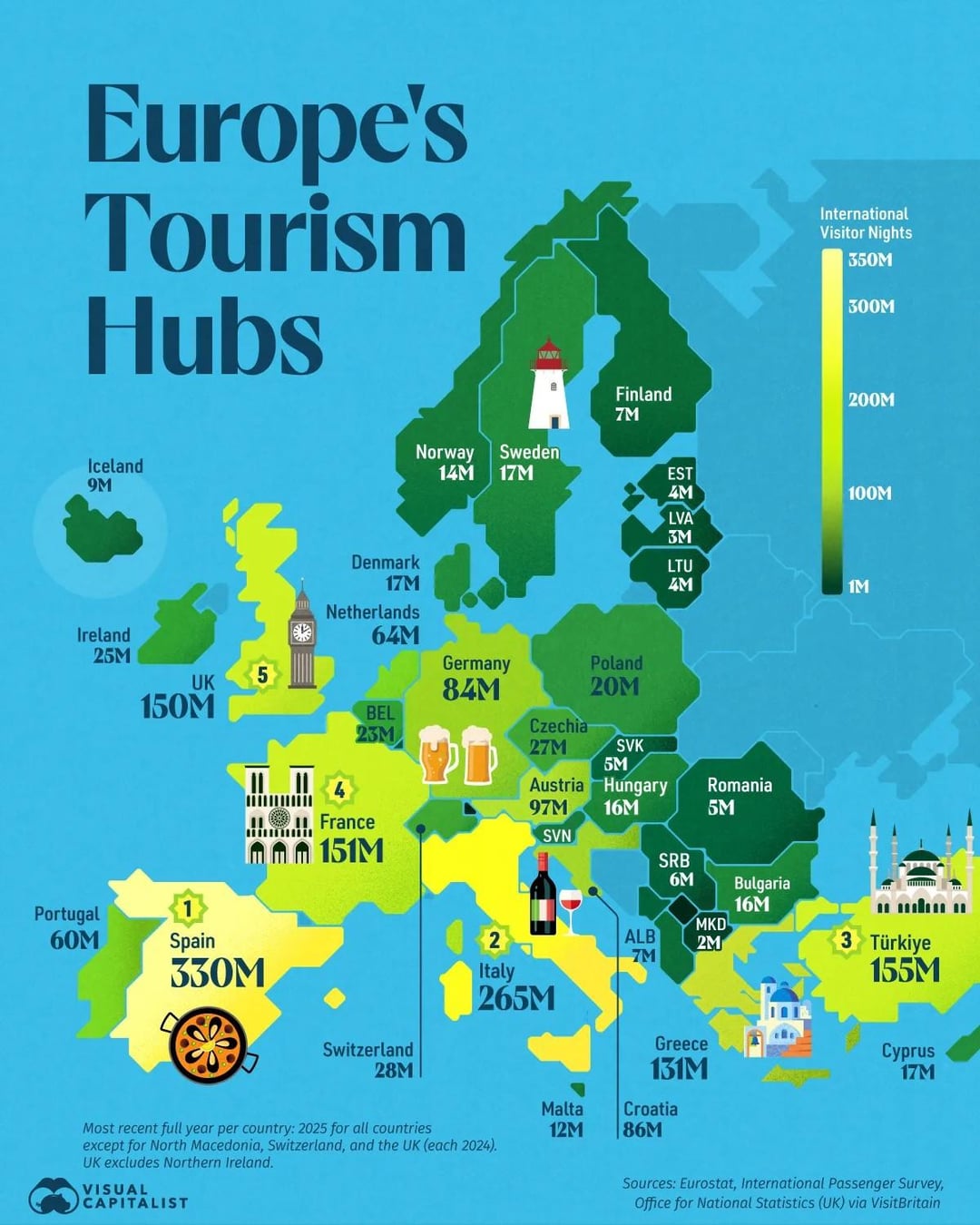
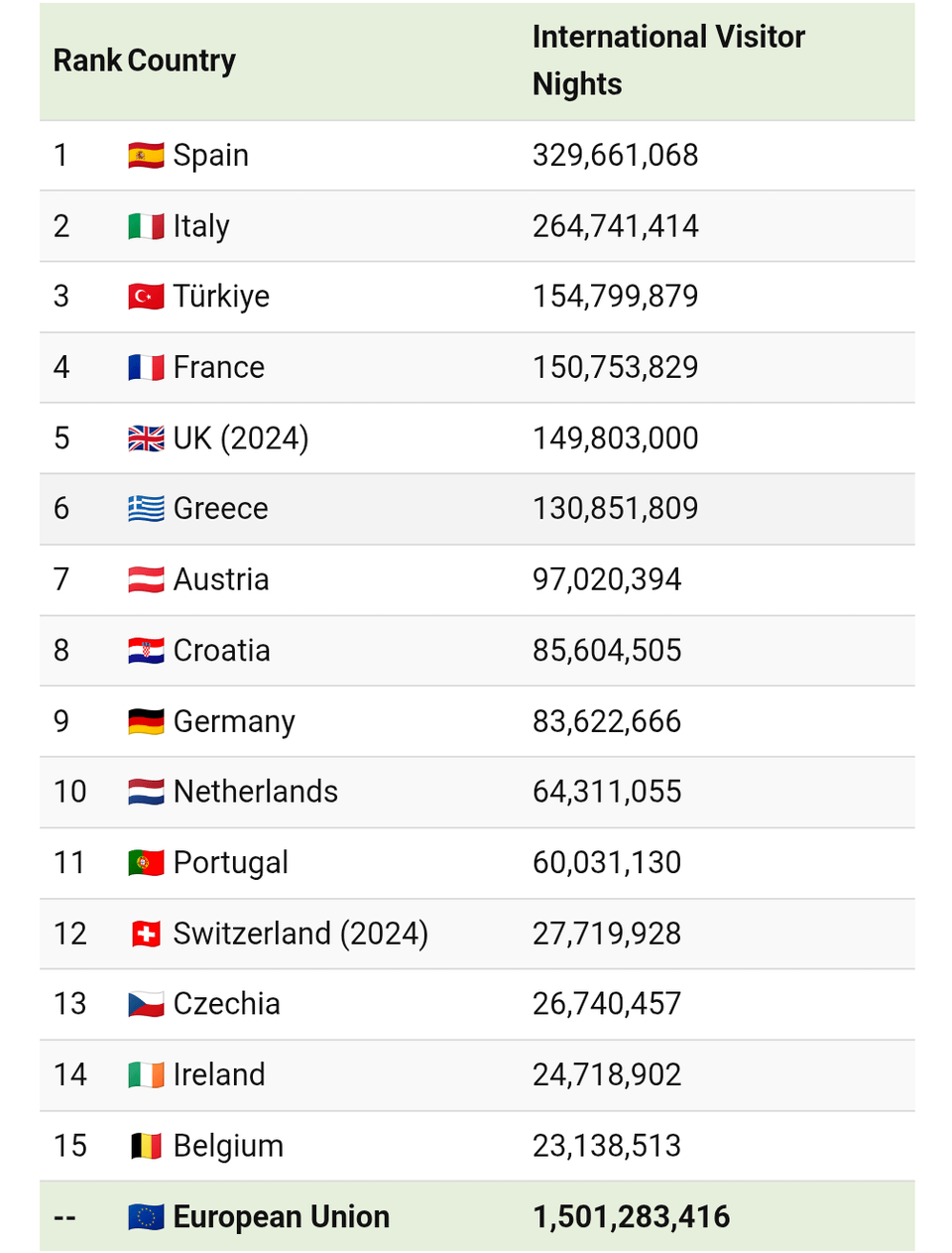
https://www.visualcapitalist.com/mapped-europes-most-visited-countries/
Note: The data shows the number of International Visitor Nights not the number of visitors.
by Marimo188

https://www.visualcapitalist.com/mapped-europes-most-visited-countries/
Note: The data shows the number of International Visitor Nights not the number of visitors.
by Marimo188
17 Comments
Serbia does not do 6M. It had ~2.3 foreign tourist visits in 2025, 4.3 including citizens
can you do one for international visitor nights per capita
You could add a second map with the numbers relative to population size. Eg Germany is roughly 1:1 and Austria 10:1, so ten times more. But in absolute numbers they appear more similar
I’m surprised Croatia, but especially Austria score higher than the Netherlands.
And I didn’t know about Turkey either, though I’m sure they get tourists from a lot of other countries as well.
I thought Switzerland would be way more
This like colour scale seems very odd to me
I would love to see Spain numbers without Mallorca and the Canary island
Might be just me, but I find it annoyingly difficult to get the information I want from this. Bad font, annoying colormap, and graphics that distract more than they add
The number sounds off
https://ec.europa.eu/eurostat/statistics-explained/index.php?title=Tourism_statistics_-_nights_spent_at_tourist_accommodation_establishments
Color scale should be reversed. That’s generally not how heatmaps work.
Romania is so depressing. That country have everything to offer for tourism but intense corruption, and frankly a terrible culture of not taking care of your country(was infuriated by the whole trash thrown in forests thing) is just a death nail to tourism.
Having only 5 million visitors is crazy for a country with so much nature and culture.
Turkey being higher than France, the UK and Greece seems impossible to believe. Not that it’s not a beautiful country with tons to do, but the others are such classic global tourist destinations.
I thought France was the most visited. Must be in number of visitors rather than number of visitor nights.
Wow Spain really? I always thought the top 3 are France Germany and Italy
Not very helpful since the data doesn’t seem to compare against the population of each country. Also the color scale appears backwards to me.
please make it per capita. much more interesting.
I think the numbers are all wrong, it seems totally off from what I’ve read over the years, and the numbers appear too high generally. No idea what the base data is here.