
[Reposting with OC tag] Last month, I posted a dashboard for exploring 2.2 million New York Times articles going back to 2000. I’ve now added a way to explore all 29,000 obituaries the paper has published during that period, and it reveals a lot about who makes history.
An estimated 1.5 billion people have died worldwide since 2000, so the Times has memorialized roughly 0.0019% of them. The number of obituaries rose briefly during COVID but has not grown much overall, despite the expansion of celebrity culture.
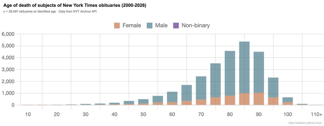
Very few obituary subjects were under 25. The youngest was Shannon Tavarez, the 11-year-old who played Nala in The Lion King. The oldest subject lived to 141 — Gramma, a Galapagos tortoise.
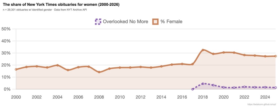
Despite efforts by the paper to address a gender imbalance, the Times still publishes roughly two obituaries of men for every one obituary of a woman.
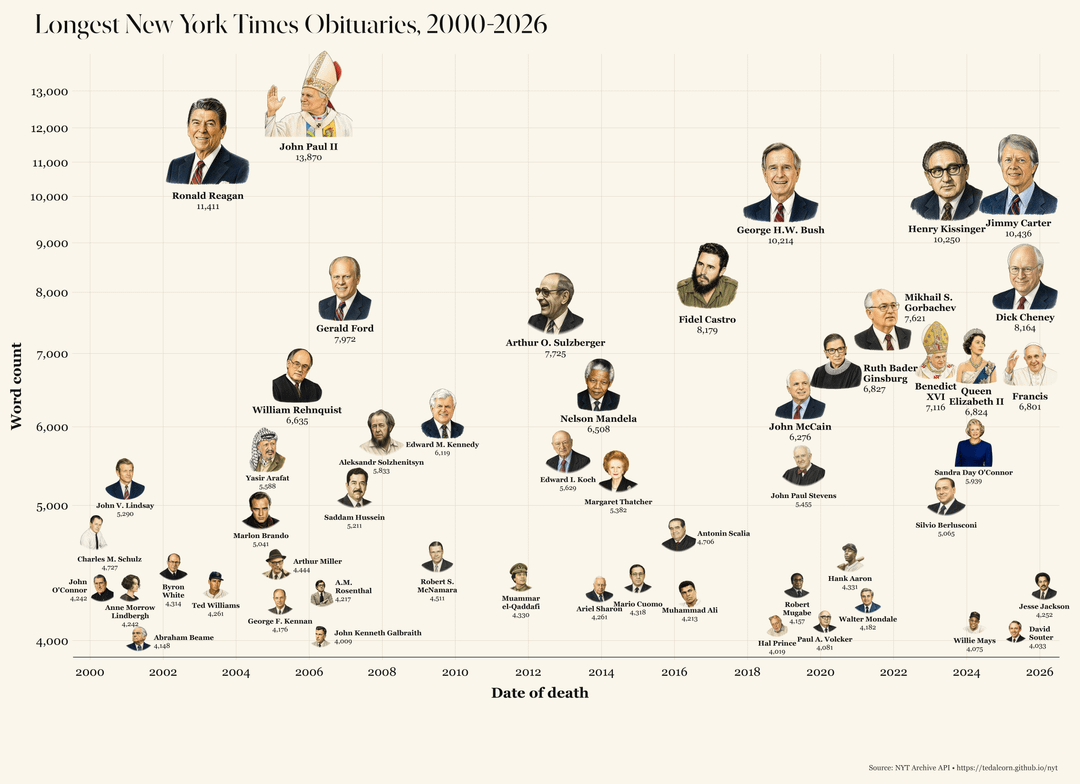
And the imbalance is sharpest at the very top. Since 2000, only 52* obits surpass 4,000 words, a group dominated by presidents, popes, monarchs and major cultural figures. Of them, just five were women, and fewer than one in five were people of color.
My dashboard lets you explore the newspaper by topic, section, geography, and other dimensions: https://tedalcorn.github.io/nyt
The NYTimes Archive from which the original data is sourced is here: https://developer.nytimes.com/docs/archive-product/1/overview
*The 53rd person just dropped – Ted Turner, who professed he wanted to be remembered "in pretty big company: Alexander the Great, Napoleon, Gandhi, Christ, Mohammed, Buddha, Washington, Roosevelt, Churchill.”
by theodore_a
4 Comments
That non-binary label seems pretty useless. If there are any samples, they aren’t visible.
Also, the binning in the age of death plot is confusing, as each bar should represent a range, not a single age. Is each bin +- 2.5 the nominal age?
But an interesting analysis nonetheless.
And just to be extra clear: the data is from the NYT Archive API: [https://developer.nytimes.com/docs/archive-product/1/overview](https://developer.nytimes.com/docs/archive-product/1/overview)
I wrote Python scripts to parse name, age, gender from the headlines and first paragraph
I also wrote a python script to assemble the visualization, which are original renderings based on public imagery of each decedent
The other histograms charts are produced by my dashboard
Constructive criticism is welcome!
great work! how did you place the photos on the graphs?
I find Gerald Ford’s obituary to be conspicuously long, even as a former president. And indeed, he had lived a deep and sprawling life, as a football star, a rookie US representative with an office next to fellow rookie JFK, and a Warren Commission panelist. He was the estranged son of a California millionaire and took the name of his stepfather, and made it to the upper echelon of the Stonemasons. I’ll plug *Fourth Reich Archaeology* which dives deep in Gerald’s upbringing and influence on today.