
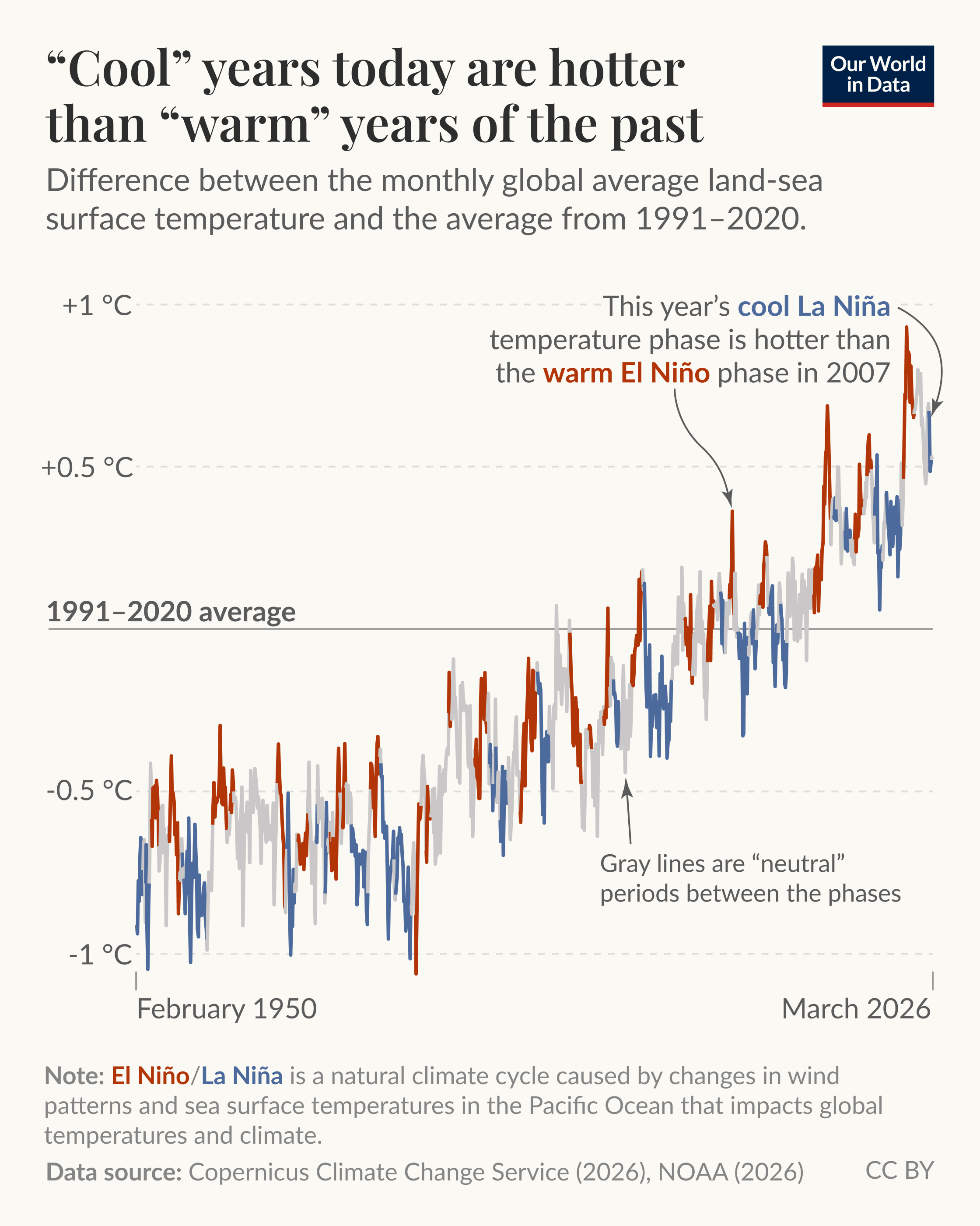
In 2025, the world was around 1.4 °C warmer than it was in pre-industrial times. But temperatures haven’t increased linearly; there have been spikes and dips along the way.
Many of these spikes and dips are caused by the El Niño-Southern Oscillation (ENSO), a natural climate cycle caused by changes in wind patterns and sea surface temperatures in the Pacific Ocean that affects global temperatures and climate.
There are two key phases of the ENSO cycle: La Niña, which causes cooler global temperatures, and El Niño, which brings warmer conditions.
The world cycles between El Niño and La Niña phases every two to seven years. There are also “neutral” periods between these phases where the world is not in either extreme.
As you can see in the chart, global temperatures during recent La Niña years were hotter than El Niño years just a few decades before. “Cool” years today are hotter than “warm” years not too long ago.
We update this data monthly on our website — search "Temperature Copernicus" to see this and several other interactive charts
As
by ourworldindata
13 Comments
**Data sources:** [Copernicus Climate Change Service](https://cds.climate.copernicus.eu/datasets/reanalysis-era5-single-levels-monthly-means?tab=overview) (2026) for the temperature data; [NOAA](https://www.ncei.noaa.gov/access/monitoring/enso/sst) (2026) for the El Nino/La Nina classification
**Tools used:** initial plotting with OWID-Grapher; finishing in Figma
Look guys, we’re just in a totally normal heating-cooling cycle. Absolutely, 100% natural. The cooling cycle will start up any moment, just you wait. Promise.
oh, no, we will die!
https://preview.redd.it/1k035cboap0h1.png?width=620&format=png&auto=webp&s=c5ba30c4a1b3d19111f76ebf4aee8e2f5149a0b3
Nice graph! The only thing I would have added perhaps would be a vertical line or another indicator showing the date where the “average temp” horizontal line begins factoring in data (at 1991)
Oh, no, it is too warm!
https://preview.redd.it/02rf72myap0h1.png?width=850&format=png&auto=webp&s=9837e44e4ed6d8a92d5f0244632cb980f000cdbf
who could have predicted this?
Garbage in, garbage out. This temperature data has been remodeled so many times it is useless. Let me adjust a couple lines of code and we’ll be headed for an ice age.
now this is a solid way to look at the temperature trends. amazing work!
Not beautiful. X axis has 2 ticks.
Also strange to plot a 30 year average. A fit might be better.
obviously not because of global warming. and yes earth is flat
2025-26 Winter would like to gave a word…
Oh, no! I found the bigger graph, with numbers! It is from this [book](https://www.amazon.com/Earth-Portrait-Planet-Stephen-Marshak/dp/039393036X), which people use to study geology at universities.
WE ALL WILL DIE!!! HELP!!!
https://preview.redd.it/fbikli24ip0h1.jpeg?width=1369&format=pjpg&auto=webp&s=9c2cfc6235aa1414455793f33d257b6f539230b1
Nelly’s hot in here about to make a come back.