
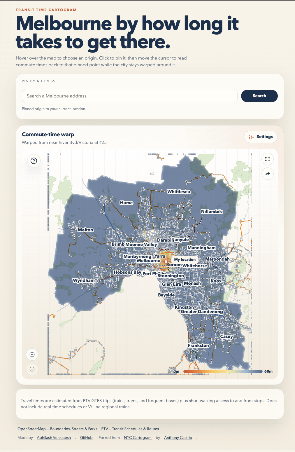
I adapted Anthony Castrio’s viral NYC commute map for Melbourne using PTV public transport data.
You can pick any train station and watch the city reshape itself based on commute time. The visualisation works both as:
- a heatmap, where colour represents travel time
- a cartogram, where Melbourne physically distorts based on transit accessibility
A few things stood out immediately while building it:
- some suburbs very close to the CBD are slower to reach than places much further away on direct train lines
- Melbourne’s tram network creates interesting “fingers” of accessibility
- transit blind spots become very obvious once the city physically warps around travel time
Technically, this involved adapting the original project for Melbourne by plugging in PTV GTFS feeds, reworking the isochrone computation, adjusting the cartogram rendering, and wiring everything into an interactive Mapbox UI.
Live demo:
https://melbtransit.avbuilds.dev
by abhilash-meso
1 Comment
It’s incredibly laggy and I can’t get it to run