
[OC] Data Sources & Tools
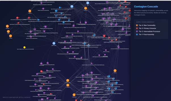
- Data Source: Industrial classifications based on 2022 NAICS (U.S. Census Bureau). Connectivity and Contagion Scores were calculated using a deterministic heuristic algorithm mapping input-output dependencies across 346 manufacturing nodes.
- Tools Used:
- Python: For data cleaning and the heuristic classification engine.
- NetworkX: For topological edge generation and directed graph analysis.
- vis.js: For the interactive physics-driven network visualization.
- The Research Context: This visualization was built to address the Visibility Gap between financial taxonomies (GICS) and the physical economy (NAICS). Research indicates that the U.S. physical economy faces a $1.1T Visibility Gap where systemic supply chain shocks remain hidden until they cause catastrophic decay.
Key Findings from the Visualization:
- Risk Aggregation: By mapping the topology into four tiers, we found that critical systemic risks aggregate most heavily at Tier 3 (Primary Extractors) and Tier 2 (Intermediate Processors).
- The Delayed Effect: Tier 1 (Final Assembly) is often the last to feel the impact, usually when it is too late to circumvent the disruption.
- The Goal: We have open-sourced this dataset and the heuristic logic to provide a digital twin of industrial topology, helping analysts and risk managers identify these invisible bottlenecks.
- Interactive Version: See Hugging Face
- Source Code/Data: See GitHub
by Vast-Village-2596
1 Comment
**[OC] Data Sources & Tools**
* **Data Source:** Industrial classifications based on 2022 NAICS (U.S. Census Bureau). Connectivity and Contagion Scores were calculated using a deterministic heuristic algorithm mapping input-output dependencies across 346 manufacturing nodes.
* **Tools Used:**
* **Python:** For data cleaning and the heuristic classification engine.
* **NetworkX:** For topological edge generation and directed graph analysis.
* **vis.js:** For the interactive physics-driven network visualization.