
Data sources: OMB Historical Tables
, CBO May 2026 Baseline, BEA
Visualization created in R using ggplot2
OC by Forensic Economic Services LLC / Rule703.com
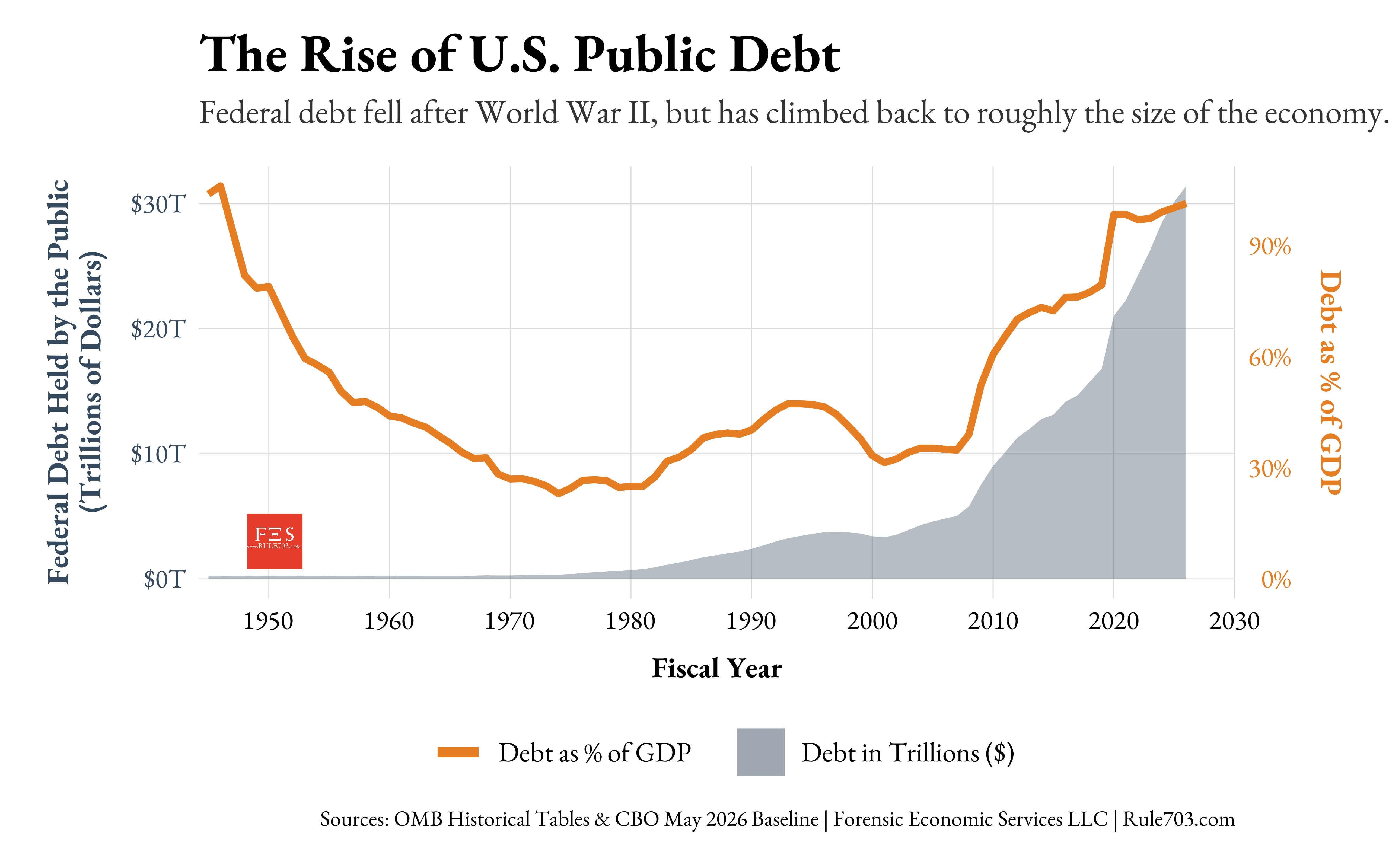
Created a long-run visualization of U.S. federal debt held by the public from 1945–2026, shown both in trillions of dollars and as a percentage of GDP.
A lot of the recent debate has focused on the debt ceiling and fiscal sustainability, but economists generally care more about the trajectory of debt relative to GDP, interest costs, and long-run growth than any single headline number.
U.S. public debt has climbed back above 100% of GDP for the first time since WWII
We look forward to hearing your feedback.
by forensiceconomics
6 Comments
Does this mean that US needs WWIII to get back on track? 😳
I recommend adding the top income tax bracket.
https://www.wolterskluwer.com/en/expert-insights/whole-ball-of-tax-historical-income-tax-rates for example
I don’t understand the graph. Is the dollar being adjusted for inflation? $260m of debt in 1945 is like 5 trillion today
Worth noting that debt is a “stock” (a total amount of something in existence) while GDP is a “flow” (how many of something happen per unit of time). This chart is a little like comparing miles to miles-per-hour. A more direct comparison of flows would be debt service payments vs GDP: “what fraction of US economic activity each year is backed by government debt service payments?”. Even then, we need to remember that a portion of debt service payments are offset by income the government gets from selling new debt. If most debt the government owes is immediately rolled over, what we’d see is high service payments almost completely offset by that money immediately returning to the government. That money round trip would have muted impact on the economy.
None of this is to say that the debt situation is fine. If bond yields continue to climb (yeah I know the jargon is a pain), the government will eventually be pulled into a self-reinforcing inflation spiral that is much worse than the current 3-4% rate. No one knows at what rate that effect would kick in, though. Also, Japan demonstrates that a government aware of this risk can usually keep interest rates low enough to avoid the death spiral. If the current energy shock is bad enough in Japan, you might see a confidence-based contagion effect across debt-saddled bond markets the world over. Fun times. The heavy financialization of government debt probably has many other more subtle downsides that contribute to inequality etc over time.
Just wild to see it go from about 30% of GDP to 90% in only 15 years or so.
FRED: [Federal Debt: Total Public Debt as Percent of Gross Domestic Product ](https://fred.stlouisfed.org/series/GFDEGDQ188S)
It’s weird to highlight “Public Debt” crossing 100% when the total debt (which includes IOUs government wrote to itself) crossed 100% back in 2015.