
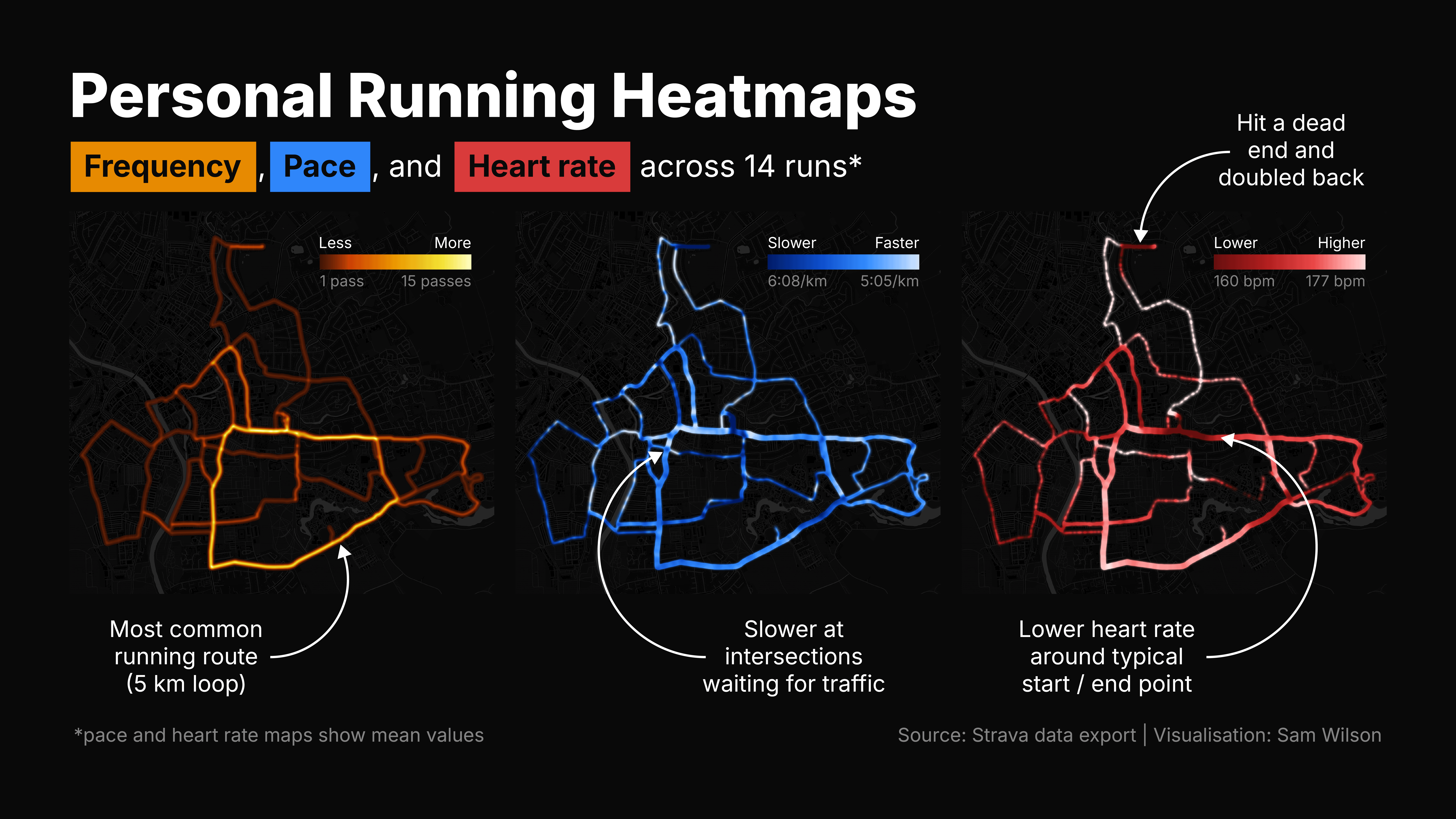
I started running again and wanted to visualise my data spatially. I use Strava to track runs but you have to pay for the personal heatmap feature, so I exported my data and rebuilt it myself in Python. I also built some additional versions to explore pace and heart rate.
After a few attempts at working with the vector running data I landed on just using (what I think is) Strava’s process for generating heatmaps:
- Project the vector run data onto a 1m x 1m pixel grid, incrementing a frequency counter for each pixel when a run passes through it.
- Convolve the pixel grid with a gaussian blur to account for variation in running paths along the same route and smooth things out.
- For pace and heart rate, every pixel records the associated metric for each run pass, so that an average (mean) value can be calculated and used to generate the map.
Note: I clipped the start and end of each run before processing so the heatmap doesn’t pass my home location.
Only 14 runs worth of data so far so it’s still pretty sparse, but I’m looking forward to seeing how it fills out over time (assuming I spend less time building heatmaps and more time actually running). I’d like to refine it further, visualise some derived metrics, and explore the relationship between different variables.
I’m in the process of tidying the code up to publish in a GitHub repo. I'll leave a comment when this is live.
Bonus points if you can guess my city from just the maps.
by anothersamwilson
2 Comments
Data source: personal Strava export.
Tools: Python (NumPy, pandas, python-fitparse, folium, pyproj, SciPy, Matplotlib).
is it weird that looking at this, I first thought is to assume that you live near this area OP?
https://preview.redd.it/39ieo437p3zg1.png?width=293&format=png&auto=webp&s=cb520bada21c89f193b61fa8ec43f798b4c9502d