
Data source: SIPRI Military Expenditure Database
Software: R / ggplot2
Visualization: Forensic Economic Services LLC / Rule703.com
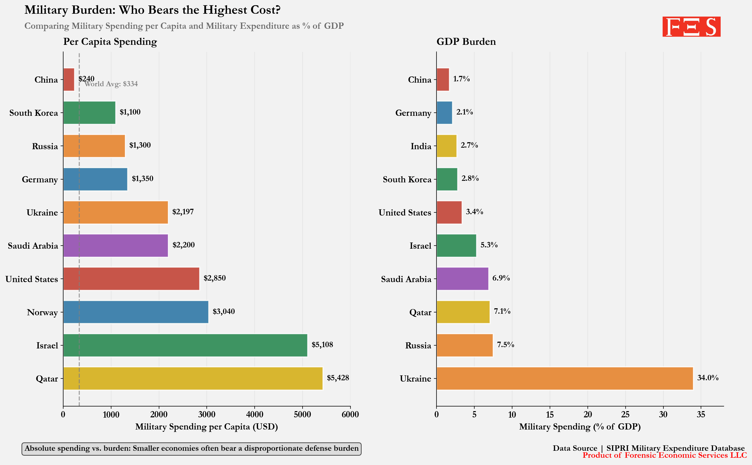
The first chart shows military spending per capita, where smaller, high-income countries like Qatar, Israel, Norway, and the United States rank very high. The second chart shows the GDP burden, where the picture changes: Ukraine stands out dramatically because military spending represents an exceptionally large share of its economy.
Military spending can look very different depending on whether we measure it by population burden or economic burden. Per capita spending captures how much is spent relative to the number of residents, while spending as a share of GDP captures how much national economic output is being directed toward defense.
by forensiceconomics
1 Comment
Surprised to see Qatar so high up the % of GDP list. I assume most of it goes towards their air force?