
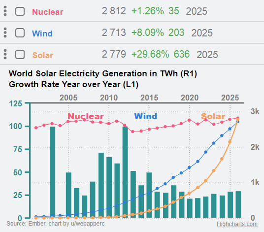
World solar electricity generation is 2,779 TWh up by 30% on 2025. It is more that from wind 2,713 TWh, for the first time, and close to world nuclear electricity generation 2,812 TWh.
Data source Ember, tools web app ERC (Economic RESTful Client).
by webapperc
9 Comments
It paints a good picture but takes a long time to understand this graph.
Including the rate of growth in green bars is distracting (it doesn’t really have a legend, so I’m assuming that’s what it is). Adding the legend text at the top rather than along each line is an odd choice.
Very good info in a not beautiful graph.
If this is accurate, that’s a beautiful exponential curve on solar.
What’s R1 and L1?
Left and right axes are the others way round.
Depends how much you’re holding, but for smaller amounts a decent home safe can sometimes make more sense.
Why’s wind slowing down? Saturation of easy to access spots for farms?
Oh look the nuclear renaissance clearly at display!
Did you vibe code this chart? Why are so many people allergic to proper chart labelling?
What do the bars represent?
Solar is scaling really fast and now the storage is a big constraint