
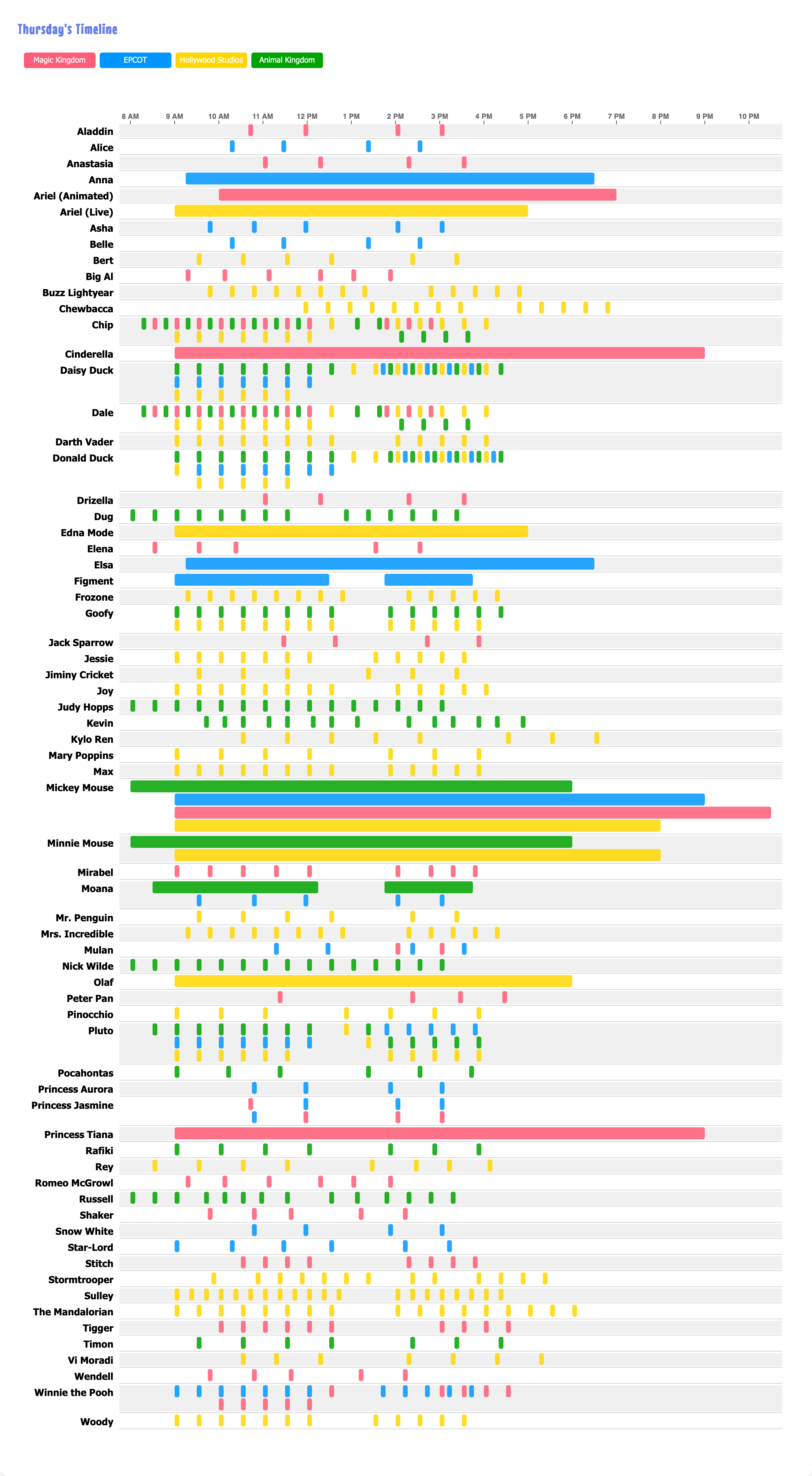
I wanted to be able to see when and where you could "meet" the characters at Walt Disney World. All the information is available on the official app, but for more visual people like myself, I wanted to SEE everything. So I made this chart. (The interactive version is here: https://whereismickey.com)
Some of the characters are "continuous" throughout the day (eg. you can meet Mickey at any point during that period). Some characters are only listed to be out for a single point in time. Hence the long bars and the short blips.
My first iteration used Flourish for a timeline/Gantt-style chart, but it was a little buggy and lacked customization (and automation was crude and relied on Selenium since Flourish doesn't provide access to an API unless you have an enterprise plan).
This new version uses D3.js and renders everything in the browser when you load the webpage. (There is also a text-table on the website above that uses the DataWrapper API.)
The interactive version on the website lets you hover over each time and the popup includes a description and specific location. The data is updated daily.
by shinyro
3 Comments
Viz is created with D3.js. All the data is directly from the Disney World app (so only characters listed there will appear on this chart). Lots of python parsing to prep and serve the data for D3.js.
Whoa whoa. What do you mean Mickey is in four places at once??? 🤨
I’d love to see Darth on his lunch break with the helmet off eating some fries