
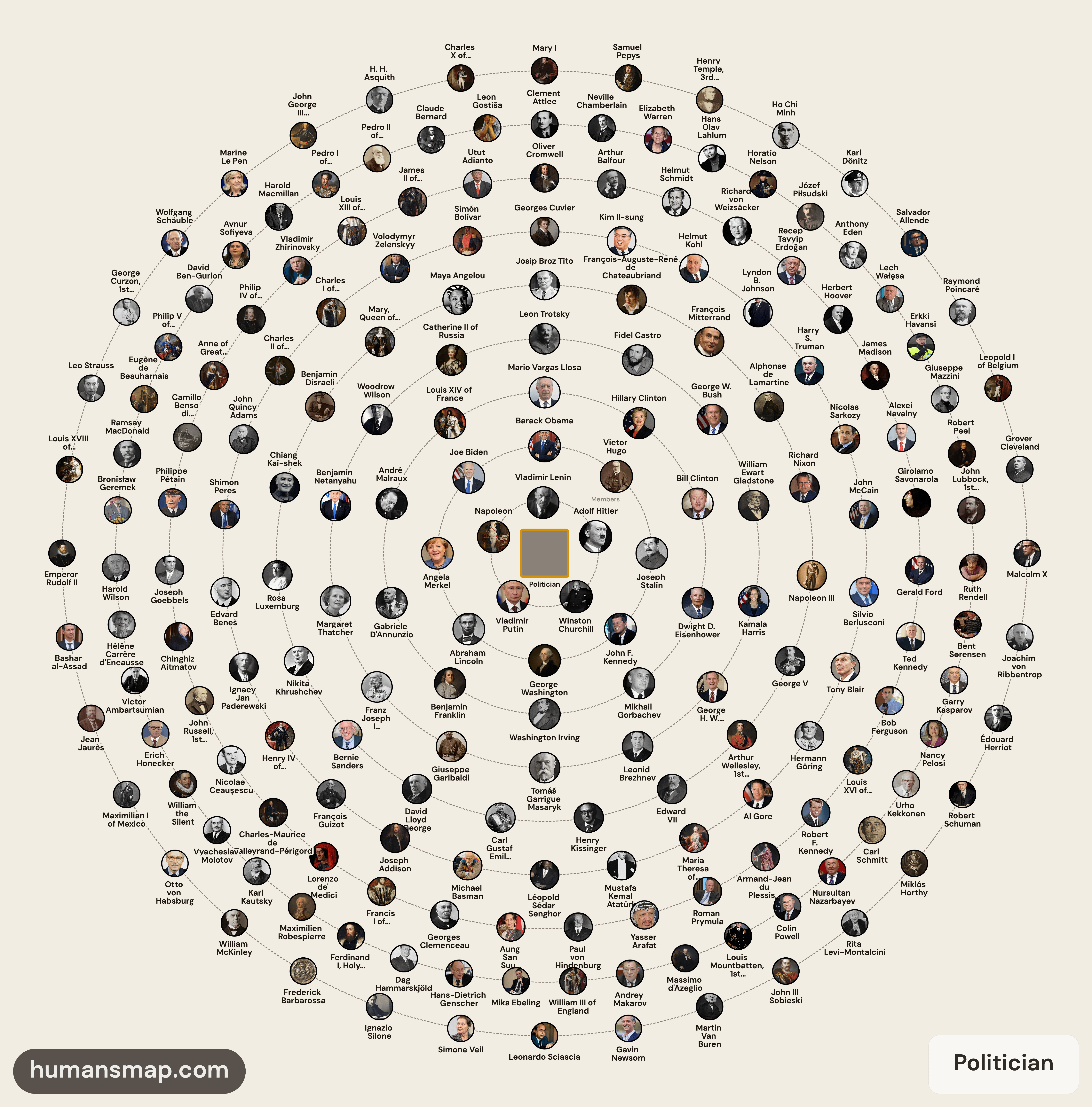
Here are figures whom their first occupation is politician on Wikidata. For example Trump first occupation is an investor, so it doesn't appear here. They are ordered by Wikipedia statements count, there is a bias regarding more recent figures, but the main purpose isn't to show who is better than the other, it is just a way to discover notable one.
The more interesting figures usually are in the outer circles.
Data is unbalanced towards Europe and America, due to Wikidata distribution my dataset includes all EU, US, CA figures, but is remains unbalanced with figures outside these regions. Don't bee too harsh, this is just to have some entertainment.
[OC] Source link: Politicians Interactive Visualization
by im4lwaysthinking
5 Comments
Source: [Politicians explorable visualization ](https://humansmap.com/person/occ_politician)
Data source: Data was extrapolated from Wikidata dump, images downloaded from Wikimedia Commons.
Site is free, no ads.
Process: I used first occupation property from Wikidata, ordered by statements counts and radially visualized ordered by notability count. Notable members are closer to the center.
Tools: ArangoDB for DB, Vue + Cytoscape.js for graph visualization. I tried to be original using this concentric visualization, its primary goal isn’t showing who is above the other.
Wow, wikipedia really is eurocentric. Is Mao even on the chart?
I feel like this is a fairly ineffective way to visualise this data. Hierarchy as concentric circles is a weird flex, but okay. Then there’s no actual representation of the “richness” which is the key metric.
I find it very strange that Horatio Nelson and Arthur Wellesley are considered “politicians” first
Biden, a one term president in the same circle with Stalin, Lincoln, Washington, Kennedy as well as Obama? Im not sure understand the connotations nor the proximity to the center. Maybe give us some more info re: how and what is actually scored ?