
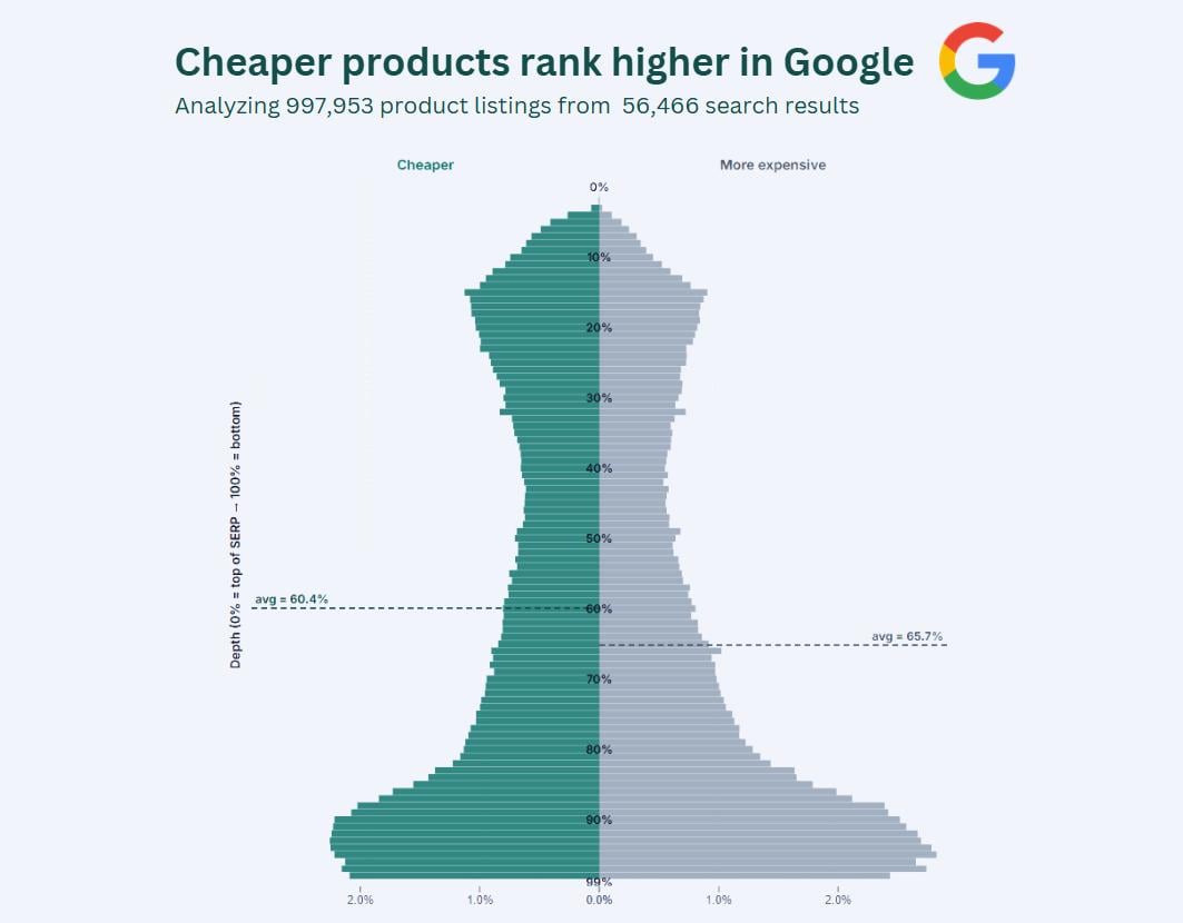
I analyzed 997,953 product listings from 56,466 search results in Google to find out whether or not cheaper products ranked higher.
Products cheaper than their SERP average have an average depth of 60.4%, while more expensive products average 65.7%, meaning cheaper products rank 8.7% higher on average.
This is a bit more nuanced than it may sound.
First, the position of a product is highly dynamic. You cannot simply calculate the order of the products, because ranking number 1 doesn't always mean you're at the top. Sometimes, Google shows an AI overview on top, or a Google Maps pack, or a YouTube video carousel. Long story short, a product's position can only be accurately calculated by measuring the pixel depth of the product compared to the bottom of the page. If the entire first page of the search result is 2,000 pixels long, and a product is listed at pixel 500, then the pixel depth of that product is 25%. I did this for every product.
Why use the relative position instead of the absolute position? Because 1,000 pixels can be the bottom of the search result but can also still be relatively high. Some search results of Google go on and on and on (because Google likes to put lots of different result types on them). No single method is perfect, but I found this to be the most accurate way to measure a product's position on the search result page.
Then the next tricky bit is defining what "cheaper" means. Whether a $50 product is cheap is relative. If you're searching for pencils, then $50 is quite expensive, whereas if you're searching for dishwashers, then $50 is dirt cheap. So, I normalized all prices for every search result page. So, in case we're looking at a search result page for the keyword "dishwasher", then the average price on the page might be $350. For every search result page, this average price is used to determine if products are cheaper or not.
Finally, I put this together in a distribution chart similar to county population charts. I always liiked this kinda charts (where male/female populations are compared for every age). I kinda think this dataset lends itself perfectly for this chart type.
Y-axis shows the relative position of a product's appearance. 100% means bottom of page. The shape of this "population" is explained by the anatomy of Google's search results. Product carousels are usually placed at the top and the bottom. Some search result pages contain just 1 product carousel, while some contain as much as 4, scattered across the page.
This dataset only includes the first page of Google, because… well, who ever looks at the second page?
Source: 997,953 product listings from 56,466 search results in Google
Tools: D3.js and Canva
by TrackingHappiness
3 Comments
waiting for the comments to start up to ELI5 this one..
I analyzed 997,953 product listings from 56,466 search results in Google to find out whether or not cheaper products ranked higher.
Products cheaper than their SERP average have an average depth of **60.4%**, while more expensive products average **65.7%**, meaning cheaper products rank **8.7% higher** on average.
This is a bit more nuanced than it may sound.
First, the position of a product is highly dynamic. You cannot simply calculate the order of the products, because ranking number 1 doesn’t always mean you’re at the top. Sometimes, Google shows an AI overview on top, or a Google Maps pack, or a YouTube video carousel. Long story short, a product’s position can only be accurately calculated by measuring the pixel depth of the product compared to the bottom of the page. If the entire first page of the search result is 2,000 pixels long, and a product is listed at pixel 500, then the pixel depth of that product is 25%. I did this for every product.
Why use the relative position instead of the absolute position? Because 1,000 pixels can be the bottom of the search result but can also still be relatively high. Some search results of Google go on and on and on (because Google likes to put lots of different result types on them). No single method is perfect, but I found this to be the most accurate way to measure a product’s position on the search result page.
Then the next tricky bit is defining what “cheaper” means. Whether a $50 product is cheap is relative. If you’re searching for pencils, then $50 is quite expensive, whereas if you’re searching for dishwashers, then $50 is dirt cheap. So, I normalized all prices for every search result page. So, in case we’re looking at a search result page for the keyword “dishwasher”, then the average price on the page might be $350. For every search result page, this average price is used to determine if products are cheaper or not.
Finally, I put this together in a distribution chart similar to county population charts. I always liiked this kinda charts (where male/female populations are compared for every age). I kinda think this dataset lends itself perfectly for this chart type.
Y-axis shows the relative position of a product’s appearance. 100% means bottom of page. The shape of this “population” is explained by the anatomy of Google’s search results. Product carousels are usually placed at the top and the bottom. Some search result pages contain just 1 product carousel, while some contain as much as 4, scattered across the page.
This dataset only includes the first page of Google, because… well, who ever looks at the second page?
**Source:** 997,953 product listings from 56,466 search results in Google
**Tools:** D3.js and Canva
we’re all thinking it but im not gonna be the first one to say it