
Last post was removed by mods because it was deemed related to US politics, so doing a Thursday repost as asked.
Tools and data in the comments.
by therafort
Last post was removed by mods because it was deemed related to US politics, so doing a Thursday repost as asked.
Tools and data in the comments.
by therafort
5 Comments
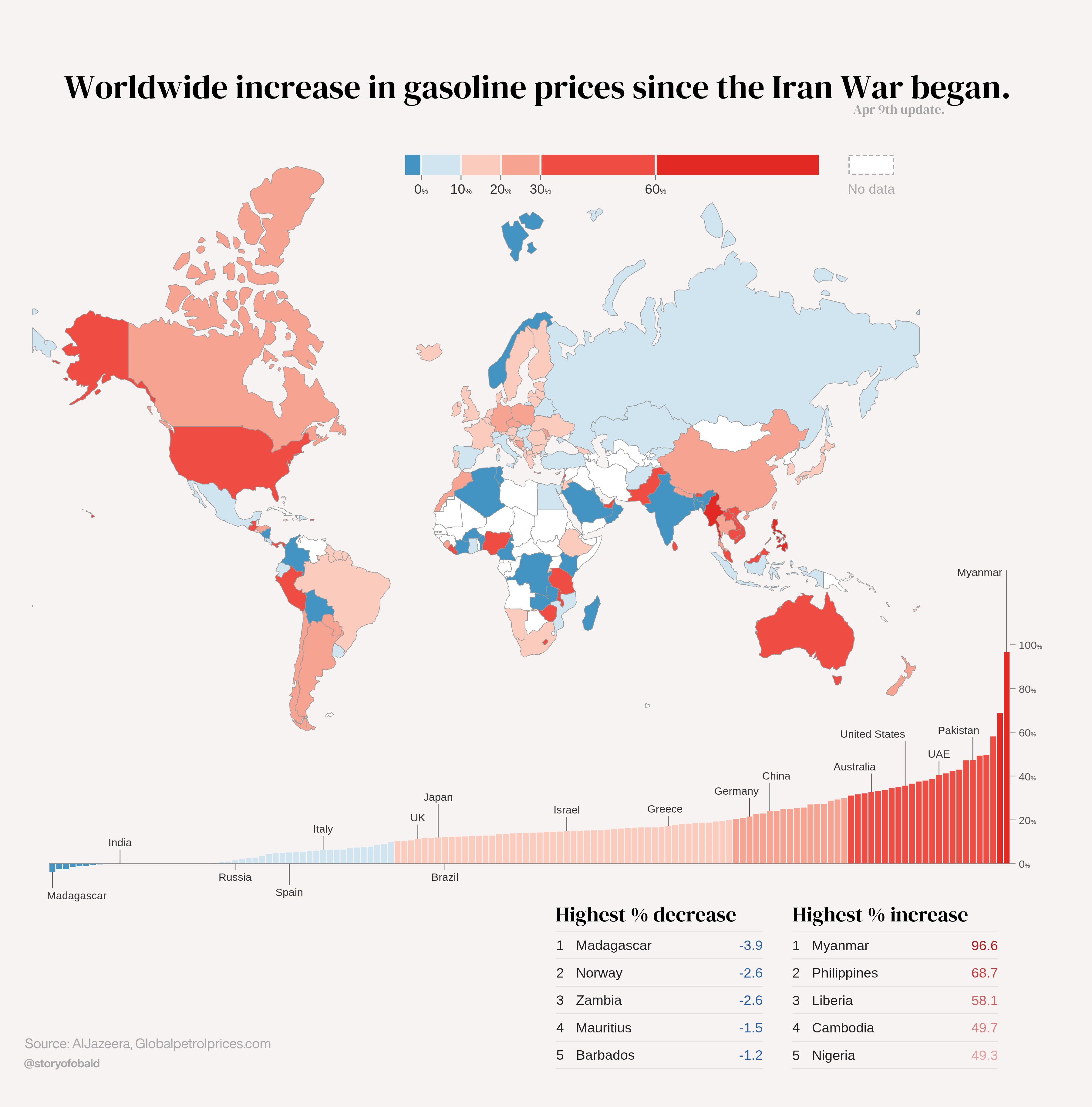
**1. Tool:** Made the world map, bar chart, and legend all with D3.js, converted to SVG, imported in Canva, and did the rest in that.
**2. Data:** From [globalpetrolprices.com](http://globalpetrolprices.com/). Price might be a little lagging, but this is one of the most reliable sources available: regularly referenced by Reuters, AP, and many highly reputed publishers. full data [[here]](https://data.tablepage.ai/d/gasoline-price-changes-by-country-with-sources).
**Changes since last post:** Nearly half the countries had their gas prices update since the last post, so this is obviously quite a different chart. I also changed the negative y axis’ like the top comment suggested.
How is Europe less effected than the US?
Interesting. The US is less directly impacted by the blockade at Hormuz but in terms of price they are hot harder than most of Europe, which actually replies on those imports.
I guess a lot of European countries have prices that are already much higher though, so the price increase in percentage is lower. Some countries also reduced taxes, fees and tariffs on oil and gas.
Trump has stolen Greenland it looks like.
Wow Australia was sideline kicked in the balls for no reason