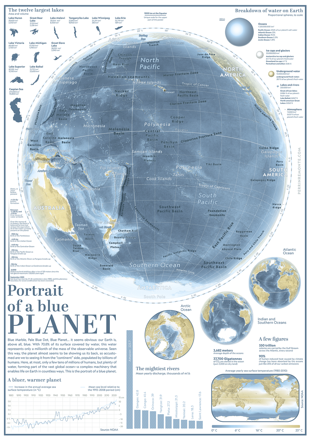
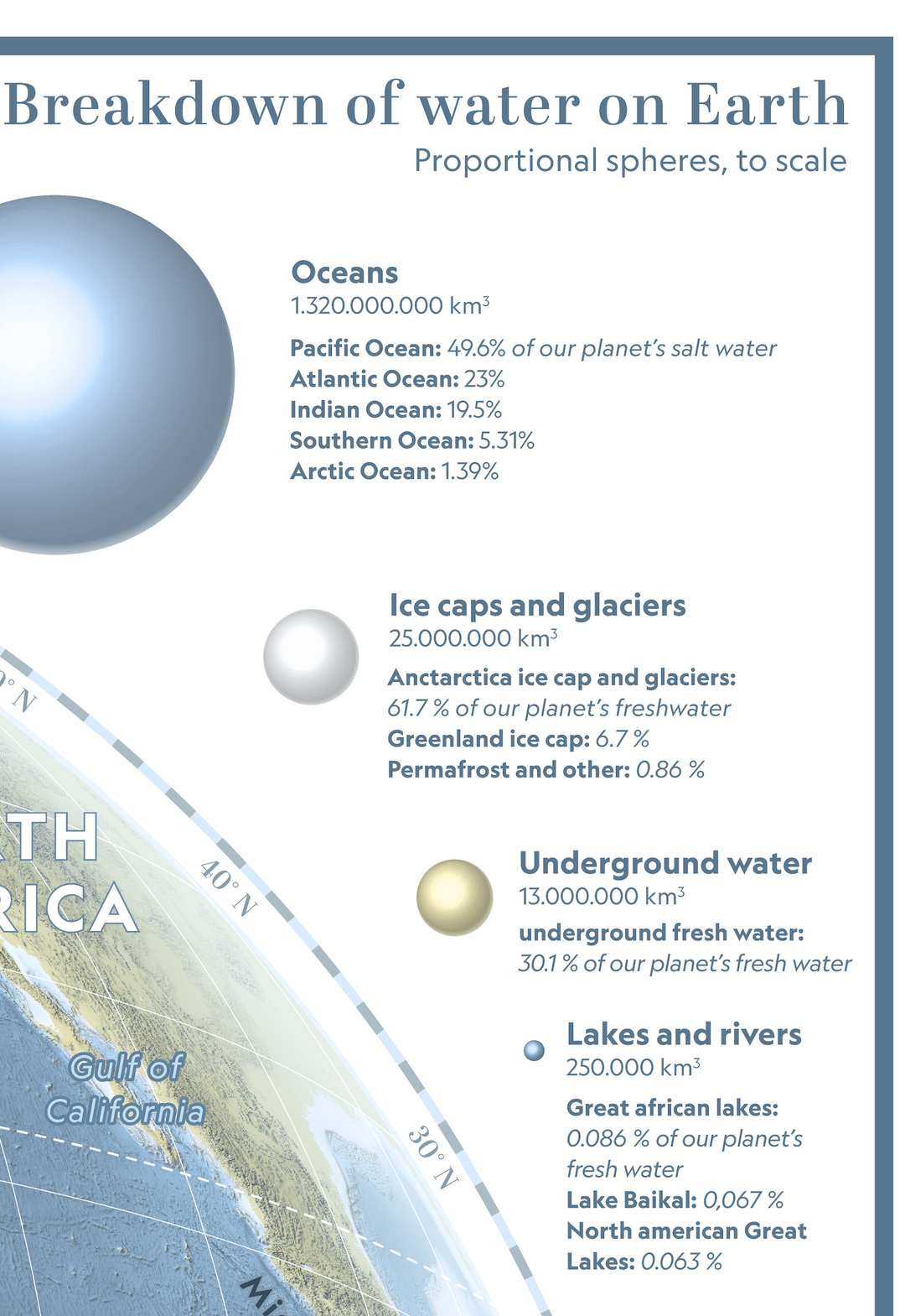
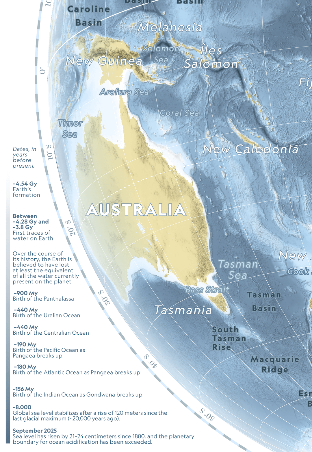
“Blue Marble, Pale Blue Dot, Blue Planet… it seems obvious: our Earth is, above all, blue. With 70.8% of its surface covered by water, this water represents only a millionth of the mass of the observable universe. Seen this way, the planet almost seems to be showing us its back, so accustomed are we to seeing it from the “continent” side, populated by billions of humans. Here, at most, only a few tens of millions of humans, but plenty of water, forming part of the vast global ocean—a complex machinery that enables life on Earth in countless ways. This is the portrait of a blue planet.”
Data: GEBCO, NOAA
Tools: QGIS, Adobe Illustrator
Edit : had to resubmit my post, it was deleted yesterday (for anyone wondering why it’s showing up again)
NoobMusker69 on
Actually beautiful data? In this economy?
It’s refreshing to see such a complex data visualization not being AI slop, thank you for that OP
Grouchy_Order_7576 on
Very nice ! Anywhere I can download a high resolution version?
Fantastic-Safety4604 on
I like it very much, thank you.
theobviousanswers on
This looks exactly like 1990s Australian Geographic Magazine posters my dad would buy- beautiful!!
flipp45 on
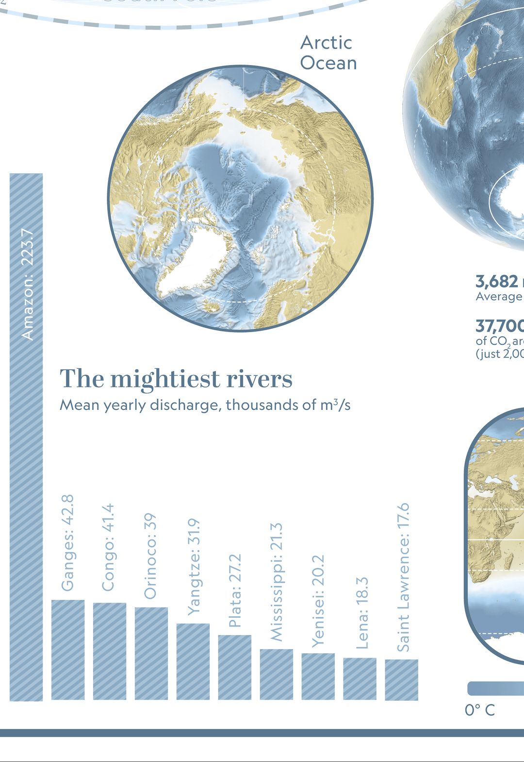
There is no other river even close to the Amazon.
Acceptable-Bus5189 on
this image is not that clear can you pleases give the PDF version of this .
Nikkibraga on
I’d love to visit Oceania one day. As someone who lives in the mountains, I can’t fathom the idea of being surrounded by endless oceans.
PM_your_Nopales on
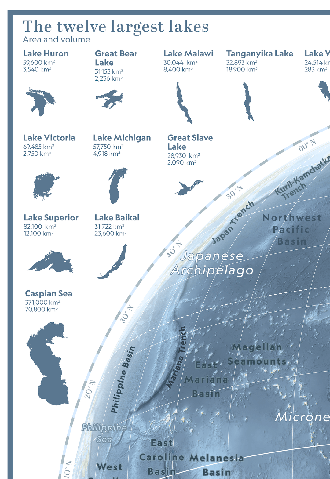
The Caspian sea is hardly considered a lake. It’s salinity it’s brackish. It doesn’t belong in regards to any of the other freshwater lakes at all
redmera on
It seems OP is an actual cartographer with lots of great content. Thumbs up!
LostOnWhistleStreet on
Wait the Nile isn’t in the 10 largest rivers by discharge? I had to double check that and it’s not even close. Funny what you assume based on other factors. Length doesn’t compensate for rainfall.
Love your map!
I’ve been working on a global oceangoing renewable energy platform for a few years, and accidentally came up with this shot while on Google Earth. Until that day I’d known book-knowledge, and having flown over it, but this was my WOW moment.
Will you be marketing your map as a poster?
YachtswithPyramids on
Can we have a few teams of geologist confirm this maps accuracy? If so this thing is incredible
FaithlessnessBig621 on
I got the 2024 local tide chart up on a wall at home without too many complaints. I’ll be adding this one shortly…
Popular_Tomorrow_204 on
The graphics these cool info books had back in the day
rogert2 on
This is great! Would make a great wall poster in a kid’s bedroom or a K-12 science classroom.
jeffh4 on
Very nice! Better quality than what National Geographic would include every month in our subscription.
One question: 550 Trillion calories carried by the Gulf Stream every second? Calories are units of energy used to denote thermal energy (heating water) or nutrition. Unless you are talking about the Gulf Stream warming up the Atlantic Ocean, I recommend using joules or kilowatt-hours.

17 Comments
“Blue Marble, Pale Blue Dot, Blue Planet… it seems obvious: our Earth is, above all, blue. With 70.8% of its surface covered by water, this water represents only a millionth of the mass of the observable universe. Seen this way, the planet almost seems to be showing us its back, so accustomed are we to seeing it from the “continent” side, populated by billions of humans. Here, at most, only a few tens of millions of humans, but plenty of water, forming part of the vast global ocean—a complex machinery that enables life on Earth in countless ways. This is the portrait of a blue planet.”
Data: GEBCO, NOAA
Tools: QGIS, Adobe Illustrator
Edit : had to resubmit my post, it was deleted yesterday (for anyone wondering why it’s showing up again)
Actually beautiful data? In this economy?
It’s refreshing to see such a complex data visualization not being AI slop, thank you for that OP
Very nice ! Anywhere I can download a high resolution version?
I like it very much, thank you.
This looks exactly like 1990s Australian Geographic Magazine posters my dad would buy- beautiful!!
There is no other river even close to the Amazon.
this image is not that clear can you pleases give the PDF version of this .
I’d love to visit Oceania one day. As someone who lives in the mountains, I can’t fathom the idea of being surrounded by endless oceans.
The Caspian sea is hardly considered a lake. It’s salinity it’s brackish. It doesn’t belong in regards to any of the other freshwater lakes at all
It seems OP is an actual cartographer with lots of great content. Thumbs up!
Wait the Nile isn’t in the 10 largest rivers by discharge? I had to double check that and it’s not even close. Funny what you assume based on other factors. Length doesn’t compensate for rainfall.
https://preview.redd.it/gtq4y1pjcjtg1.jpeg?width=1140&format=pjpg&auto=webp&s=6b2e92e4ef1cb390046467541ca15ac0c6ba7a29
Love your map!
I’ve been working on a global oceangoing renewable energy platform for a few years, and accidentally came up with this shot while on Google Earth. Until that day I’d known book-knowledge, and having flown over it, but this was my WOW moment.
Will you be marketing your map as a poster?
Can we have a few teams of geologist confirm this maps accuracy? If so this thing is incredible
I got the 2024 local tide chart up on a wall at home without too many complaints. I’ll be adding this one shortly…
The graphics these cool info books had back in the day
This is great! Would make a great wall poster in a kid’s bedroom or a K-12 science classroom.
Very nice! Better quality than what National Geographic would include every month in our subscription.
One question: 550 Trillion calories carried by the Gulf Stream every second? Calories are units of energy used to denote thermal energy (heating water) or nutrition. Unless you are talking about the Gulf Stream warming up the Atlantic Ocean, I recommend using joules or kilowatt-hours.