
Data: ~11,000 freestyle laps from 202 pool sessions recorded on a Garmin watch (Aug 2024 – Mar 2026).
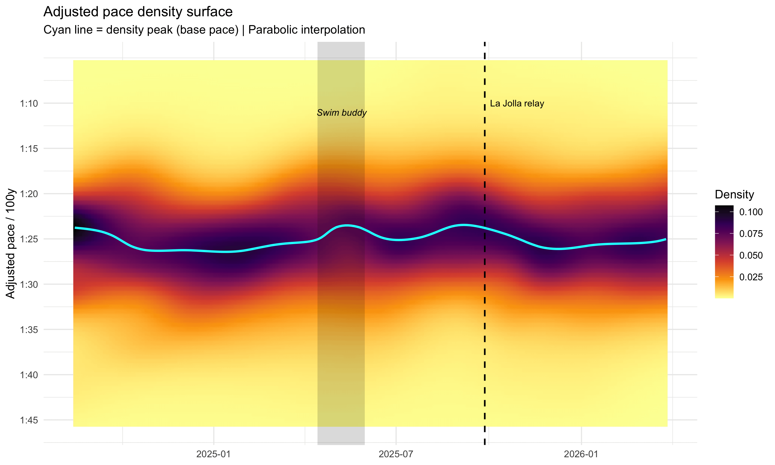
Each session's lap times are adjusted for workout structure (pacing, fatigue, rest, effort) using a generalized additive model, then binned into 1-second pace brackets. The heatmap shows how the proportion of laps at each pace evolves over time. Darker = more laps at that pace. The cyan line traces the peak of the distribution — essentially my 'base pace' at any point in time.
The shaded region is when I had a regular swim buddy. The dashed line is when I raced the La Jolla Rough Water Swim relay.
Tools: R, mgcv, ggplot2.
Full writeup and code: https://jbogomolovas2.github.io/Julius-s-Blog/posts/swim-css-pipeline/
by rrytas
1 Comment
the methodology here is legitimately interesting. using a gam to partial out workout structure before computing the pace distribution is a smart way to get at true underlying fitness signal rather than comparing interval sets vs easy swims directly. a lot of athletes just log raw splits and then wonder why there’s so much noise.
the swim buddy effect visible in the shaded band is the most human part of this whole dataset. pacing off another person is one of the most consistent performance drivers in endurance sports and almost never shows up cleanly in self-tracked data because it’s hard to tag. you basically found it by accident through density shift in the heatmap.
would be curious whether the improvements from that period held after the buddy training ended or if it regressed partially. what ended up happening to your base pace after they stopped swimming with you?