
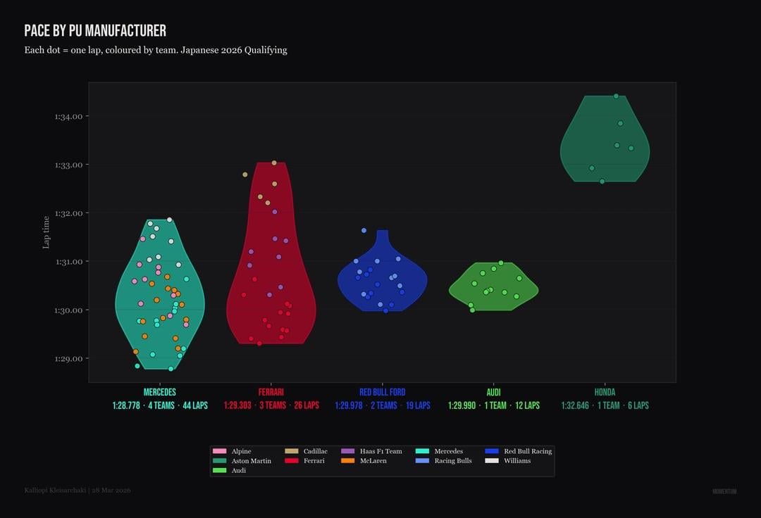
Five Power Unit manufacturers on the 2026 grid. The violin chart pools every qualifying lap by power unit supplier. What it shows is not just who is fast but how the performance distributes across customer teams sharing the same hardware.
Mercedes powered 44 laps across four teams. Their best of 1:28.778 sits half a second clear of Ferrari's 1:29.303. But look inside the violin. The Mercedes shape is bottom heavy, meaning most of their laps cluster near the fast end. That is four different chassis and aero packages all extracting similar performance from the same PU. The spread from best to worst Mercedes powered lap is around 3 seconds, but the density sits in the 1:29 to 1:30 band.
Ferrari's violin is taller and wider. Three teams, 26 laps, and the distribution is more uniform. That wider shape means more variance between the works team and the customers. The Haas and Cadillac dots sit visibly higher than the Ferrari works dots inside the same violin.
Red Bull Ford is the most compact shape on the chart. Two teams, 19 laps, and the body barely stretches beyond 1.5 seconds peak to trough. Both cars are finding similar limits, which for a brand new PU programme in its first season is notable. Whether that compactness is genuine convergence or just limited data from two teams is worth watching over the next few races.
Audi at 1:29.990 from one team and 12 laps. The shape is tight and centred around 1:30. For a manufacturer building their own power unit from scratch, being within 1.2 seconds of the Mercedes best in qualifying is closer than most people predicted.
Honda with Aston Martin is the outlier. Six laps, 1:32.646 best, and the violin body sits 3 seconds off the pace. Limited running makes it hard to read too much into the shape but the gap to the next slowest PU is over two seconds.
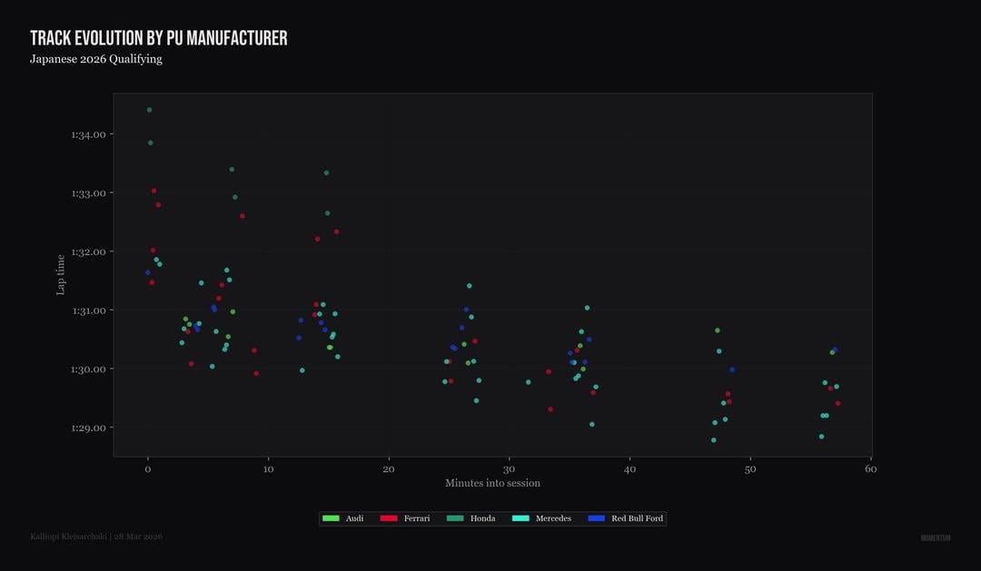
The track evolution by PU confirms the pattern from a different angle. From minute 40 onwards the Mercedes and Ferrari dots separate downward while Red Bull Ford and Audi compress into a band. The PU advantage at Suzuka is not just peak power on the back straight. It is how consistently the package delivers across a full qualifying session when the energy management demands are highest.
by Ginger_Rook
3 Comments
The Mercedes shows that the Merc and McLaren are relatively close to one another, implying McLaren is a good car, at least compared to the Ferrari chart which is completely dominated by the works team, implying their car is either very good or their customer cars are horrendous garbage
Oh oh yes! THIS is some beautiful data, please keep it up love the analysis thanks for sharing!
Thanks, i found this really interesting. Im hoping McLaren can catch up with Mercedes and this gives me faith.