
Look at the attached image (code and data: https://gorelik.net/2020/11/10/before-and-after-alternatives-to-a-radar-chart-spider-chart).
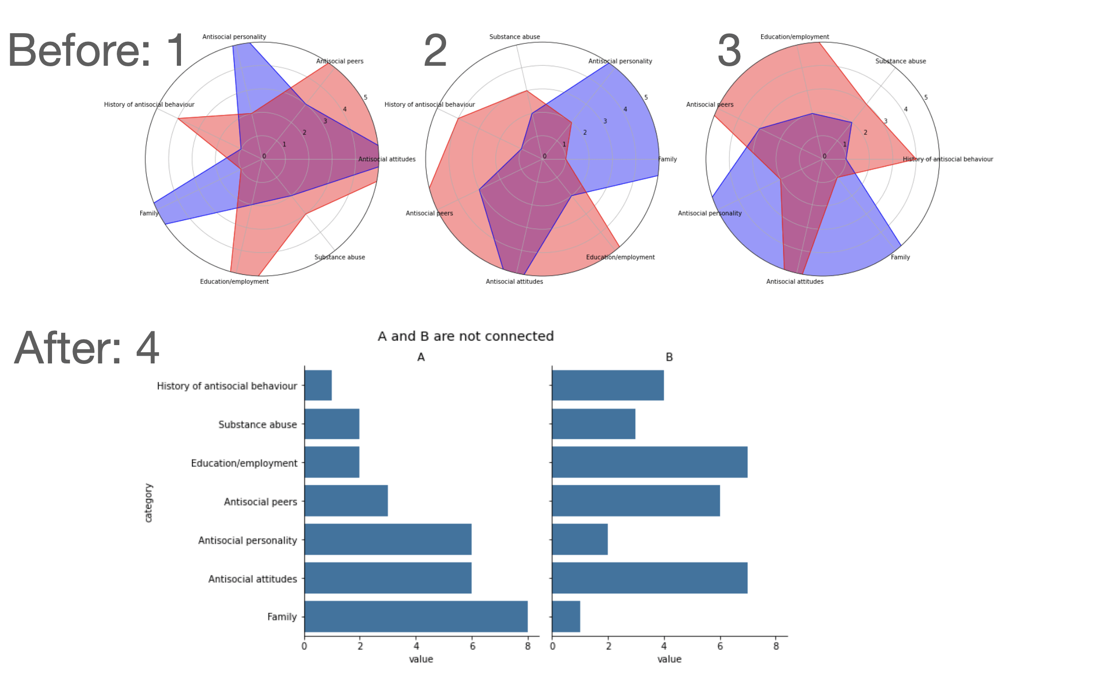
Do you notice that the different radar charts look very different? Would you guess that they are all based on the same data? This is the most serious hazard of radar charts — the shape changes dramatically depending on the arbitrary order of categories, making them actively misleading.
To fix a graph like this, start with a conclusion. What are you trying to say? Without a conclusion, nothing will work. Then formalize that conclusion in a graph. In this case I used paired horizontal bar charts, sorted by value. Black color for axes, blue – for the data. Maximal signal, minimal distraction.
I hope you'll agree the result is both clearer and more beautiful.
——
Boris Gorelik. Data visualization consultant
by No_Theory6368
3 Comments
I think they’re only possible with a very narrow number or variables – like 5-6. Any less and there’s not enough area, any more it becomes far too busy. Very situational.
The way these charts are made sucks. This type of chart can work great if done properly. If you want to display correlation a scatter plot is better than the 2 charts side by side, and if you want to display the differences then plot them as such.
They’re good when representing something simple, like in sports games where more coverage = better stats. They’re awful if you need to compare between values in the plot.