Caveat: this only captures rent + food relative to gross income. It doesn’t include taxes, healthcare, transport, or childcare, and can understate pressure in high-income metros.
Tools: Python for data handling and Canva for data vis
Europe (Southern / Eastern) is next.
thechemistrychef on
Curious about San Jose being so low. Is the average income there so high that it offsets the housing costs?
atchn01 on
I am sure the data is correct, but housing and food being 75% of the median income just makes my bull shit detector ring.
CougarForLife on
The colors in slide 1 are redundant no? the bars already show the viewer what their stat is. and the grouping seems arbitrary:
– under 30%
– 30-35% (5% range)
– 35-40% (5% range)
– 40-45% (5% range)
– 45-55% (10% range)
– over 55%
I’d try using colors to convey a different idea. A third data point maybe? A classification of some kind? Another common one is region.
Overall super interesting tho, well done!
TMWNN on
Yet another reason for annexation
ProjectCoast on
Why use Pittsburgh and not Philadelphia?
DrTonyTiger on
Why report these numbers with five decimal places? That precision implies a comparably, extraordinarily, high precision in making the index and its stability over time. How many digits would both convey the meaningful differences most economically, as well as keep the implied precision accurate?
summerstay on
You should use color to distinguish between Canadian and U.S. cities, since those are using different median incomes. The current colors are not providing any useful information.

8 Comments
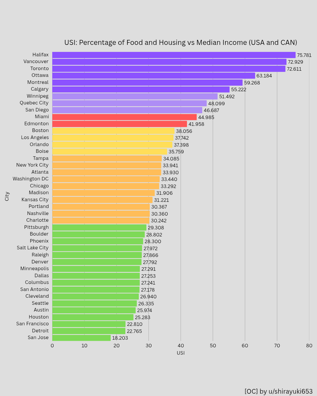
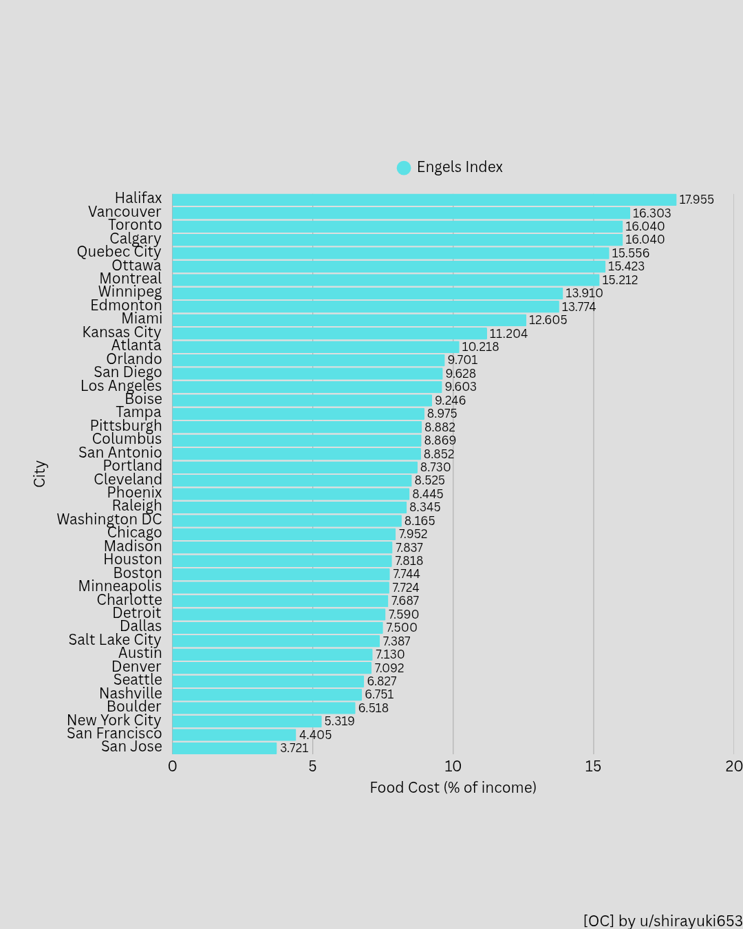
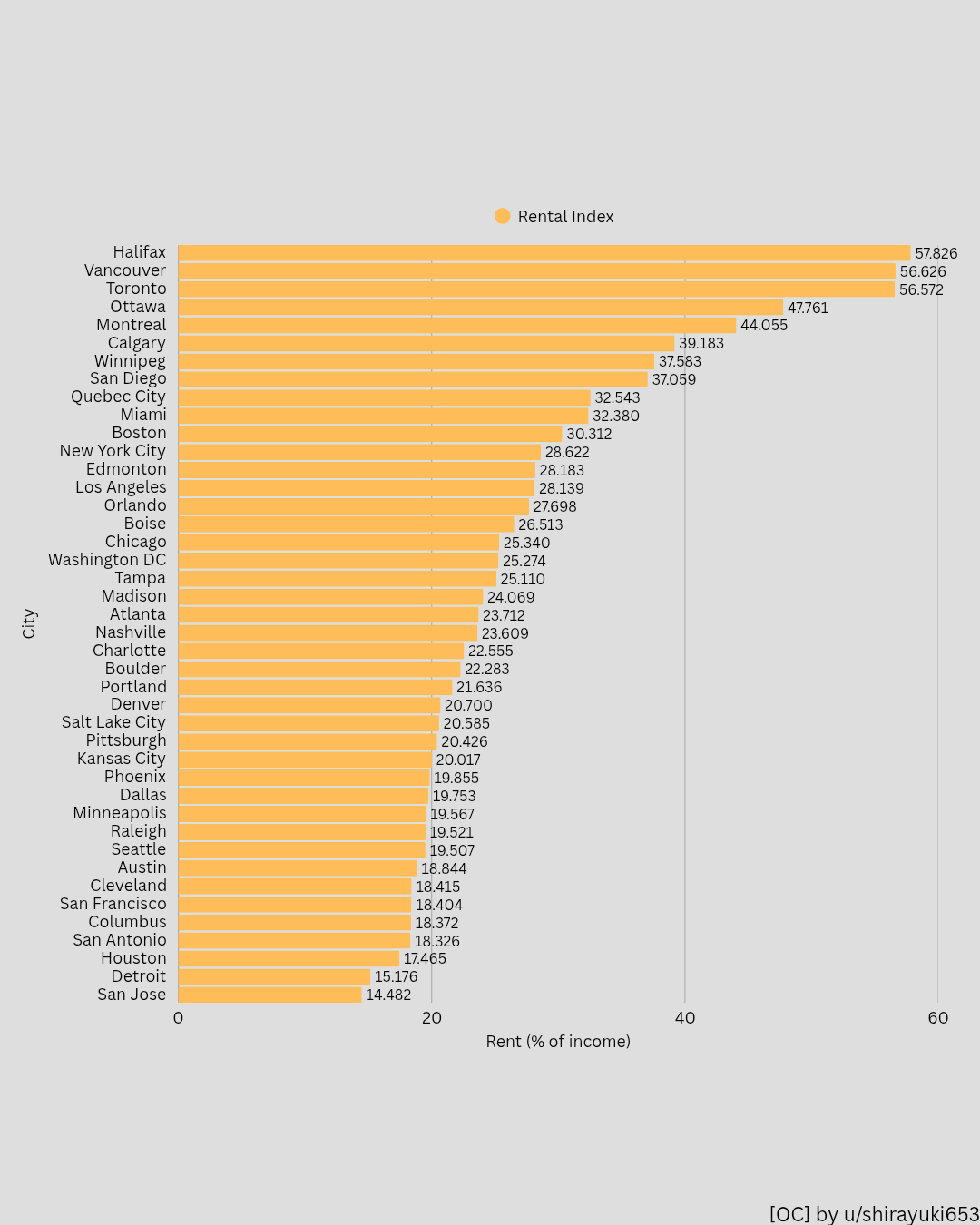
This is an updated version of Part 1 of the USI series .I switched from a map to bar charts for easier comparison.
USI = housing burden + essential food share (% of gross income)
Housing = median 1BR rent / income
Food = simplified essential consumption proxy
Data:
• BLS + Statistics Canada (income)
• Zillow / Rentals.ca (rent)
• Numbeo (food)
Caveat: this only captures rent + food relative to gross income. It doesn’t include taxes, healthcare, transport, or childcare, and can understate pressure in high-income metros.
Tools: Python for data handling and Canva for data vis
Europe (Southern / Eastern) is next.
Curious about San Jose being so low. Is the average income there so high that it offsets the housing costs?
I am sure the data is correct, but housing and food being 75% of the median income just makes my bull shit detector ring.
The colors in slide 1 are redundant no? the bars already show the viewer what their stat is. and the grouping seems arbitrary:
– under 30%
– 30-35% (5% range)
– 35-40% (5% range)
– 40-45% (5% range)
– 45-55% (10% range)
– over 55%
I’d try using colors to convey a different idea. A third data point maybe? A classification of some kind? Another common one is region.
Overall super interesting tho, well done!
Yet another reason for annexation
Why use Pittsburgh and not Philadelphia?
Why report these numbers with five decimal places? That precision implies a comparably, extraordinarily, high precision in making the index and its stability over time. How many digits would both convey the meaningful differences most economically, as well as keep the implied precision accurate?
You should use color to distinguish between Canadian and U.S. cities, since those are using different median incomes. The current colors are not providing any useful information.