
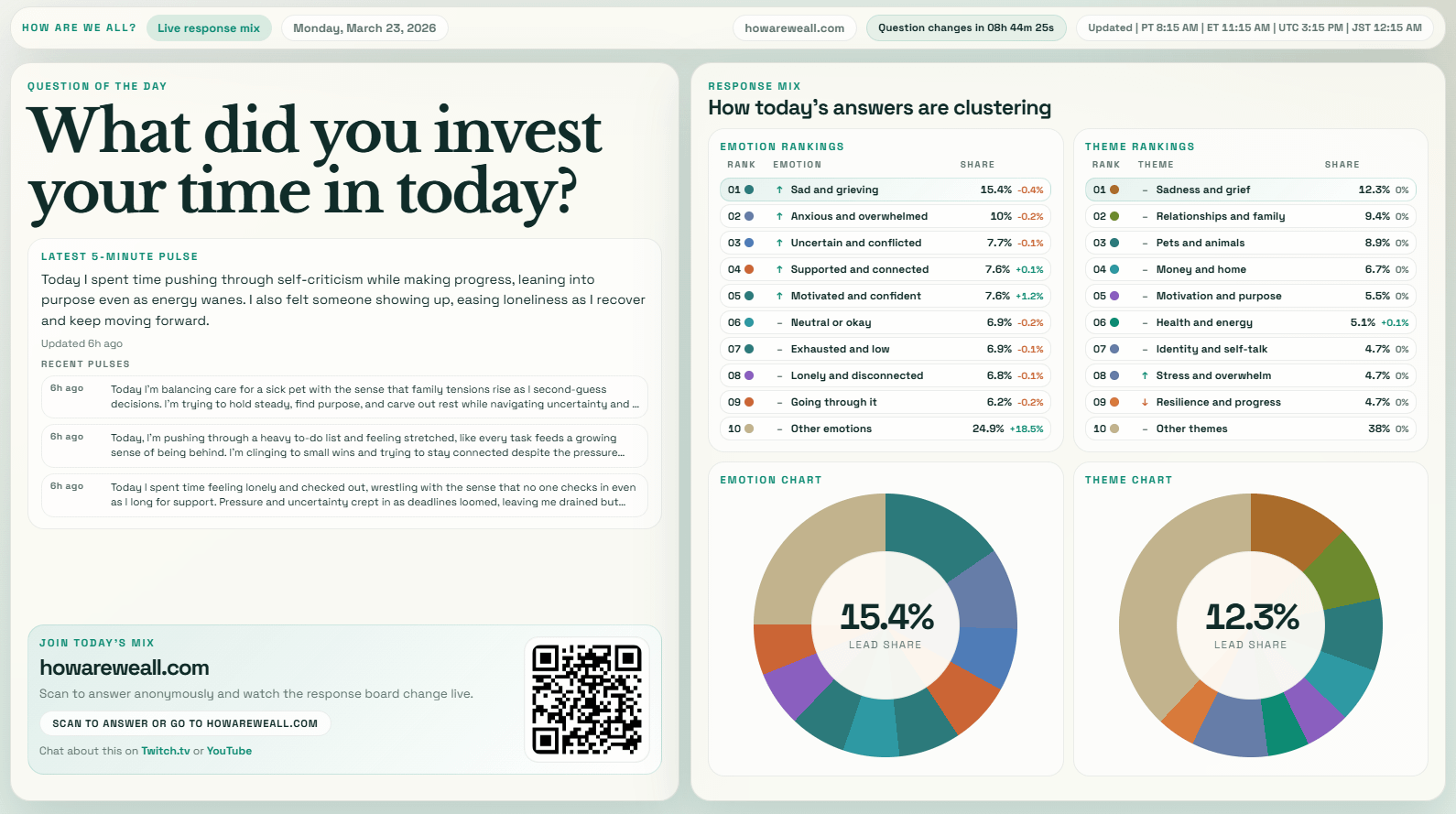
Data source: ~300 anonymous responses submitted to a single daily question
Processing: Responses grouped into themes and emotions using a custom clustering approach, then aggregated into percentage shares
Visualization: Generated using a custom web interface (JS) based on the aggregated data
(apologies to anyone who already seen this, the previous post was deleted and mods said to repost on Monday)
by Another_User_92
2 Comments
Why use a color palette with so few hue? (also, an annotated bar chart will serve you better instead of a bagel where we have to constantly check what color is what label)
Would you say that “Responses centered on reflection and meaning-making, with a noticeable layer of inner states, regulation, and naming what felt strongest”?
(Is your summary bot broken? It’s said the same thing five times.)