
Built this dashboard to track what most war coverage ignores—the infrastructure dimension of the Iran-US war.
What you're seeing:
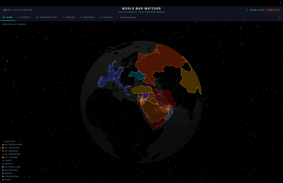
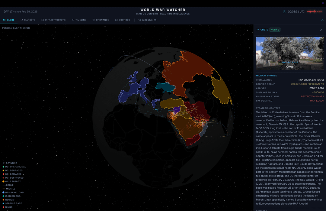
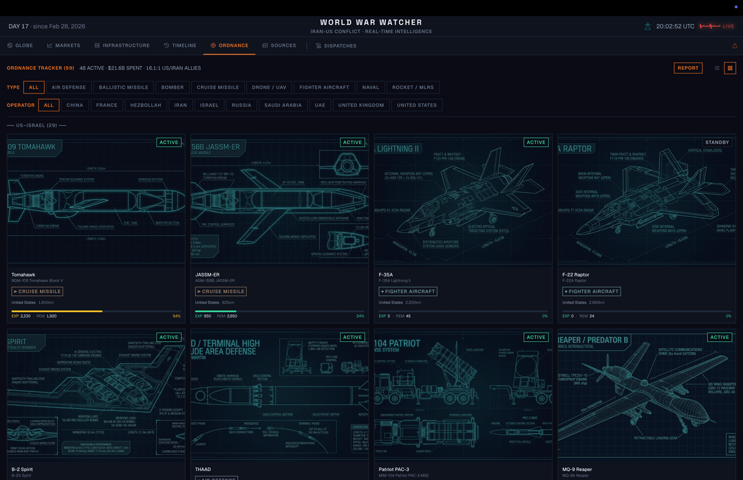
– 3D globe with 31 data centers, 16 submarine cables, 59 ordnance systems, and 30 missile trajectories rendered in real-time
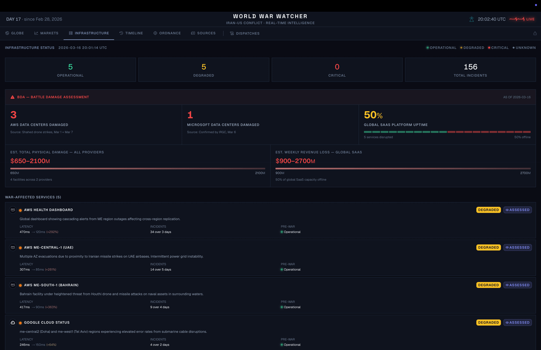
– Battle Damage Assessment: 3 AWS + 1 Microsoft data centers physically struck by Shahed drones
– Ordnance tracker: 48 active weapon systems with burn rates and depletion projections
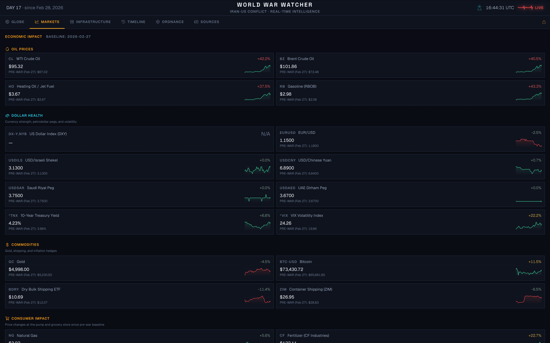
– Market sparklines: Brent at $105.70 (+40% since war started), defense stocks, dollar health
– 103 timeline entries with Admiralty confidence ratings (A1-F6)
Key numbers from Day 18:
– Hormuz throughput: 3% of pre-war baseline
– Iran-to-Israel kill ratio: 108:1 (AP aggregate)
– Cost asymmetry: $7K per Shahed drone vs $1-3.5M per interceptor (17.4:1 weekly spend ratio)
– 7,600 Israeli strikes in 18 days (422/day)
– UAE has intercepted 1,950+ projectiles since Feb 28
Stack: Next.js 16, react-globe.gl, Three.js (14 DRACO-compressed GLB models), Cloudflare Workers (live data every 10-15 min), hand-rolled SVG sparklines. 357 credibility-tiered sources. Links in comments.
Tools used: Figma/Pencil for design, Exa for OSINT scanning, Gemini for OG images, Claude Code for everything else.
by Pnutmaster
5 Comments
[https://www.worldwarwatcher.com](https://www.worldwarwatcher.com)
This is genuinely sick. Nice work
If you don’t mind me asking, how is the timeline populated? Is it using like gdelt + webscrape or some other feed you created?
I hate to make it feel like this is a warthunder forum but the Shahed drone costs were anywhere between $20k-$50k and that was in 2023 before the Rial imploded in value.
I don’t know anywhere that reports $7k as a per unit-cost.
Do you have a GitHub?
If you were to make a video on how you put this all together, I’d watch it. It’s a very nice showpiece.