
I've been doing this for many years. A close friend of mine has seen other people on here doing something similar and has told me to share this sort of thing several times and I'm finally complying.
I started out just tracking my work hours for different clients. Then, I started using the same app to track my video game time. Eventually, I added my exercise time. At some point (maybe around 2018?) I started tracking all of my time.
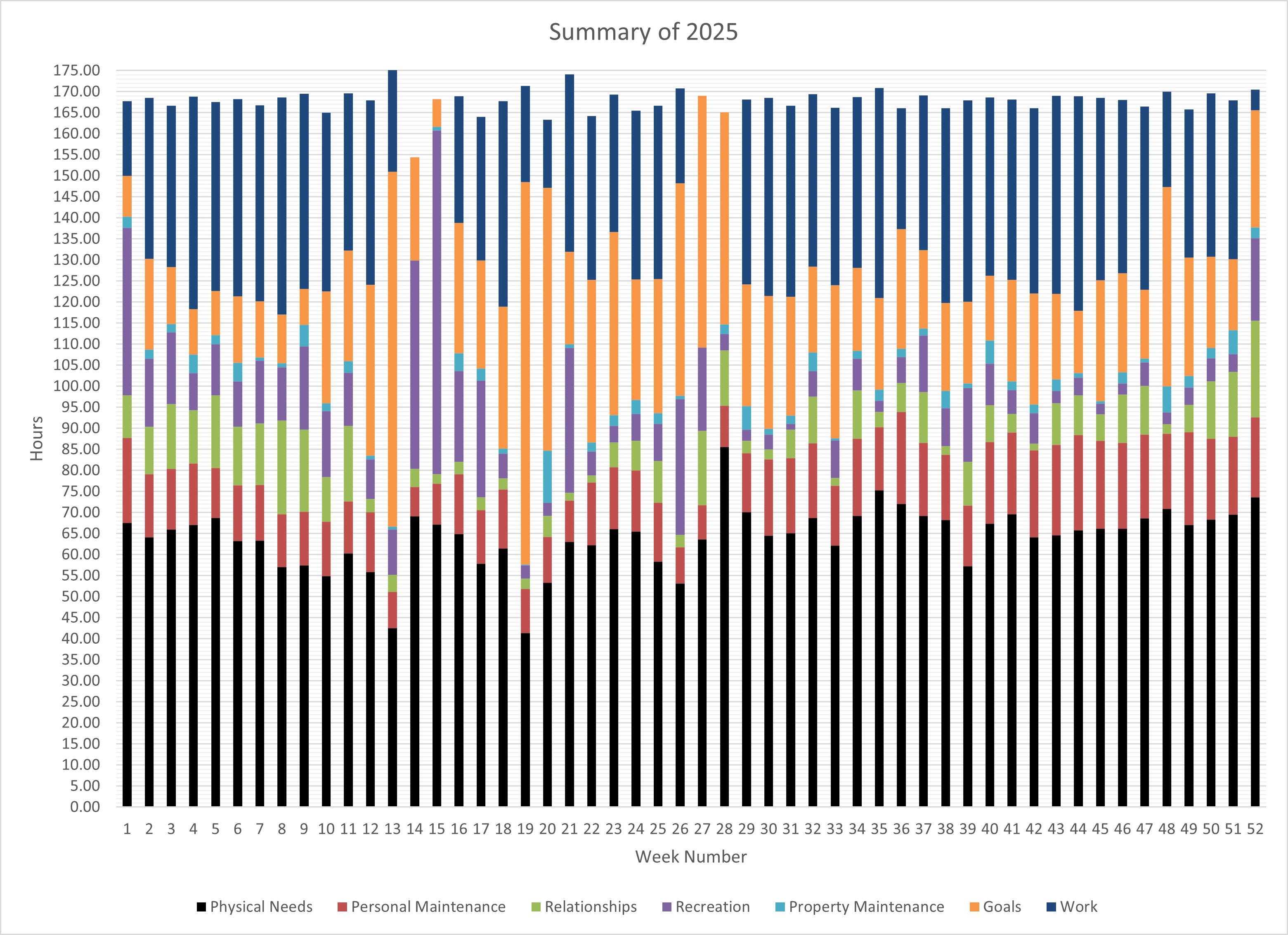
I've been meaning to make my own app that would make it more automated. I track my time with an app that was designed for contractors tracking job time for different clients. Once a week, I manually transfer the data from the app to Excel. Then, I review the plots to see if I'm on track for my annual targets.
by Arbitrary18
3 Comments
There is no point in displaying 52 bars you should find a way to aggregate or displaying it in another way
This is great data, but the visualization itself isn’t really effective. Consider a line chart with a line per category (though can get too busy with this many categories). Or one small chart per category, each with the same fixed axis if you want to allude to a percent of time comparison.
There’s some pretty large margins of error in there – a week is 168 hours but many columns appear to be much larger or smaller