
Hi everyone!
I have been watching the Russian-Ukrainian war for a long time and I became interested in visualizing a "drone war". This is how the first version of this project came about. Now I have also added monitoring of other world conflicts.
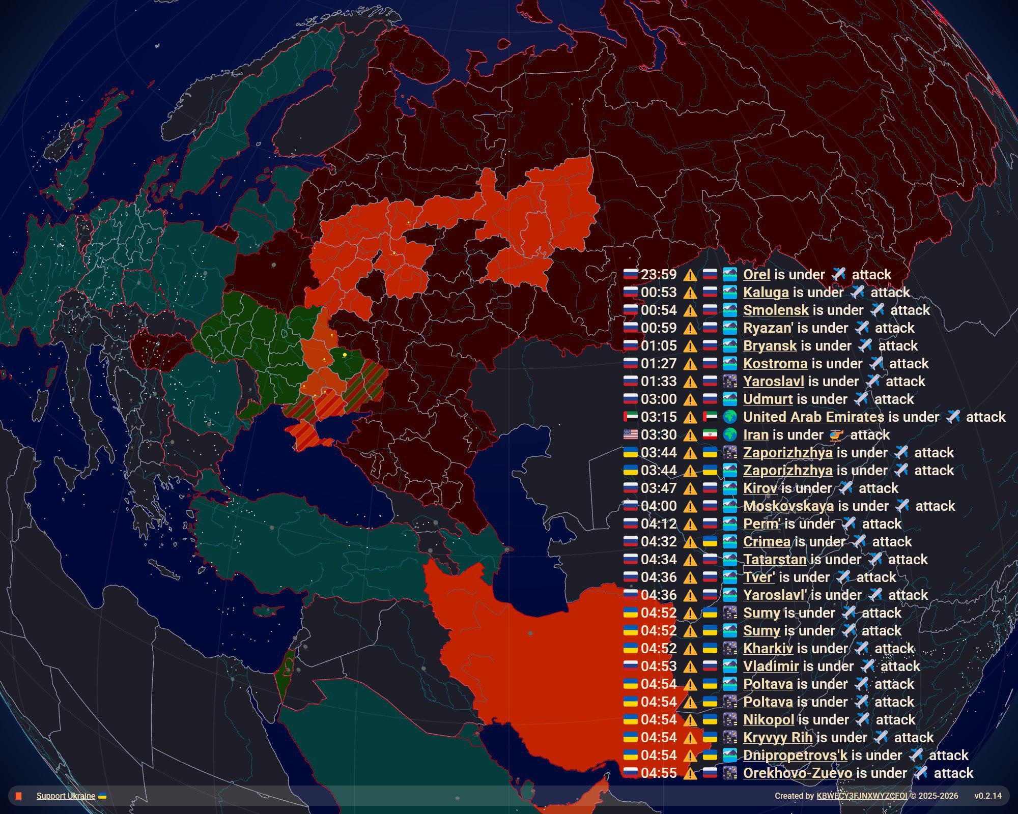
Link to the project: https://ww-3.online/
by KBWECY3FJNXWYZCFOI
8 Comments
Key Features: All-in-one realtime map, which provides high accuracy alerts for Russian-Ukranian war and medium accuracy alerts for the rest of the world with ability to monitor aircrafts in realtime.
Data Sources: A bunch of official and non-official telegram monitoring channels for realtime Russian-Ukranian alerts monitoring, a bunch of media for worldwide incidents monitoring, Open Sky for aircrafts, n2yo for satellites, Natural Earth for geo data, local Ollama for processing worldwide incidents.
Data Pipeline: Python script actively monitoring telegram channels and news, building alerts “package” and sending it to cdn.
Frontend: Map is rendered using GlobeGL (build on three.js) and fetches alerts packages from cdn. Another script monitors changes in packages. If any presented, renders page using Selenium and sending screenshot to telegram channel.
No legend – I have no idea what a ✈️ means compared to a 🚁
Cool idea, but I just opening the site made my processor sound like a helicopter. Add a legend and it’ll be much easier to interpret.
What are those small square boxes/dots floating around?
This should go to r/dataisterrifying or r/dataissaddening
EDIT: This comment is not about the means of visualization of the data, but rather about how I don’t like what the data says. I’d prefer peace.
this is not a beautiful visualization
In those alerts that have that pattern [emoji], [time] [warning triangle] [emoji] [emoji] [city name] [type of attack] what do the different emojis mean?
Pretty broken buddy, but really cool idea. Will bookmark it for when things are a little further along