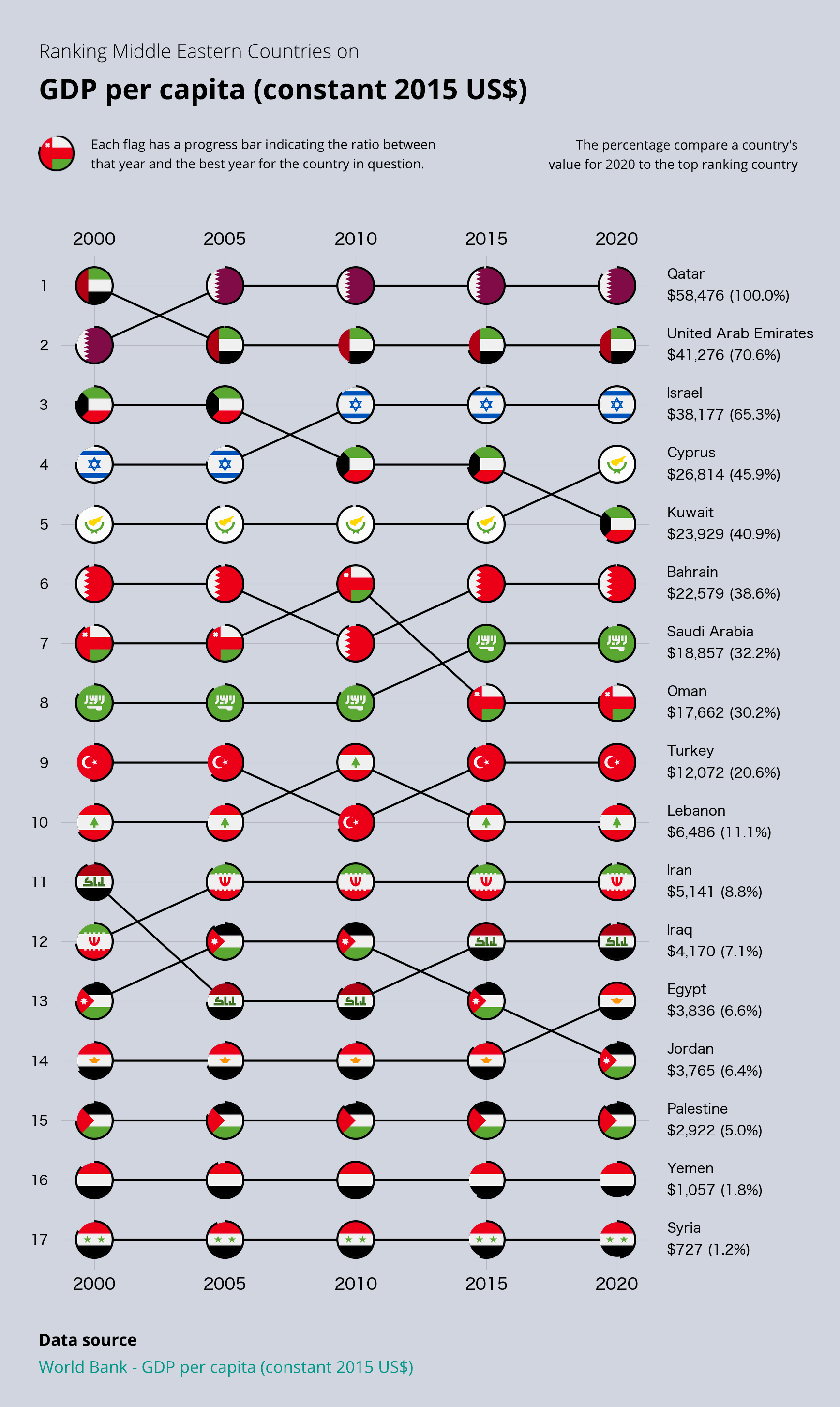
I finally found a good way to use my country ranking chart by selecting a geographical region and including all countries for every year. Previously, I got some complaints that countries were missing from the plot because I only compared the ones in the lead right now.
With constant $US, we measure the output of goods rather than their monetary value. The technique stabilizes the GDP metric and better describes what the economy looks like inside the country.

2 Comments
Data source: [World Bank – GDP per capita (constant 2015 US$)](https://databank.worldbank.org/source/sustainable-development-goals-(sdgs)/Series/NY.GDP.PCAP.KD)
Tools used: Python and Matplotlib
I finally found a good way to use my country ranking chart by selecting a geographical region and including all countries for every year. Previously, I got some complaints that countries were missing from the plot because I only compared the ones in the lead right now.
With constant $US, we measure the output of goods rather than their monetary value. The technique stabilizes the GDP metric and better describes what the economy looks like inside the country.
You can find more information and visualization in this article from my newsletter: [https://datawonder.substack.com/p/middle-eastern-to-tech-trends](https://datawonder.substack.com/p/middle-eastern-to-tech-trends)
And here’s a [tweet](https://twitter.com/DataWonder_/status/1711741752313290847) with the same chart.
I hope you like it! 😀
When measuring per capita, nominal makes little sense
In general nominal should be used to calculate things related to power, geopolitical strength and such
The economic size, what changes with gdp growth and what gives people quality of life is PPP adjusted