
Fully interactive version available here via GitHub
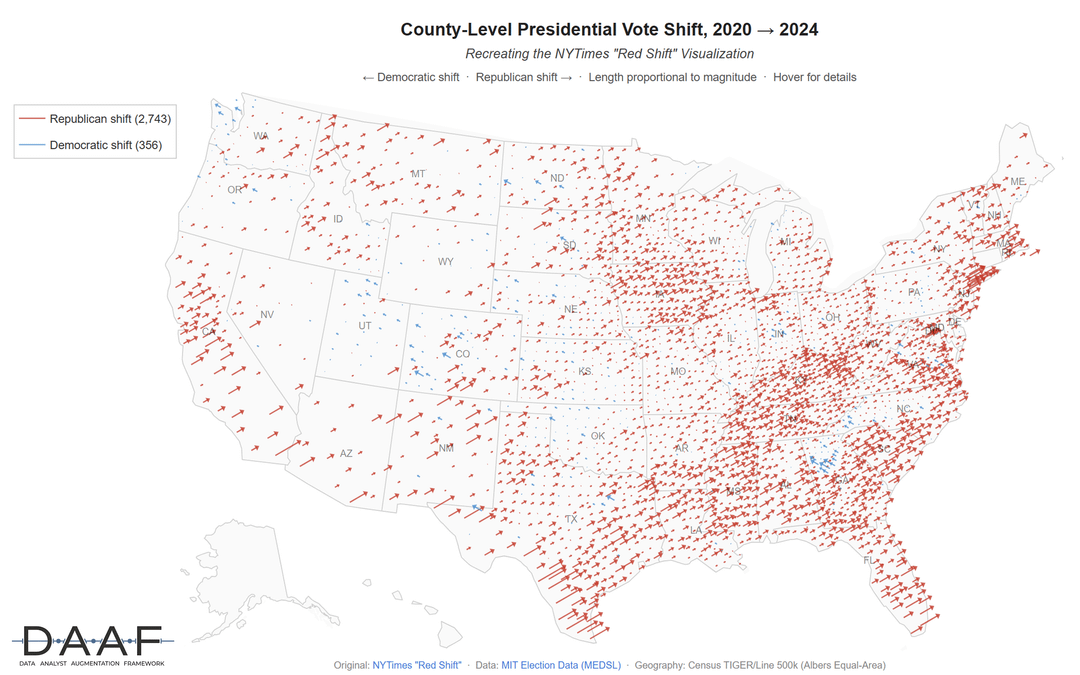
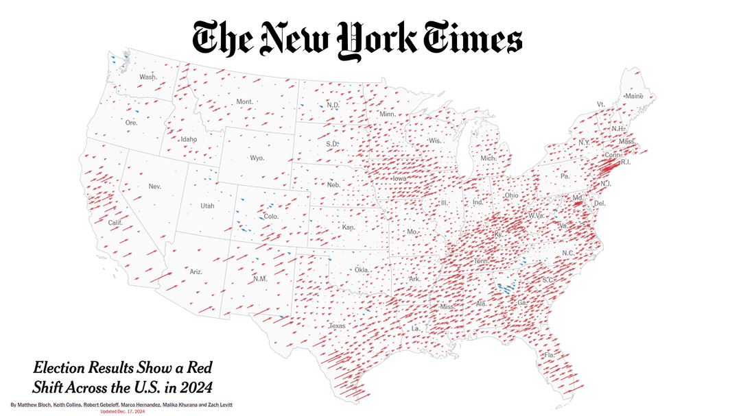
As a replication study, I wanted to try and recreate one of my favorite visualizations of all time: the NYTimes' "Red Shift" data visualization map (please take a peek at the original!!) charting how county vote shares changed from the 2020 to 2024 presidential elections. It's so visually clear, super intuitive, and extremely impactful, while being driven by thoughtful underlying data analysis. Everything I think we want in a good data viz!
Source: I was able to easily pull the relevant data thanks to the MIT Election Data and Science Lab (via the Harvard Dataverse)
Tools used:
- Python, plotly, polars
I did this largely as a test of robustness for an open-source data analysis framework I created to see if it was possible to do data analysis with Claude Code in a way that's still rigorous, reproducible, and transparent with a human expert still very much in control and calling the shots (AI slop is a real problem!! will only comment below with the info and video tutorial to avoid spamming). This replication study allowed me to directly check point-by-point whether the data analysis worked as expected against known-good values from the NYT article, and it was also a great test to see how easily I could create the interactive dashboard version with the AI assistance (turns out, scary easy — not to be trifled with).
Note that some vote share counts and values may deviate from the NYTimes article mostly due to the source data being meaningfully different, which I think is expected — you can see more in the underlying data documentation available via Harvard Dataverse and the linked Nature data methodology article.
by brhkim
1 Comment
Source: I was able to easily pull the relevant data thanks to the [MIT Election Data and Science Lab (via the Harvard Dataverse)](https://dataverse.harvard.edu/dataset.xhtml?persistentId=doi:10.7910/DVN/VOQCHQ)
Tools used: Python, plotly, polars
Only for those interested from the main post: My Claude Code framework [DAAF, the Data Analyst Augmentation Framework](https://github.com/DAAF-Contribution-Community/daaf), can be found in this open-source forever-free repo here. I also made a [youtube tutorial demonstrating the exact process](https://youtu.be/G5uKSlI6jls) for replicating the NYTimes’ viz using DAAF here. For this dataisbeautiful post specifically, I also went back and did another 5 minutes of iterating on the aesthetics with Claude after the version shown in the video.