
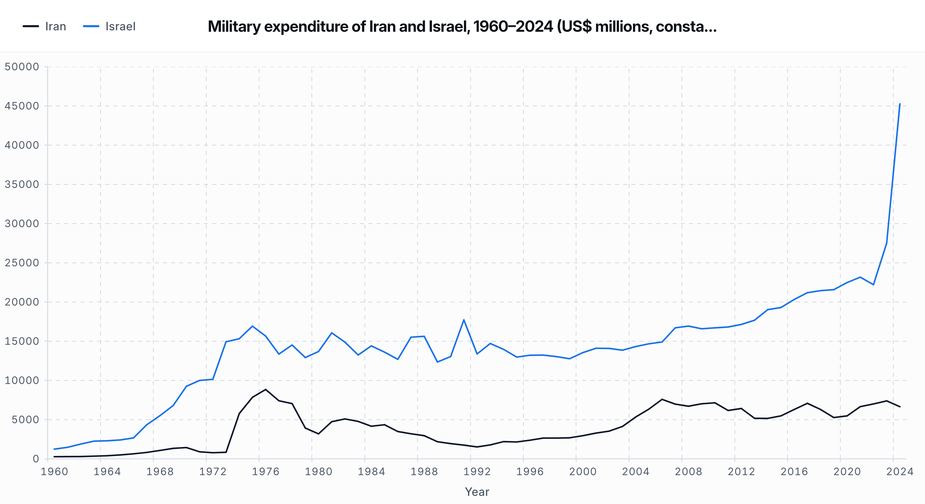
I visualized military expenditure trends for Iran and Israel from 1960 to 2024 using SIPRI’s 2024 database release.
All figures are in constant 2024 US$ millions to account for inflation.
Some noticeable patterns:
• Sharp increases for both countries during the 1970s
• Divergence beginning in the late 1980s
• A significant spike for Israel in 2023–2024
Data source: SIPRI Military Expenditure Database (2024 release)
Method: Line chart comparison, constant 2024 US$ millions
by Still-Alternative-64
8 Comments
Source: SIPRI Military Expenditure Database (2024).
Figures are in constant 2024 US$ millions.
One of these countries has figured out a way to leech unlimited resources off the US, one hasn’t.
Isn’t this just a stacked line chart? Can it be more beautiful?
Gee, I wonder what happened towards the end of 2023 to explain this?
US funding of Israel over time would be an interesting datapoint.
How much of that is actually just US funding?
> A significant spike for Israel in 2023–2024
Yes, I wonder why that might have been. A mystery for the ages.
Is this saying that Iranian military spending went down during the Iran-Iraq war?